تصميم شعار متجر حلويات
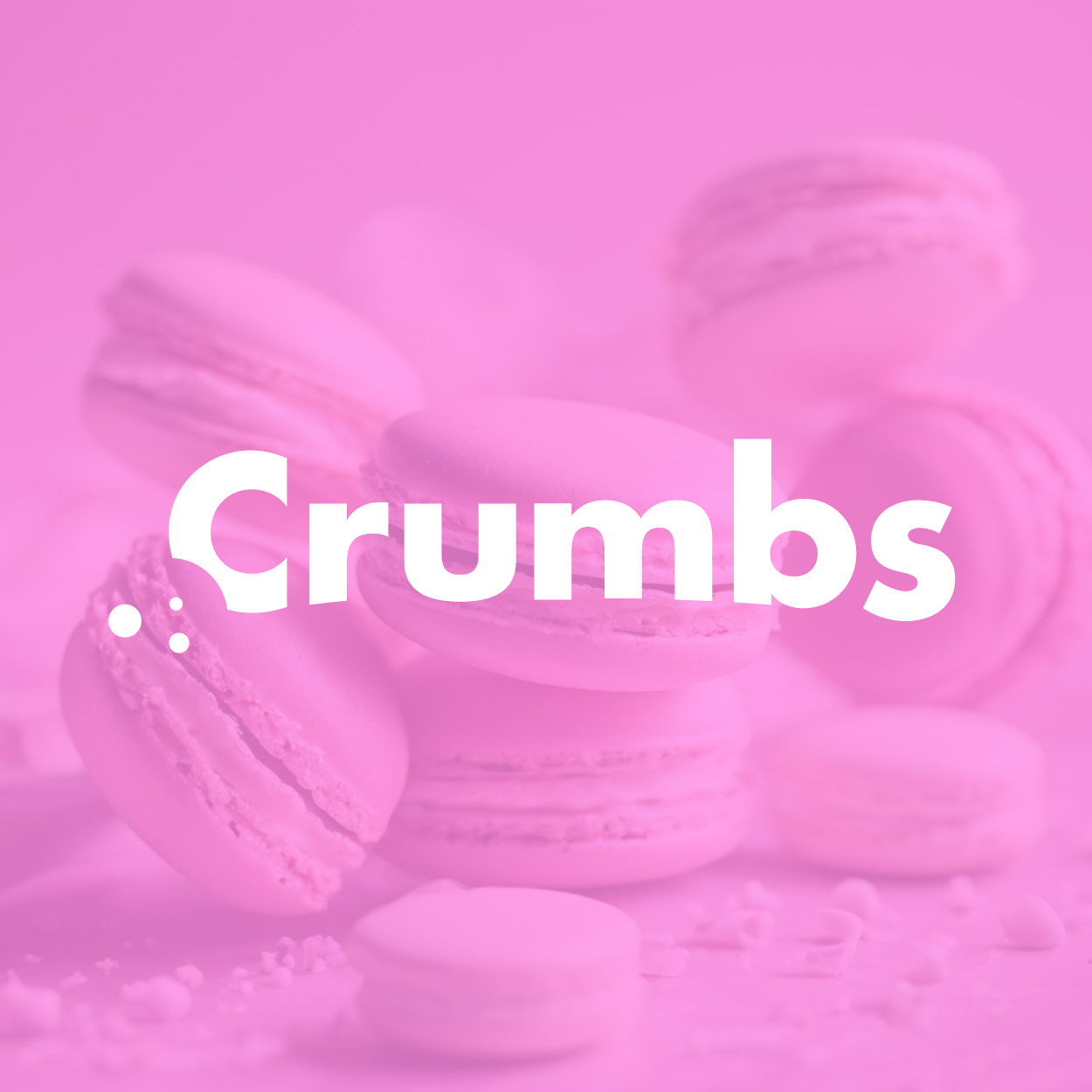
The design of this pastry shop logo centers around indulgence and joy, evoking a sense of fun and delight through playful visuals and soft, sweet tones. We aimed to capture the essence of delicious pastries, and the logo reflects the exciting and inviting nature of the business. It's all about creating an emotional connection with customers who enjoy a sweet, warm treat.

يمكننا تصميم هذا
من أجلك.
chat_bubble
تواصل معنا!
بالتفاصيل
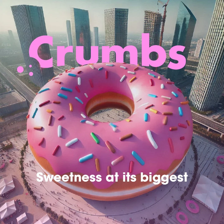
A Playful Approach to the Brand's Identity
الفكرة التصميمية
For the pastry shop logo design, we focused on reflecting the brand's playful and inviting nature. The visual elements were inspired by the joy of eating freshly baked treats and the happy emotions they bring. We integrated light, soft shapes with a modern flair to create an instantly recognizable design that speaks to the heart of the brand.
We wanted the logo to evoke feelings of comfort and nostalgia, while still being fresh and contemporary. By incorporating fun and expressive elements, we ensured the design would be both timeless and appealing to customers of all ages. This balance allows the logo to represent the brand's unique approach to baking, providing customers with a taste of joy and creativity.
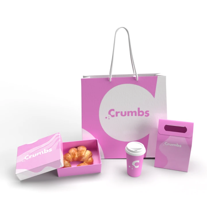
Bright, Fun, and Inviting
الأسلوب الفني
The overall style of the logo is meant to be as inviting as the pastries themselves. Using playful curves and a fun design, the logo feels lighthearted and approachable. We chose a clean, modern look with a little flair to reflect the joy and excitement that comes with indulging in a sweet treat. The style connects with a wide audience, making it universally appealing.
Fun and expressive details in the design make this logo stand out. We wanted it to immediately make people smile when they see it, which is why every curve and line was chosen to evoke positive feelings. It’s not just a logo, it’s an invitation to come enjoy something sweet and memorable, giving it the perfect touch of playfulness and approachability.
A Soft Palette for Sweetness
الألوان المختارة
For the color scheme, we chose cotton candy pink to symbolize the sweetness and light-hearted nature of the brand. This soft, inviting color instantly conveys warmth and charm, resonating with anyone looking for a little indulgence. The choice of this playful yet sophisticated pink captures the essence of a welcoming, delightful atmosphere that defines the pastry shop experience.
Cotton candy pink has been carefully selected to emphasize the sweetness of the products and the overall fun nature of the brand. It’s not overpowering but instead creates a calming and approachable environment, encouraging customers to relax and enjoy. The soft pink hue speaks to the heart of the pastry shop’s message: everything here is sweet, enjoyable, and made with love.
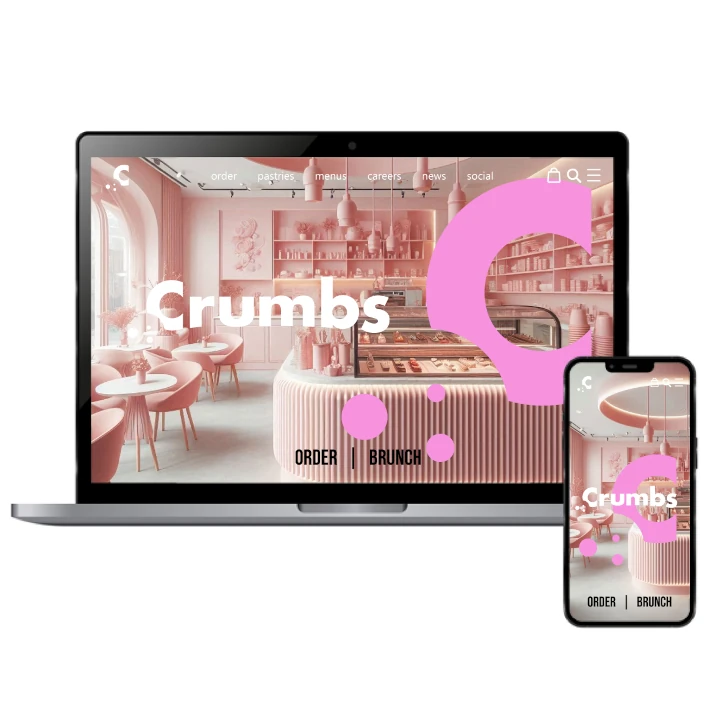
Connecting Emotion with Taste
التنفيذ البصري
The logo has been a huge success, closely tied to the playful and inviting personality of the brand. Customers immediately connect with the fun and fresh vibe, making it memorable. It’s not just about a logo; it’s a visual experience that reminds people of the joy that comes with every bite. It brings the brand's core message to life in a way that resonates with their customers.
The project's success is reflected in how well the design communicates the brand’s essence. Alongside the visual identity, our company naming agency played a crucial role in developing a name that aligns perfectly with the sweet and fun vibe of the pastry shop. From its fun curves to its inviting cotton candy pink color, the logo encapsulates the delicious experience of the pastries themselves. The design has created a strong connection with the target audience, helping the pastry shop grow its customer base and build loyalty by communicating its sweet and fun personality.