تصميم شعار مواد كيميائية
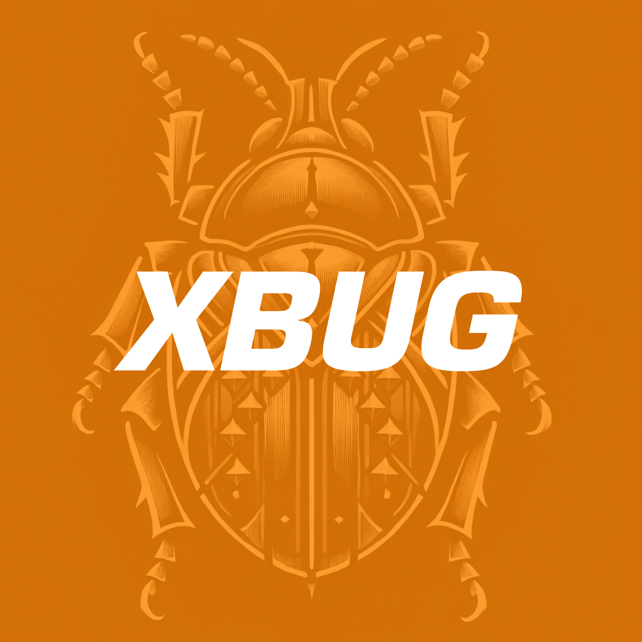
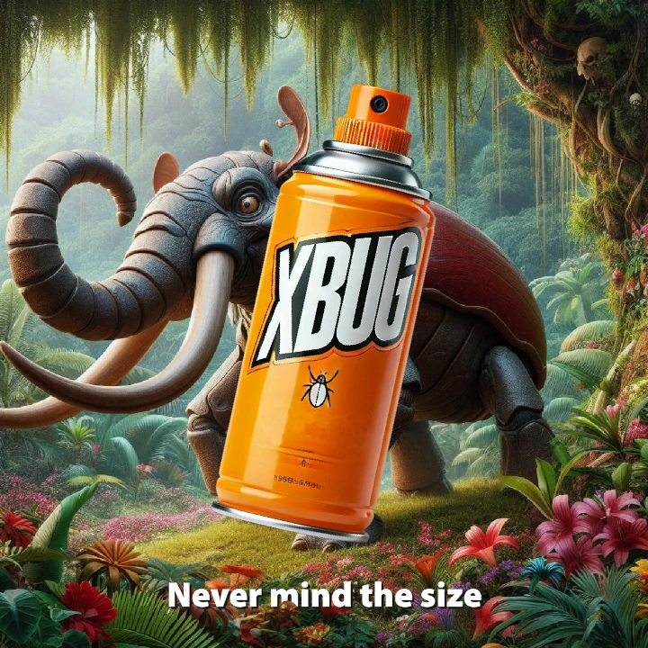
We created this chemical product logo to convey quickness and safety, key aspects of an effective insecticide. The modern, confident design, enhanced by the dynamic orange-red color, delivers a bold visual impact. This logo, along with a strong, memorable brand name, forms an identity that directly connects with its target market, emphasizing the product's reliability and effectiveness in addressing customers' needs.

يمكننا تصميم هذا
من أجلك.
chat_bubble
تواصل معنا!
بالتفاصيل
Inspired By Speed And Protection: A Chemical Logo
الفكرة التصميمية
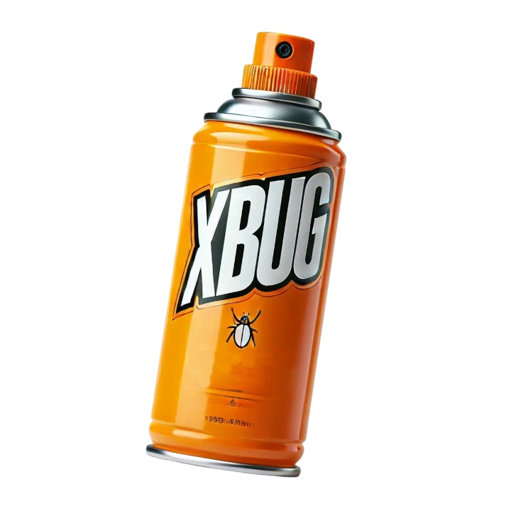
When designing this chemical product logo, we wanted it to embody the values of quick action and reliable safety. An insecticide product must communicate efficiency, and we aimed to visually represent that assurance through a bold and energetic design. The logo's vibrant elements were chosen to convey the product's potency, ensuring consumers feel confident in its effectiveness.
Creating a chemical product logo design that balanced speed and trust was key. We looked for visual cues that conveyed protection and effectiveness, ensuring the brand would be seen as a strong, capable solution to pest problems. With the help of our expert branding designers, the final design was a success that effectively communicates both reliability and efficiency.
A Design That Speaks Confidence
الأسلوب الفني
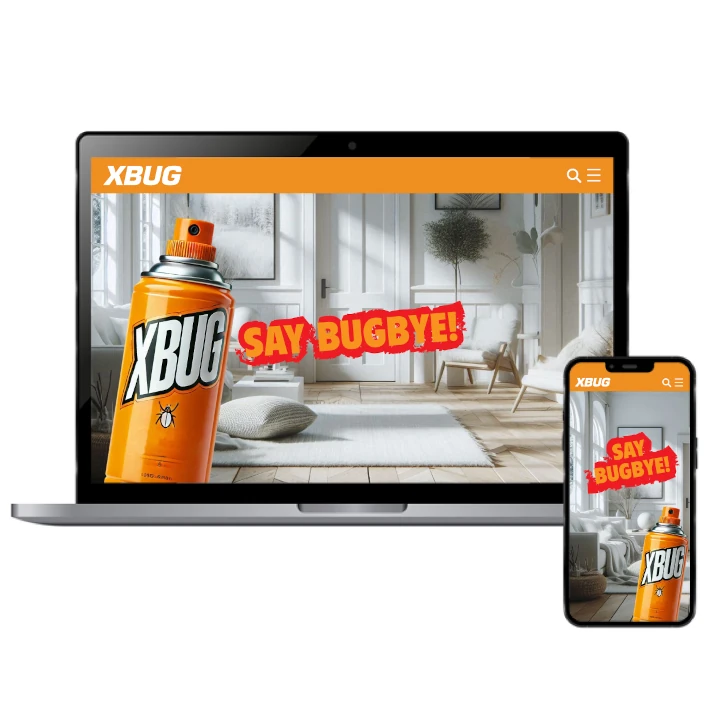
The visual direction emphasizes a sharp, progressive style with clean yet dynamic shapes. As the rebranding company in charge of this project we were looking for a combination that renewes the product's message of reliable and modern effectiveness while standing out in the competitive market of chemical solutions.
We carefully balanced strength with clarity to maintain versatility. Whether displayed on product labels or marketing materials, the logo remains visually striking and unmistakable, reflecting the confident identity of the brand. This thoughtful design ensures the logo communicates the product’s reliability and efficiency, making a lasting impression on consumers across various platforms and touchpoints.
The Energy Of Orange Red
الألوان المختارة
Orange red was chosen for its powerful and energetic connotations. The color embodies both urgency and trustworthiness, capturing the need for immediate action while reassuring consumers about the product's safety and effectiveness. This vivid hue communicates a sense of reliability and promptness, essential qualities for an insecticide, ensuring the product stands out in a competitive market.
Beyond its symbolism, orange red has a high visual impact that draws attention and creates brand recognition. Its vibrant tone reinforces the product's mission to provide quick and reliable results, making it a memorable part of the brand identity. The color choice enhances the product's appeal, ensuring it remains prominent and easily recognizable to consumers.
A Bold Identity With Proven Impact
التنفيذ البصري
This project wasn't just about a logo—it was about creating a complete brand system. From selecting the right name to crafting a visual language that supports the product's story, we developed a cohesive and powerful brand. Our holistic approach ensured that every element aligned with the brand's core values and communicated its mission effectively.
Since launching the new branding, the product has gained a stronger market presence. The logo has become a recognizable symbol, helping the brand grow and connect with its audience more effectively, boosting both sales and consumer trust. This comprehensive branding strategy has solidified the brand’s position in the market and fostered lasting consumer relationships.