تصميم شعار إنشاءات
The design of this construction logo focuses on trust, stability, and progress. We chose a clean, geometric style paired with a strong blue color scheme to symbolize professionalism and dependability. This thoughtful combination reflects the company's dedication to delivering high-quality services and building lasting relationships. The resulting logo conveys a brand identity that not only stands out but resonates with clients and endures through changing market trends.

يمكننا تصميم هذا
من أجلك.
chat_bubble
تواصل معنا!
بالتفاصيل
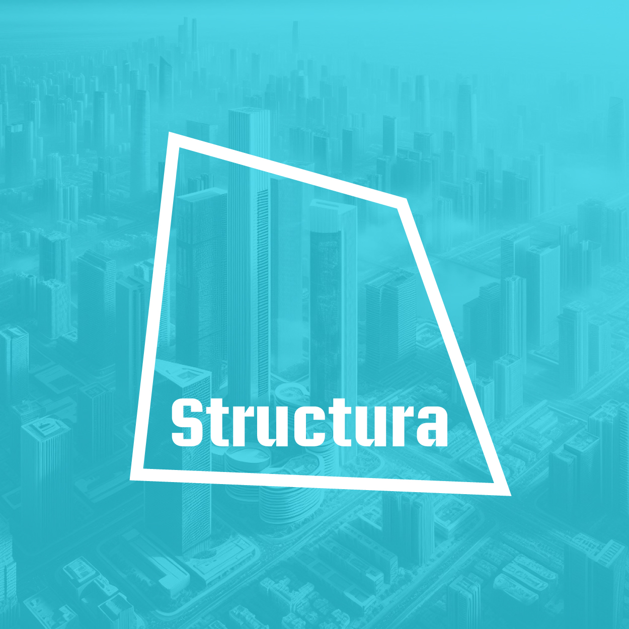
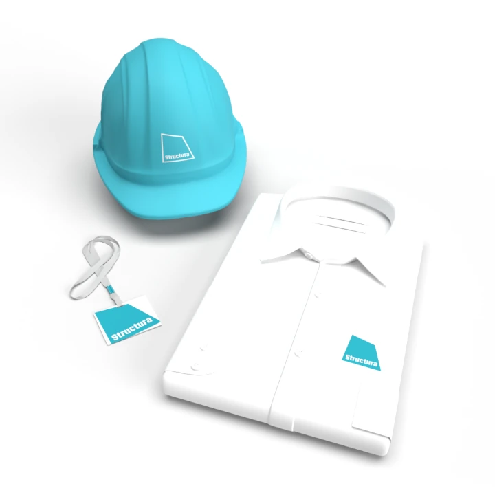
Building Trust and Style for this Construction Logo Design
الفكرة التصميمية
In creating the construction logo, trust and soundness were the foundation of the concept. A construction logo design must exude a sense of dependability. We carefully chose geometric shapes, representing structure and stability, ensuring that the logo would make a strong first impression and reflect the brand's professional nature.
The design speaks to the audience by reinforcing the reliability that clients expect from a construction company. The use of sturdy, clean lines portrays strength, while the overall composition establishes credibility. This visual strategy instills a sense of security and trust in potential clients, reinforcing the company's reputation as a reliable industry leader.
Clean, Modern, and Modular Style
الأسلوب الفني
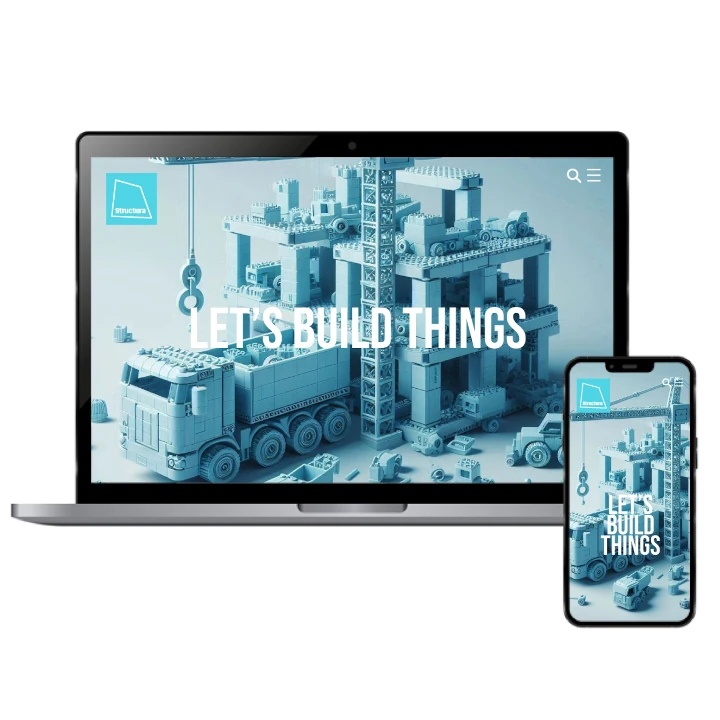
Since we started working on this project at our brand consulting agency, we were looking for a style that combined modern aesthetics with timeless strength. The geometric elements of the construction logo design create a contemporary feel, while also maintaining a sense of ruggedness and stability. The sharp lines and structured form of the design help the logo stand out while conveying professionalism and attention to detail.
This bold, modern approach communicates that the company is forward-thinking and focused on progress, while the geometric nature reinforces the idea of precision and quality. The design is versatile enough to be impactful across a variety of mediums, from business cards to billboards, making it both modern and functional.
Blue: Symbolizing Stability and Professionalism
الألوان المختارة
The choice of blue for the construction logo design was intentional, as the color is widely associated with trust, professionalism, and calm. Blue is often used in industries that require credibility and dependability, making it the perfect choice for a construction company. It communicates stability while evoking confidence in the company's services.
Additionally, blue represents a sense of calm and focus—traits that are essential when overseeing construction projects. It suggests a steady hand and a clear, methodical approach to problem-solving. The color choice helps the company stand out as a dependable, skilled provider, ensuring that clients feel secure in their decision to partner with the brand.
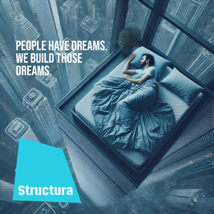
The Logo Design's Impact on Brand Growth
التنفيذ البصري
The full branding effort, including the logo design, has been key to the company's growth. With the expert support of our company naming agency, we were also able to create a name that solidifies the brand’s identity. By focusing on trust, strength, and professionalism, the logo design has helped the brand carve out its position in the market. The consistency of the branding across all touchpoints has increased brand recognition and customer loyalty.
The impact on the company's audience has been overwhelmingly positive. Clients now associate the brand with reliability and expertise, while the cohesive visual identity has been instrumental in attracting new business. The logo plays a significant role in the company's continued success, making it a cornerstone of their overall branding strategy.