الهوية البصرية لـ إنشاءات
Our construction company corporate design focuses on durability and innovation, with blue as the core color symbolizing trust, strength, and stability. The solid and innovative style mirrors the company’s commitment to designing and building with quality. Every aspect of the branding, from logos to business cards, reflects these values, ensuring the company is seen as a leader in reliable and creative construction solutions.

يمكننا تصميم هذا
من أجلك.
chat_bubble
تواصل معنا!
بالتفاصيل
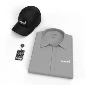
Durability and Innovation in Every Detail
الفكرة التصميمية
For our construction corporate design, we drew inspiration from the values of durability and innovation. The choice of blue is symbolic of strength and stability, which aligns with the company's focus on building reliable structures. The design’s solid and innovative style reflects the cutting-edge solutions and expert craftsmanship offered. Each branded material emphasizes these principles, helping the company create a lasting impact in the industry while maintaining a trustworthy and modern image.
The concept of the design revolves around the strength and forward-thinking nature of the construction industry. Blue was chosen for its association with stability and trust, essential for any construction company. By using this color, the design communicates the company’s dedication to building durable and innovative structures. Every branding element, from stationery to digital assets, is tailored to create a cohesive brand experience that mirrors the company's commitment to quality and progress in construction.
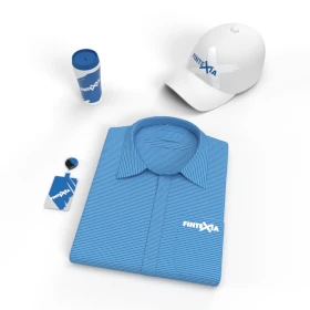
A Bold and Forward-Thinking Design Language
الأسلوب الفني
The style of this branding is bold yet refined, combining solidity with modernity. Our brand design company had an essential role in developing this vision, bringing creativity and expertise to every detail. The strong blue color evokes stability, while the sleek, innovative typography adds a distinctly modern flair. This thoughtful blend captures the company's ability to merge time-tested durability with cutting-edge innovation. The result is a design that not only highlights reliability but also underscores a forward-thinking, creative approach to construction.
A perfect balance of boldness and innovation defines the design style. The strong blue is complemented by contemporary design elements that emphasize creativity and modernity. Typography is clean and sharp, echoing the professionalism and forward-thinking nature of the company. Every branded touchpoint incorporates these design elements, allowing the brand to communicate both its solid foundation in durability and its dynamic, innovative approach to future projects and solutions.
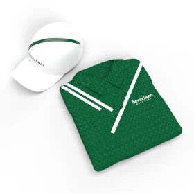
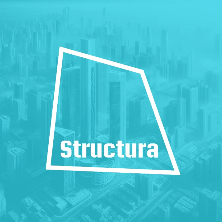
The Power of Blue: Strength and Trust
الألوان المختارة
Blue was chosen as the primary color for this construction design for its symbolic meaning of strength, stability, and trust. In an industry built on reliability, blue communicates a sense of durability that clients can count on. This timeless color enhances the company’s image as a solid and dependable partner in construction. It creates an immediate connection with clients who value strength, security, and long-term results in every project.
The blue color scheme speaks to the core values of the construction industry: strength, trust, and reliability. Blue is often associated with stability, which is crucial for any construction business aiming to leave a lasting legacy. By using blue throughout the design, the company communicates its commitment to building durable and sustainable solutions. The color’s versatility works across various branding materials, ensuring a strong and consistent message about the company's expertise in construction.
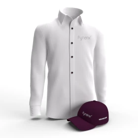
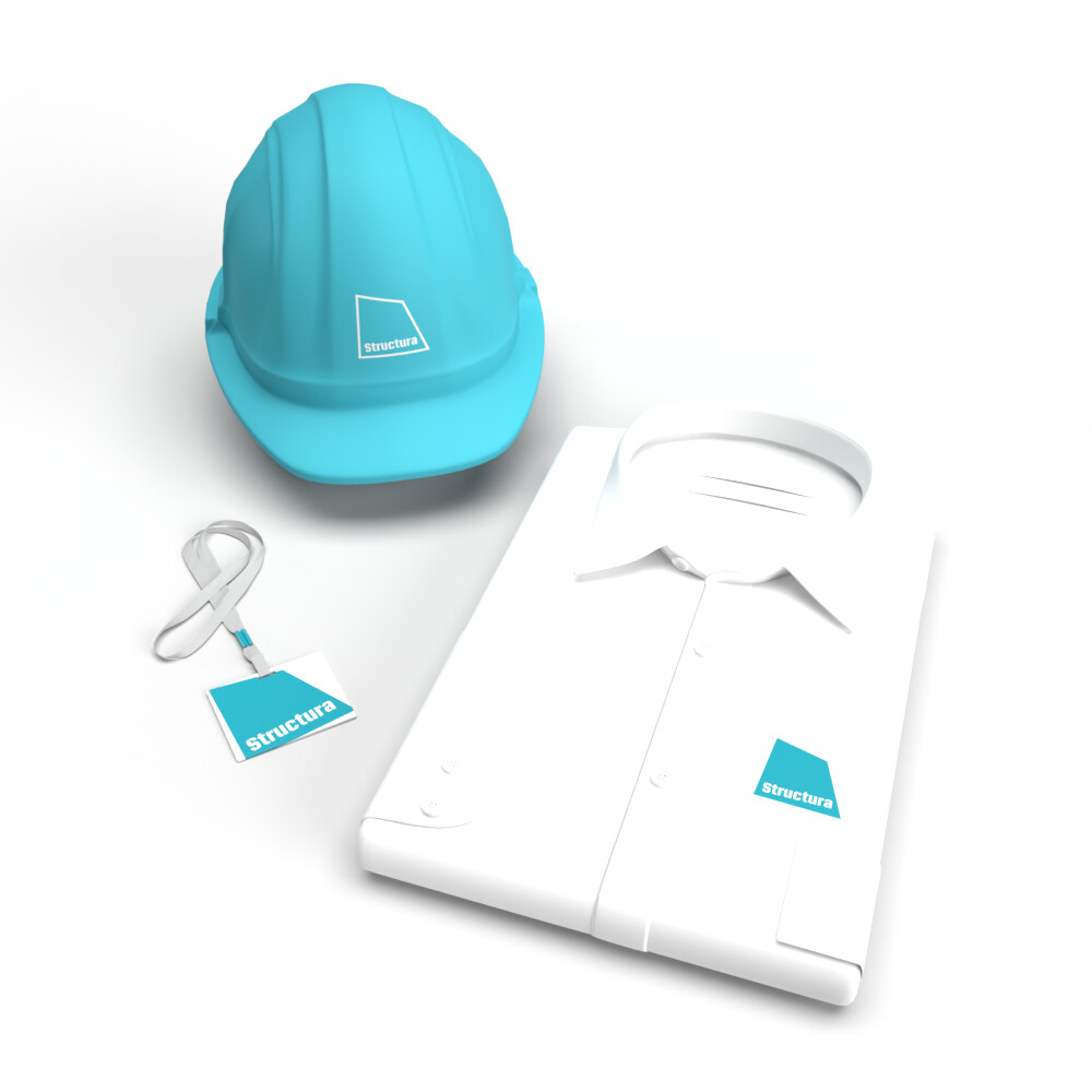
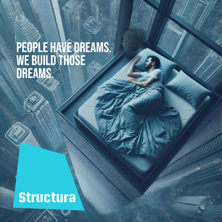
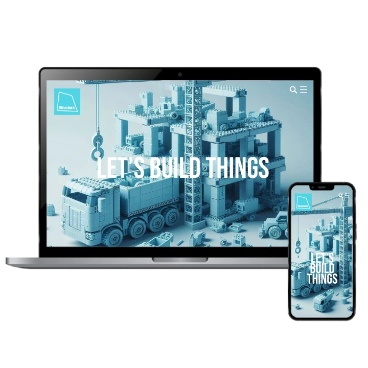
A Unified Brand Experience of Durability and Design
التنفيذ البصري
This construction branded material ensures a seamless experience for clients at every touchpoint. From digital presentations to physical branded materials, the color blue and strong design elements consistently communicate durability and trust. The innovative style highlights the company’s modern approach to construction, while every design decision reinforces the idea of strength and forward-thinking solutions. Whether seen in marketing assets or on-site, the brand’s values shine through clearly and confidently.
The brand’s corporate design is a cohesive reflection of its core values of durability and innovation. Every detail, from the logo to project proposals, exudes strength, while innovative elements position the company as a modern leader in the construction industry. The blue color anchors the brand in trustworthiness, and the forward-thinking style invites potential clients to recognize the company's commitment to delivering both timeless structures and creative, cutting-edge solutions.