تصميم التغليف لـ دار نشر
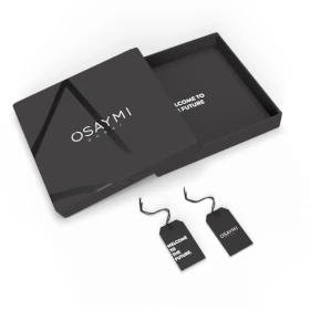
Our publisher packaging design symbolizes the nature of inspiration and vision. The ink black color represents sophistication and depth, while the creative and impactful style reflects the forward-thinking approach to publishing. This design invites readers into a world of innovation, ensuring the work within is presented with the respect and vision it deserves. It’s a packaging experience that speaks to both intellect and imagination.


يمكننا تصميم هذا
من أجلك.
chat_bubble
تواصل معنا!
بالتفاصيل
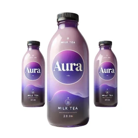
Publisher Packaging: Visionary and Thought-Provoking
الفكرة التصميمية
The concept behind our publisher packaging design merges the power of inspiration with a bold, visionary perspective. Ink black was chosen for its association with depth, intellect, and clarity, symbolizing the intellectual nature of publishing. The design focuses on making a statement, encapsulating creativity and forward-thinking vision in a simple, elegant presentation. The result is packaging that reflects the weight and value of the content it contains.
We designed the packaging to showcase the sophistication and creativity inherent in the publishing world. The ink black color is timeless and authoritative, aligning perfectly with the concept of vision and intellect. The packaging serves as a visual introduction to the rich, meaningful content within. It’s intended to inspire the audience to think deeply, creating an impact long before the first page is turned.
Creative & Impactful: Delivering Powerful Messages
الأسلوب الفني
The style of the packaging is both creative and impactful, aiming to create a visual experience that resonates with the audience. Ink black lends the design an air of authority and elegance, while the design itself makes a bold, creative statement. It balances simplicity with innovation, offering a refined, yet powerful look that invites curiosity. This style captures the essence of impactful content – strong, meaningful, and thought-provoking.
Our goal was to create a design that sparks engagement and curiosity. The creative approach is clean and modern, with ink black providing a striking contrast that grabs attention. The overall style encourages readers to explore and connect with the content on a deeper level. By combining creativity with impact, we’ve crafted a design that will leave a lasting impression on anyone who encounters it.
Ink Black: Authority, Depth & Vision
الألوان المختارة
Ink black was chosen for its connection to both tradition and modernity. It’s a color that signifies authority, clarity, and depth. In publishing, it mirrors the intellectual nature of the inspiration while also providing a sleek, professional aesthetic. This rich hue adds an element of sophistication and vision, ensuring the packaging stands out as both a work of art and a representation of meaningful, impactful content.
The use of ink black in the packaging design speaks to the seriousness and significance of publishing. It carries connotations of authority, depth, and clarity, helping to elevate the content within. This color symbolizes the idea that great ideas and stories deserve a presentation that is as bold and impactful as the words themselves. It ensures that the packaging feels timeless yet forward-thinking, a perfect fit for visionary inspiration.
Packaging That Amplifies Vision & Creativity
التنفيذ البصري
The artwork on the packaging has been carefully crafted to reinforce the visionary nature of the publisher’s inspiration. Thanks to our packaging design agency, ink black provides a bold, commanding foundation, while the design elements are thoughtfully executed to enhance the message of creativity and impact. Every detail is intended to communicate the intellectual and artistic merit of the work within, making the packaging as compelling as the content itself.
The success of the packaging lies in its ability to amplify the publisher’s vision. The ink black color creates a backdrop of sophistication, allowing the creative elements of the design to shine through. The minimalist yet impactful design directs attention to the content, ensuring that the packaging feels just as visionary and thought-provoking as the work it holds. It’s packaging that truly makes an impact.