تصميم شعار دار نشر
This publisher logo design reflects the brand’s dedication to inspiring minds and pushing the boundaries of knowledge beyond the sun. With bold symbolism, we aimed to create a memorable identity that connects with the audience’s thirst for innovation, creativity, and the written word. The design speaks to the publisher’s role in shaping ideas and communicating important messages in a fresh, bold way, while ensuring its legacy.


يمكننا تصميم هذا
من أجلك.
chat_bubble
تواصل معنا!
بالتفاصيل
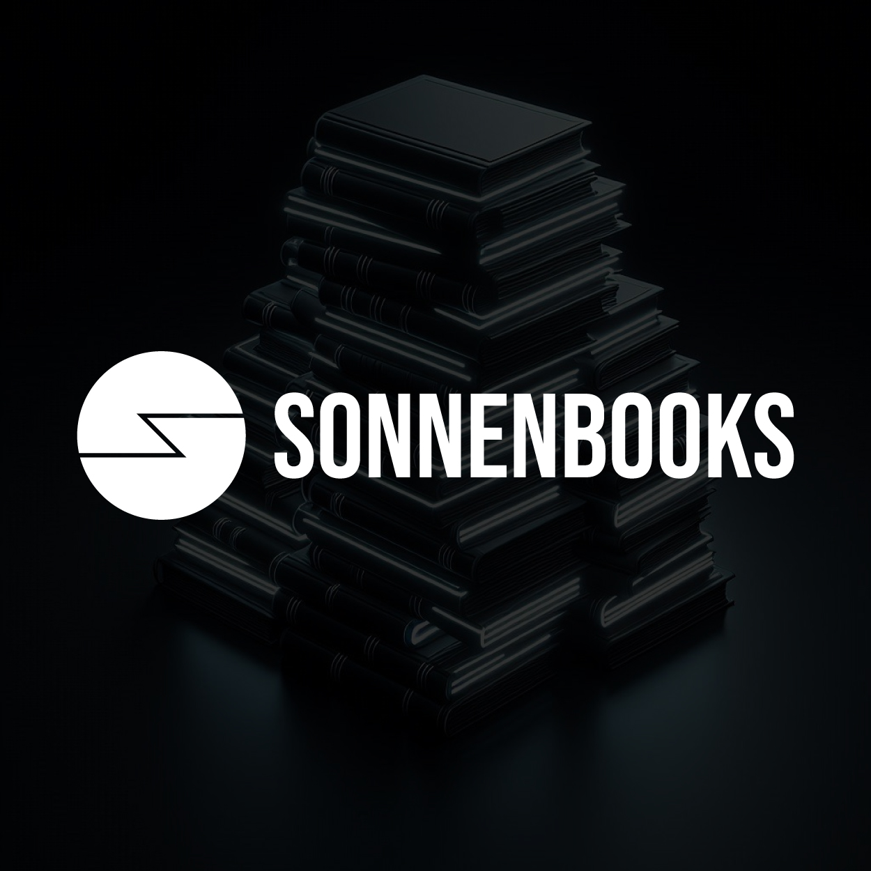
An Emblem of Knowledge and Inspiration
الفكرة التصميمية
For this publisher logo design, we centered the concept on the idea of light and inspiration. The design needed to be striking and memorable, representing the powerful impact of literature and knowledge on the world. By using bold lines and iconic imagery, we created a logo that would stand out while symbolizing the flow of ideas and creativity that a publisher embodies.
The concept transcends the written word, highlighting the transformative power of books and publications. Crefully crafted at our brand design company, the logo uses simple yet profound imagery to emphasize the publishing industry’s role in sparking new ideas and expressions. This design resonates with readers, writers, and creators, positioning the publisher as an essential pillar of the creative landscape.
Bold and Impactful Design that Inspires
الأسلوب الفني
We chose a bold style for this logo to match the publisher’s strong impact on the world of literature and ideas. The design is symbolic, using clear, modern shapes to evoke a sense of importance and reliability. We wanted the logo to feel timeless and iconic, much like the content the publisher shares with the world. The clean lines and assertive geometry convey a sense of confidence.
In this style, the logo emphasizes a sense of power and presence, while still being simple enough to be easily recognizable. The choice of bold elements reflects the publisher’s role in driving change, ensuring that the logo would be both memorable and impactful. Its geometric yet symbolic structure represents the publisher's modern approach while embracing the weight of tradition.
Ink Black: A Nod to Literary Roots
الألوان المختارة
Ink black was a natural choice for this publisher logo due to its association with the written word and classic print. The color evokes a sense of authority, timelessness, and sophistication, making it an ideal fit for a publishing house that values creativity and innovation. It also brings a strong contrast, ensuring the logo stands out in a variety of settings.
Black offers versatility and balance in design, aligning with the publisher’s commitment to timeless, thought-provoking content. It’s a color that represents knowledge and authority, but also creative freedom, providing a perfect foundation for the publisher's bold identity. The ink black color reinforces the symbolism of the logo, grounding it in tradition while leaving room for innovation.
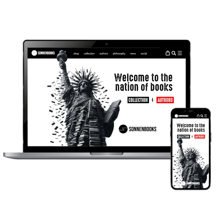
A Powerful Identity for a Creative Force
التنفيذ البصري
The success of this publisher logo design lies in how well it encapsulates the brand's core values. By combining bold shapes and iconic symbols with the sophisticated ink black color, the logo represents the power of knowledge, creativity, and inspiration. This project not only gave the brand a strong identity but also connected with its audience on an emotional level.
With this logo, we were able to create a visual identity that stands for strength, vision, and transformation. The combination of bold design elements, classic color, and a meaningful symbol ensures that the logo reflects the publisher's commitment to shaping the future of literature. This logo is designed to resonate deeply with its audience, driving both trust and inspiration.