تصميم شعار طيران خاص
Our designers aimed to create an aviation logo design that not only captures the thrill of flight but also embodies the spirit of challenge and adventure. The goal was to develop a bold and progressive identity, utilizing vibrant, striking colors paired with sharp, clean lines. The brand name and logo work cohesively, evoking a sense of energy, precision, and excitement. This design resonates with both professionals and aviation enthusiasts sparking a sense of adventure in those who interact with the brand.


يمكننا تصميم هذا
من أجلك.
chat_bubble
تواصل معنا!
بالتفاصيل
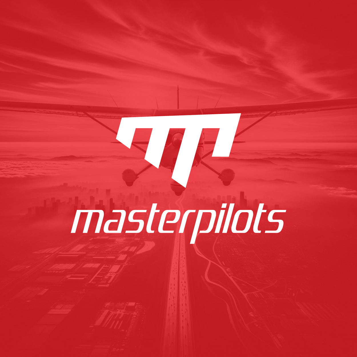
Aviation Logo: a Bold Take on Flight
الفكرة التصميمية
The concept for this aviation logo design draws from a deep passion for flight. We wanted the logo to reflect both the beauty and the challenge inherent in aviation. The design process was centered around creating something that would stand out while representing the precision and excitement that the aviation world embodies.
The focus on flight and challenge led us to integrate bold lines and dynamic shapes. We aimed for a design that felt both energetic and inspiring. By blending these elements, we've captured the essence of aviation in a logo that feels both innovative and timeless, perfect for a brand that thrives on pushing boundaries.
Sharp Lines Creating Modern Appeal
الأسلوب الفني
The style of this aviation logo design is sleek and sharp. We opted for clean, angular lines to convey a sense of movement, precision, and forward-thinking. The sharpness of the design speaks to the technological aspects of aviation, highlighting speed and efficiency without sacrificing elegance.
By incorporating modern design trends, at our brand consulting agency we wanted the logo to feel contemporary while remaining grounded in the history and legacy of flight. The overall design exudes confidence, pushing the brand into the future while still respecting the traditions of aviation. The result is a sharp and progressive logo with impact.
The Power of Red in the Design
الألوان المختارة
The color red was chosen deliberately for its ability to evoke strong emotions. In the context of this aviation logo design, red symbolizes energy, passion, and creativity. It's a color that stands out and immediately draws attention, reflecting the boldness and innovation that we wanted to communicate through the brand.
Red also represents action and determination, traits that are key to the aviation industry. It speaks to the courage required in flight, the thrill of adventure, and the drive for excellence. The use of red in this design aligns with the brand's ambition to soar above the competition and constantly push for progress.
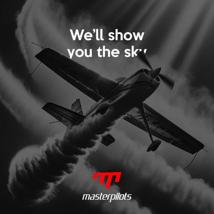
A Successful Branding Experience
التنفيذ البصري
This project was about more than just a logo—it was a full branding experience. We worked to craft a name and identity that would resonate deeply with the audience. The logo became a symbol of the brand's energy and passion for aviation, helping establish an emotional connection with both aviation professionals and enthusiasts. Our team at our rebranding company successfully transformed the brand's identity, capturing its core values and vision in the final design.
The impact has been remarkable. Since the launch, the brand has seen increased recognition and engagement, with the logo resonating strongly within the aviation community. The combination of bold naming and striking logo design has positioned the brand for growth, ensuring its place in the competitive landscape of the aviation industry.