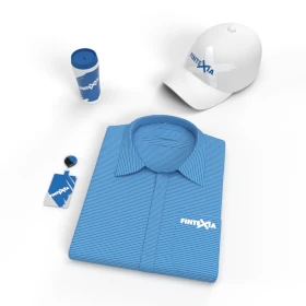
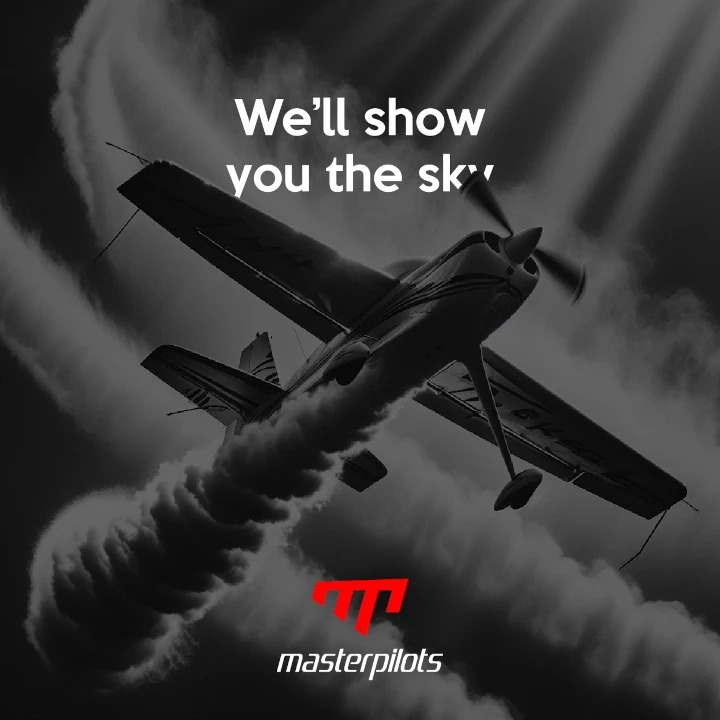
الهوية البصرية لـ طيران خاص
Our corporate design for aviation combines the spirit of adventure with the precision the industry demands. Red was chosen for its passion, energy, and the high stakes of flight. The sleek and powerful design mirrors cutting-edge aviation technology, providing a strong and forward-thinking visual identity. Each piece of branded material ensures a consistent, dynamic experience, emphasizing innovation, precision, and excitement at every touchpoint.


يمكننا تصميم هذا
من أجلك.
chat_bubble
تواصل معنا!
بالتفاصيل
Brand Identity Rooted in Adventure and Precision
الفكرة التصميمية
The concept behind this corporate design highlights both adventure and precision. Red, symbolizing passion and energy, represents the thrill of flight, while clean, sleek design elements reflect aviation's exacting standards. The design is meant to speak to clients and partners who are drawn to the excitement of the aviation world, as well as the precision and cutting-edge technology that make it all possible. Every material is thoughtfully designed to reflect these core values.
This aviation corporate design draws inspiration from the perfect balance between adventure and precision. The client collaborated with our graphic design agency to incorporate red, symbolizing energy and passion, while the modern design evokes the innovative spirit of the industry. The goal was to create an identity that resonates with both the bold, adventurous nature of aviation and its precise, technical requirements. All branding materials are carefully crafted to ensure the brand stands out while staying true to these values.
Sleek and Modern: A Design That Speaks to Innovation
الأسلوب الفني
The style of this branding blends modernity with sleek, powerful elements. Aviation is about innovation and efficiency, and this design reflects that with its streamlined visuals and sharp lines. The red color gives a sense of urgency and vitality, while the overall aesthetic speaks to a future-focused, dynamic industry. This combination of modernity and energy creates a visual identity that is as bold as the world of aviation itself.
With a modern, sleek approach, the design reflects the forward-thinking and precise nature of aviation. The clean lines and high-energy use of red create a look that is powerful yet streamlined, embodying the very spirit of the aviation industry. This style speaks to the company’s commitment to innovation, offering a visual experience that is contemporary and energetic—just like the aviation sector it represents.
Red: A Bold Statement of Energy and Precision
الألوان المختارة
Red was chosen as the key color to communicate both adventure and precision in this corporate design. It conveys energy, excitement, and urgency, which are all inherent to the aviation world. The color also aligns with the brand’s values of power, precision, and excellence, making it the perfect choice to represent a company committed to cutting-edge technology and unmatched performance. Red creates a bold, memorable visual presence, ensuring the brand stands out in the competitive aviation industry.
Red serves as a powerful representation of the aviation industry’s dynamic energy and focus on precision. It signifies passion, strength, and excitement—perfectly suited to the high-stakes world of aviation. The color also reflects the brand’s dedication to technology and innovation, helping establish a memorable and impactful visual identity. Red, with its vibrant energy, ensures that the company’s brand speaks to both its customers' adventurous spirit and its technical expertise.
A Consistent and Dynamic Brand Experience
التنفيذ البصري
The artwork within this branding is crafted to create a consistent and dynamic experience across all touchpoints. From digital to print materials, the bold use of red makes sure the brand is instantly recognizable. The sleek design elements ensure that the brand conveys its message of precision and power, while the overall visual identity enhances the sense of excitement that comes with the world of aviation. Every piece of branding helps reinforce the company’s forward-thinking, innovative spirit.
This design ensures that the brand’s dynamic, sleek identity remains consistent across all visual touchpoints. The use of red not only captures the energy of flight but also ensures the brand stands out as an industry leader in innovation. The overall design creates a compelling, professional experience that emphasizes the company’s commitment to precision and adventure. The artwork is a visual embodiment of the exciting, high-performance nature of aviation.