تصميم التغليف لـ علامة تجارية للملابس
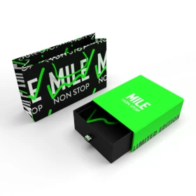
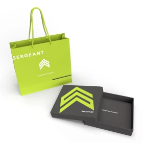
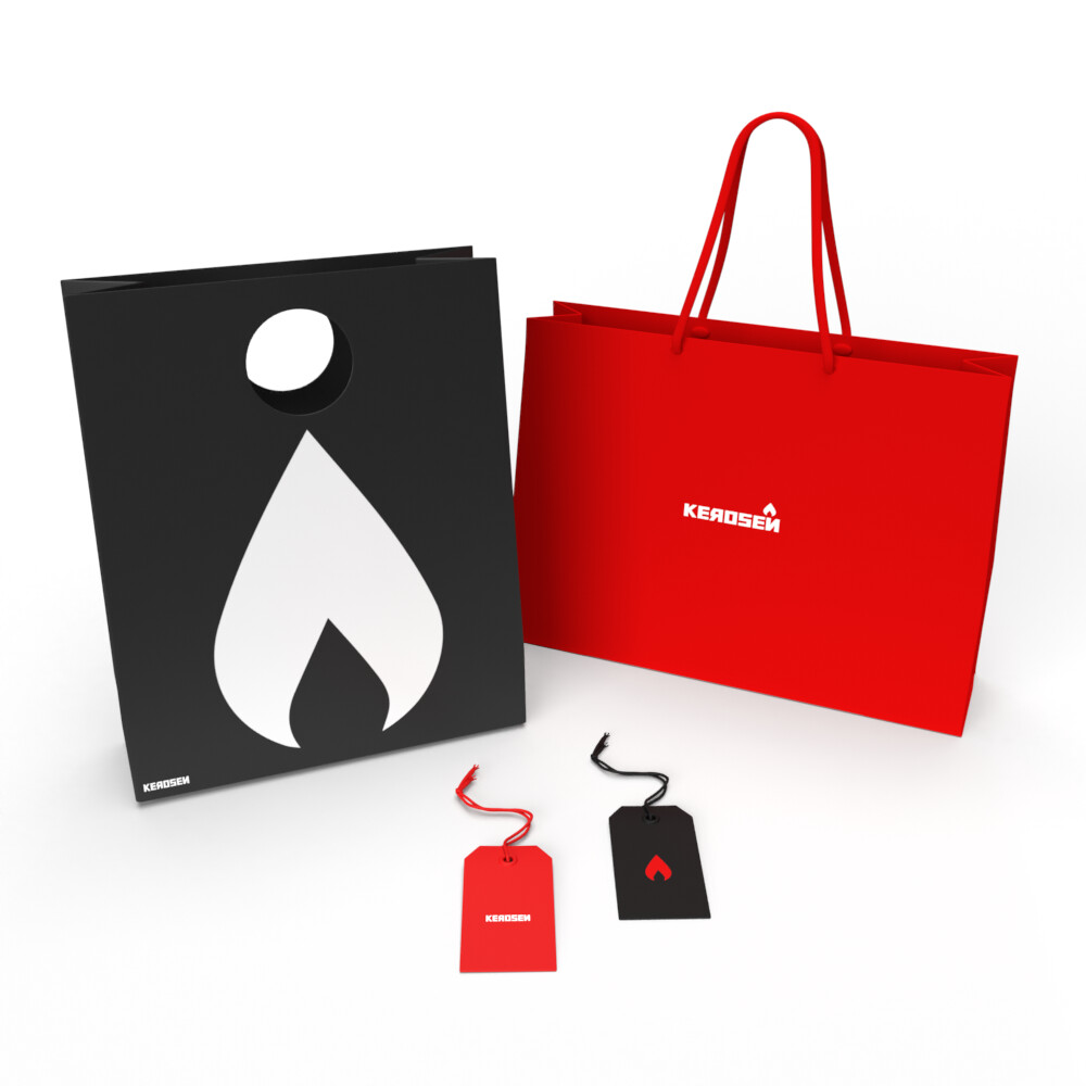
Our clothing brand packaging design fuses innovation and quality with a bold red color. The daring and refined style stands as a testament to the brand’s commitment to creating cutting-edge fashion. This packaging goes beyond just functionality, providing a visually striking, luxurious experience that aligns with the brand’s image of creativity, boldness, and superior craftsmanship.

يمكننا تصميم هذا
من أجلك.
chat_bubble
تواصل معنا!
بالتفاصيل
Clothing Brand Packaging: A Blend of Innovation & Craft
الفكرة التصميمية
Our clothing brand packaging was conceptualized to reflect the innovation and quality that define our products. By using red as the primary color, we evoke energy, passion, and boldness, aligning with the brand’s creative spirit. The design emphasizes the brand’s commitment to pushing boundaries in fashion while maintaining the utmost quality. Each detail was chosen to reflect a sense of refinement and daring creativity.
We wanted the packaging to make a bold statement. Red was selected to represent both passion and innovation, resonating with the brand’s drive to be different. The design ensures that every customer feels the excitement of receiving something unique and crafted with care. It captures the essence of the brand, focusing on new ideas and pushing the limits of fashion.
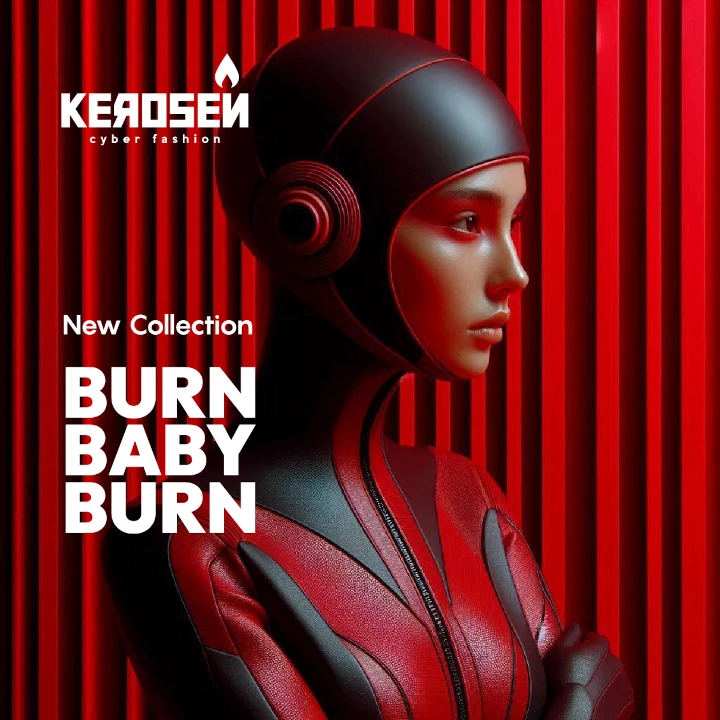
A Daring Yet Refined Design Language
الأسلوب الفني
The packaging style reflects both boldness and sophistication. We aimed to create a daring design that stands out but doesn’t compromise on refinement. Every detail, from the typeface to the texture, was chosen to enhance the luxurious yet bold feel of the packaging. The refined approach ensures that the packaging appeals to fashion-forward individuals looking for something distinctive and high-quality.
The daring style is complemented by the use of sleek, minimalistic design elements that maintain a sense of refinement. The strong contrast between bold and subtle creates a balanced aesthetic, appealing to those who value innovation but still seek luxury and quality. This dual approach highlights the brand’s commitment to creating an unforgettable fashion experience.
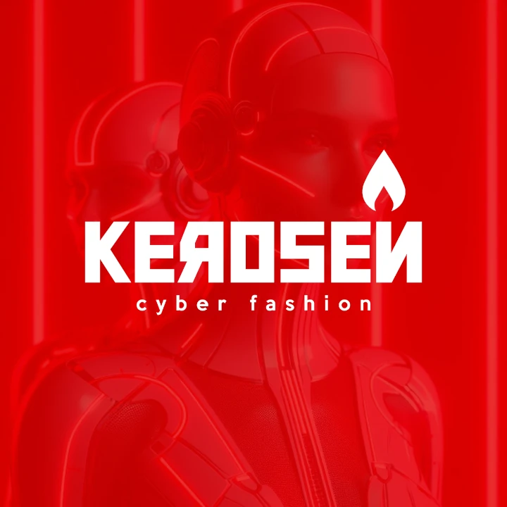
Red: Bold, Passionate, and Dynamic
الألوان المختارة
The use of red in the packaging design was deliberate—representing boldness, passion, and energy. At our packaging design agency, we chose red as a color that commands attention and conveys the brand’s spirit of innovation and daring creativity. It’s a color associated with excitement and vitality, perfectly aligning with the bold new approaches the brand takes in fashion design. The red color draws customers in, ensuring the product doesn’t go unnoticed.
Red is not just vibrant; it’s a color that stands for confidence and power. It communicates the brand’s commitment to offering innovative, high-quality products. The vivid hue helps establish an emotional connection, drawing customers to the brand’s products. This dynamic color reinforces the idea that the clothing brand is all about breaking boundaries, offering customers something bold and exciting.
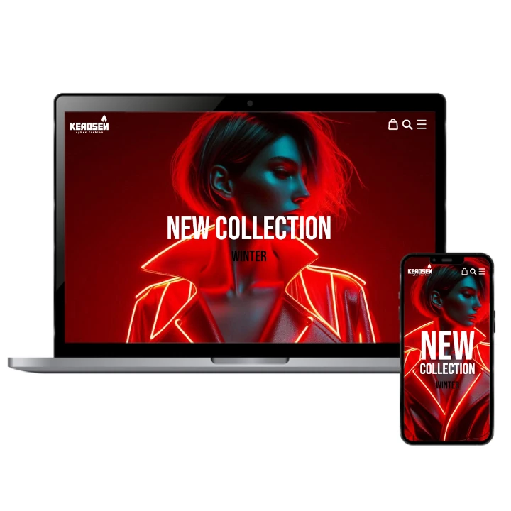
Packaging That Reflects Innovation & Luxury
التنفيذ البصري
The packaging design’s success lies in how it marries the brand’s innovative spirit with its refined approach to luxury. The daring red color immediately grabs attention, while the clean, luxurious design ensures the packaging reflects the high-quality craftsmanship behind each piece. This design communicates to the customer that the brand’s clothing is not only bold but also made with care and attention to detail.
The packaging reinforces the brand’s commitment to quality while also highlighting its creative and daring approach. By balancing innovation with refinement, we’ve created packaging that aligns perfectly with the brand’s identity. The result is a product experience that feels exclusive and inspiring, a true reflection of the brand’s values of pushing boundaries and delivering top-notch fashion.