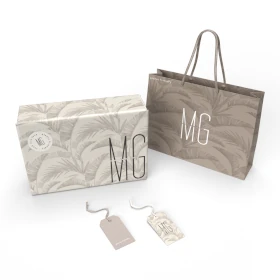
تصميم التغليف لـ مشروب غازي
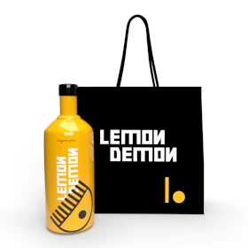
Our soda drink packaging design embodies the energy of punk and youth, with dirt brown capturing the raw, authentic vibe. The bold, lively style reflects a sense of rebellion and individuality. This design is crafted to stand out and make a statement, offering a refreshing and unique experience for those who crave something different. It’s packaging that speaks to those looking for a drink that matches their bold personality and youthful energy.

يمكننا تصميم هذا
من أجلك.
chat_bubble
تواصل معنا!
بالتفاصيل
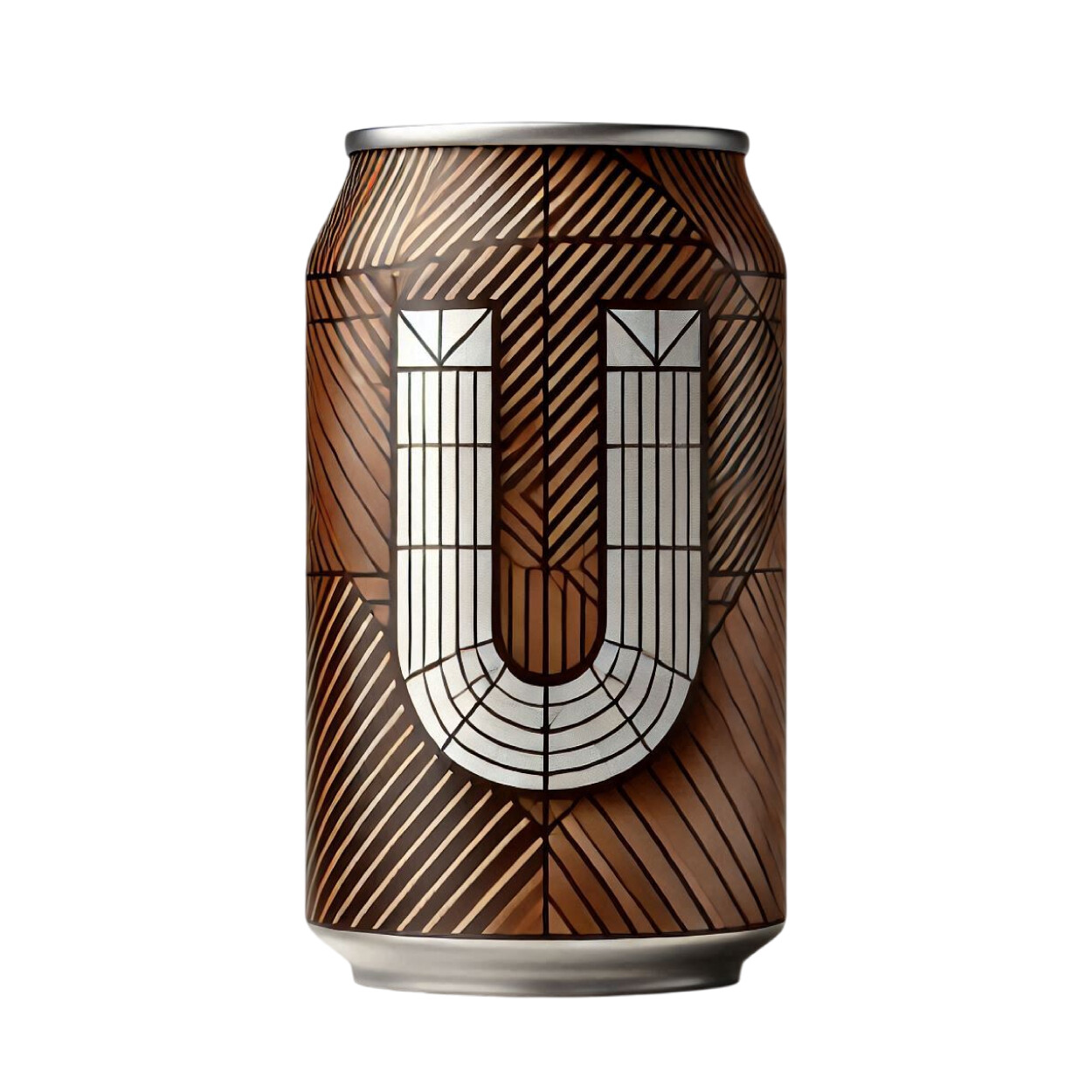
Soda Drink Packaging: Punk Energy & Rebellion
الفكرة التصميمية
The concept behind this packaging design is rooted in punk culture, using dirt brown to evoke authenticity and rebellion. This color speaks to the raw, unpolished spirit of youth, capturing the essence of a generation that values individuality. The design is meant to stand out in a crowded market, offering a product that speaks to the energetic, bold personality of those who embrace punk style. It’s about expressing freedom through packaging.
Our packaging design is an extension of punk’s rebellious spirit. Dirt brown serves as a nod to the underground, unrefined aesthetic of the movement, while the bold, lively design reflects youthful energy. We wanted to create something visually striking that would resonate with those who feel empowered by punk culture. The packaging offers a visual connection to the freedom and edginess that comes with youth and rebellion, making it instantly recognizable.
Bold & Lively: A Soda for the Youthful Spirit
الأسلوب الفني
The style of this soda drink packaging is both bold and lively, capturing the energy and spirit of youth. Dirt brown contrasts with dynamic design elements, creating a sense of movement and excitement. The overall style feels raw and authentic, inspired by the punk movement’s fearless, non-conformist attitude. It’s about communicating power, individuality, and a sense of youthful rebellion through the packaging itself. Every detail speaks to that energetic vibe.
This packaging style is unapologetically bold, using dirt brown as the foundation to ground the design in a punk-inspired aesthetic. The lively elements of the design reflect the product’s energetic, youthful nature, offering an experience that feels as rebellious and fun as the soda itself. It’s a packaging style that demands attention and speaks to those who aren’t afraid to stand out, embracing a unique approach to design and individuality.
Dirt Brown: Raw, Authentic & Bold
الألوان المختارة
Dirt brown was chosen for its raw, authentic quality, perfectly aligning with the punk and youthful energy behind the design. At our packaging design agency, we used this color to represent individuality and rebellion, giving the packaging a grounded, unrefined look that still feels powerful. Dirt brown contrasts with the vibrant, lively elements of the design, highlighting the boldness of the soda. It’s a color that embodies strength, resilience, and the untamed spirit of youth.
The dirt brown color scheme gives the packaging a gritty, authentic edge that connects to the roots of punk culture. It’s a color that feels raw and real, reinforcing the bold and lively nature of the soda drink. Combined with the vibrant design, it speaks to a generation that values uniqueness and non-conformity. Dirt brown stands as a foundation for a brand that isn’t afraid to make a statement and embrace individuality.
Packaging That Represents Rebellion & Youth
التنفيذ البصري
The artwork on this soda drink packaging speaks directly to those who embrace rebellion and youthful energy. The dirt brown color grounds the design, while bold, lively elements bring the packaging to life. The overall design reflects the unfiltered, untamed spirit of punk culture, appealing to individuals who want their drink to represent their bold personality. It’s a packaging experience that feels alive with energy and excitement.
Success comes from the boldness of the design, which perfectly captures the punk-inspired ethos of youth and rebellion. The dirt brown base sets the tone, while the lively design elements elevate the overall look, making it feel dynamic and exciting. This packaging offers customers a visual representation of the bold, youthful spirit of the drink. It’s rebellious, vibrant, and ready to make a statement wherever it’s seen.