الهوية البصرية لـ مركز علاج أوستيوباثي
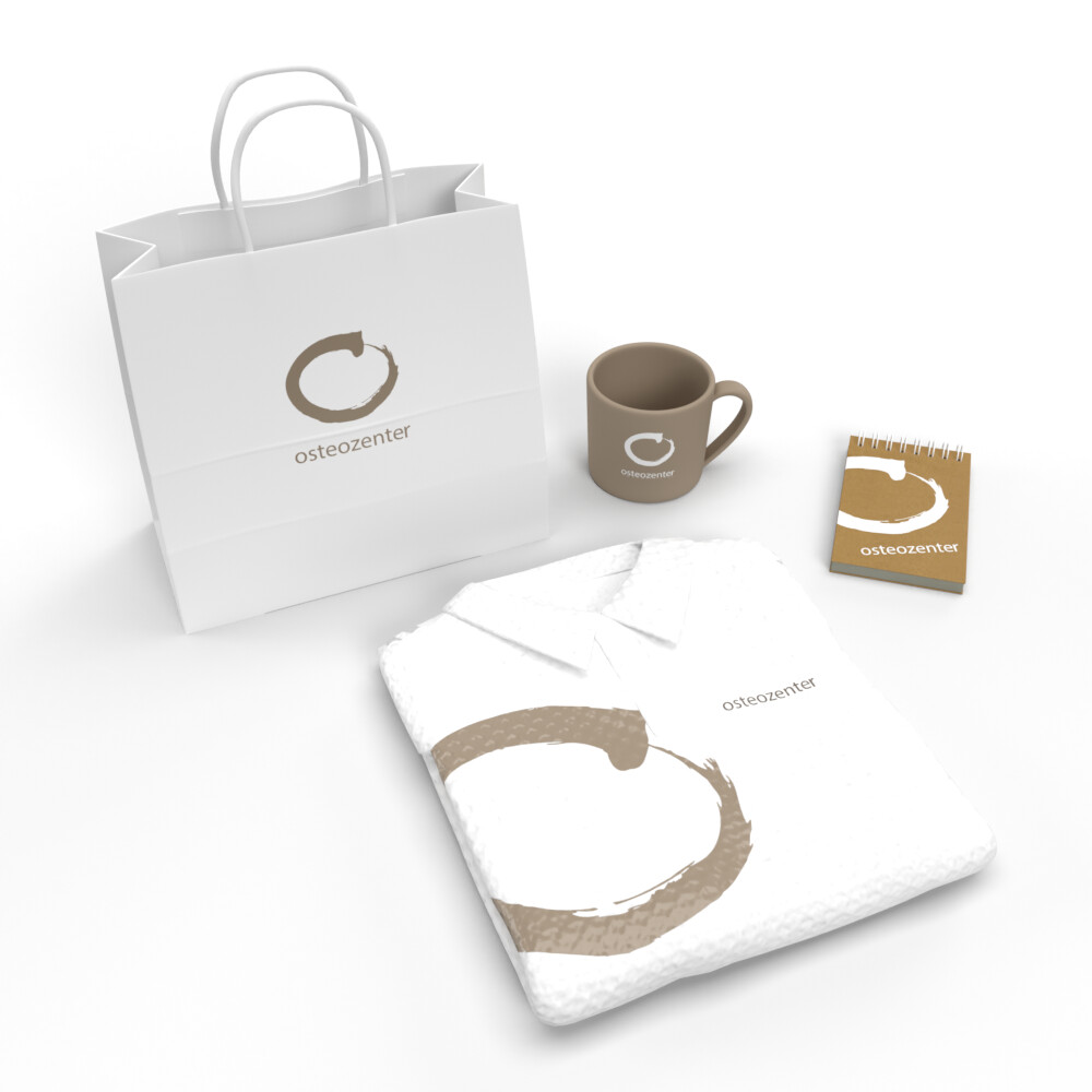
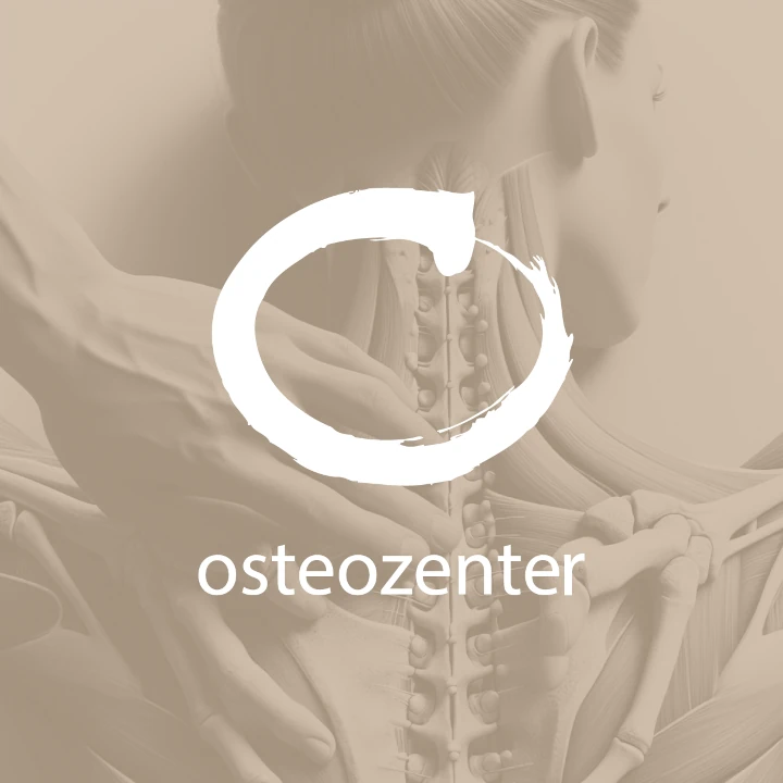
This massage therapist's corporate design integrates calming elements to establish a professional yet welcoming atmosphere. Light brown tones embody relaxation and well-being, while simple, holistic design elements evoke feelings of peace and healing. The brand materials, from business cards to digital presence, are crafted to convey trust and care. Every touchpoint reinforces the holistic approach to wellness this therapist offers, ensuring an overall calming experience for clients.

يمكننا تصميم هذا
من أجلك.
chat_bubble
تواصل معنا!
بالتفاصيل
Corporate Design for Massage Therapy Services
الفكرة التصميمية
The corporate design for this massage therapy service employs light brown tones and holistic design elements to create a welcoming and soothing environment. This aesthetic speaks directly to the therapist's commitment to wellness, calm, and healing. The carefully designed branding reflects the therapeutic atmosphere, creating trust and professionalism in every interaction. The design process ensures that clients immediately feel at ease and assured of the care they will receive.
The corporate design behind this massage therapist's business is centered on providing a calm and healing environment. Light brown tones are used to symbolize comfort and trust, while the minimalist design highlights wellness and professionalism. The goal is to present a unified, peaceful identity across all brand materials, reinforcing the brand’s dedication to holistic care and ensuring a seamless experience for clients seeking relaxation and rejuvenation.
Calming & Holistic Style Approach
الأسلوب الفني
The style for this massage therapist's brand reflects the tranquil and healing nature of the services provided. Light brown tones paired with organic, natural design elements communicate a sense of calm and well-being. Every design decision ensures that the therapist’s identity conveys a holistic, soothing experience, from the website to promotional materials. The brand style resonates with clients, ensuring they feel relaxed and confident in the services offered.
A holistic, calming design style defines this massage therapist's corporate identity. Light brown tones evoke a sense of warmth and healing, while soft curves and natural design elements invite relaxation. The minimalist approach guarantees that the focus remains on wellness and peace, making the therapist’s brand approachable and professional. The visual identity creates an environment where clients feel cared for and at ease from the moment they engage with the business.
Natural Color Palette: Light Brown & Earth Tones
الألوان المختارة
The color scheme emphasizes light brown, symbolizing healing and calm, paired with soft earth tones that enhance the sense of natural wellness. This palette exudes warmth and comfort, aligning with the therapist's mission to promote relaxation and wellness. It ensures that every brand interaction feels grounded and professional, creating an inviting environment for clients. The earthy tones also serve to reinforce the therapist's holistic approach to healing. Our brand consulting agency helped the therapist business define these key colors to make sure clients feel comfortable and at ease.
The color palette uses light brown and earth tones to convey comfort, warmth, and trust. Light brown reflects the calming nature of the services, while soft neutrals complement the peaceful and natural aesthetic of the brand. The earthy colors ensure a relaxing experience across all touchpoints, from the therapist’s website to printed materials. The color scheme fosters an atmosphere of well-being, inviting clients to engage with the business in a serene and professional manner.
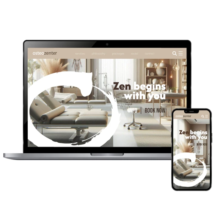
Visual Identity: Soothing & Minimalist Imagery
التنفيذ البصري
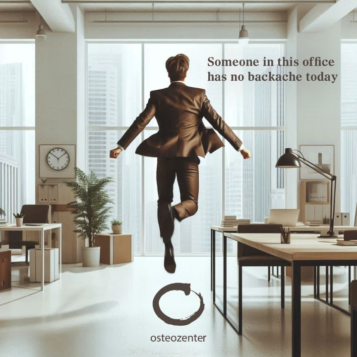
The artwork for this massage therapist’s brand uses simple, clean lines and light brown accents to create a soothing atmosphere. Organic shapes and minimalist designs reflect the healing services provided. This approach ensures the brand feels grounded, calm, and inviting. The use of earthy colors and soft textures supports a therapeutic, relaxing brand experience across all touchpoints, making it clear that clients are engaging with a professional and calming environment.
Incorporating soft curves, natural imagery, and light brown tones, the artwork for this massage therapist business reinforces the holistic and calming values of the brand. As a seal from our graphic design agency, the minimalist approach ensures that each element communicates peace, professionalism, and care. Every visual detail works cohesively to create a soothing, trustworthy identity. Whether on printed materials or digital platforms, the artwork is designed to establish a calm, welcoming environment for clients seeking relaxation and wellness.