تصميم شعار مركز علاج أوستيوباثي
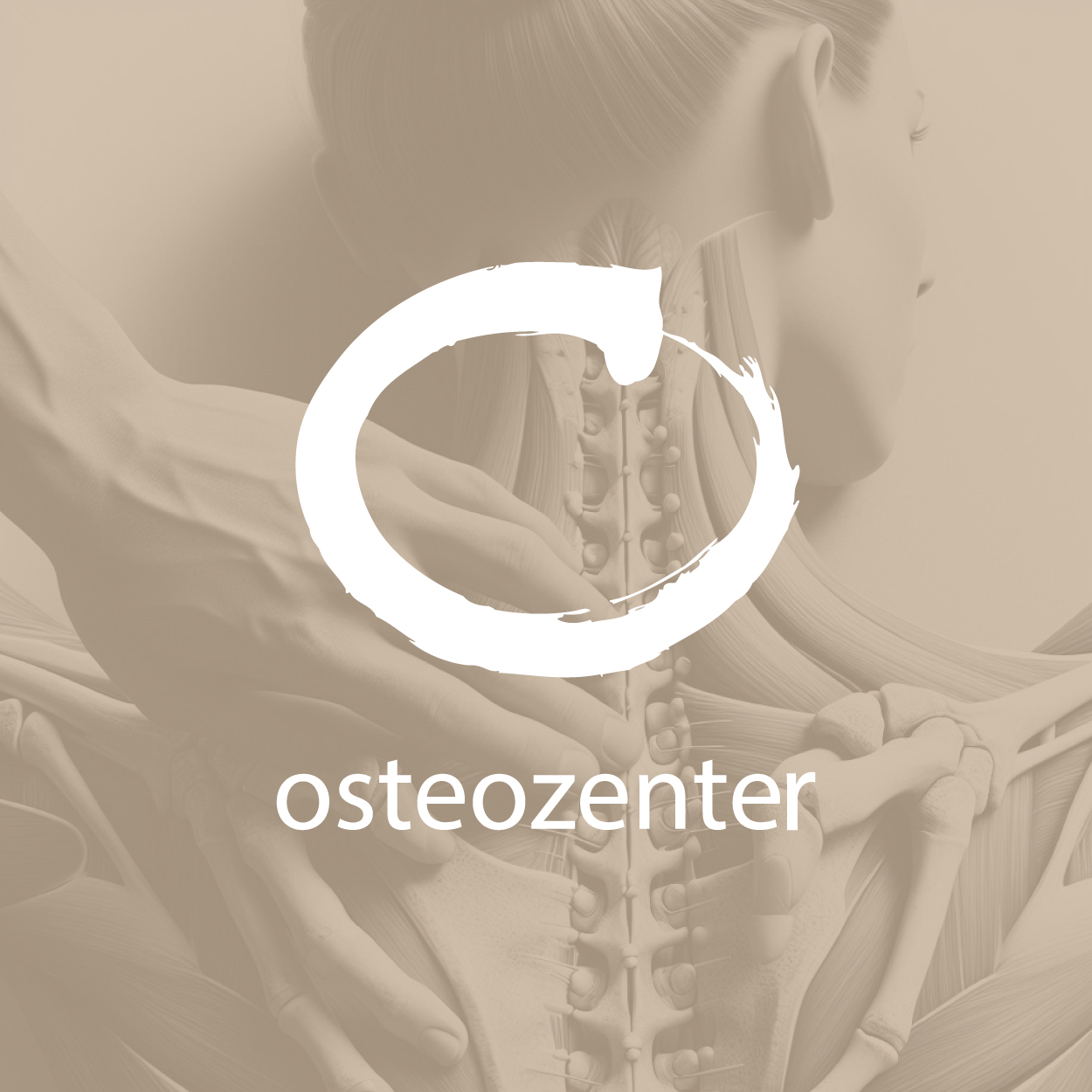
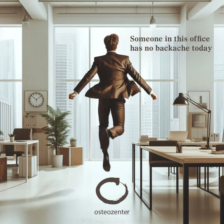
For this design, we focused on creating a logo that would reflect the spirit of nature and balance, inspired by light brown hues to represent calmness and harmony. The zen, organic style mirrors the peaceful, holistic experience of a massage therapist's work. This visual identity aims to evoke feelings of tranquility and well-being, inviting clients into a space where they can relax and rejuvenate.

يمكننا تصميم هذا
من أجلك.
chat_bubble
تواصل معنا!
بالتفاصيل
Rooted in Harmony and Wellness
الفكرة التصميمية
For the massage therapist logo design, our goal was to create a visual identity that speaks to the harmony between body and mind. We chose light brown, which symbolizes earthiness and tranquility, combined with an organic, zen style to reflect the natural healing that massage therapists provide. This logo embodies a sense of grounded calm, capturing the essence of a peaceful, restorative experience.
By blending nature and balance, the design becomes a subtle invitation for clients seeking relief. The light brown tones speak to a welcoming, calming environment, while the zen-inspired design represents the balance that massage therapy restores to the body and mind. It’s a holistic symbol that perfectly aligns with the therapeutic services offered.
Zen and Organic: A Perfect Fit
الأسلوب الفني
The zen and organic style we chose for the logo emphasizes simplicity and balance, a vision that was brought to life with the help of our creative team. Their expertise ensured the design reflects the peaceful, grounded nature of the massage therapy practice, making it feel like it belongs in a tranquil space where clients can escape from the stresses of life. The clean and natural lines represent the ease and flow of energy that massage therapists create.
The organic style reflects the harmony between the therapist and the client, while the minimalist approach ensures the focus stays on the therapeutic experience. The subtle curves and smooth shapes evoke a sense of ease, inviting individuals to take a deep breath and enjoy the balance and relaxation massage brings. The design provides a sense of calm, which is essential in building trust and loyalty with clients.
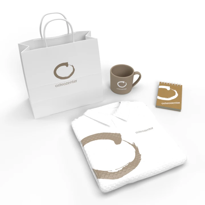
Light Brown: A Natural Path to Calm
الألوان المختارة
Light brown was carefully chosen for its earthy and soothing qualities. The color is associated with nature, grounding, and relaxation, making it an ideal choice for a massage therapist's logo. It conveys a sense of comfort and stability, creating an immediate connection to the natural, healing environment clients expect during their massage sessions.
The light brown color also emphasizes the organic qualities of the business, reinforcing the idea that the services offered are closely tied to nature and well-being. It’s a color that is both inviting and peaceful, allowing clients to feel at ease as soon as they see the logo. This choice ensures that the massage therapist brand is perceived as a trustworthy and calming presence.
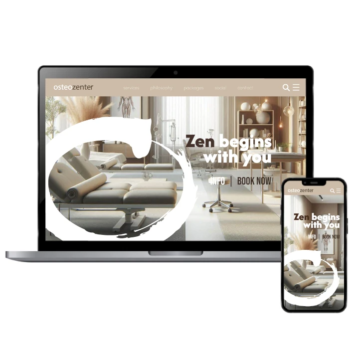
Building a Calming Identity for Clients
التنفيذ البصري
The success of this logo design lies in its ability to convey a peaceful and organic brand identity. By using light brown and zen elements, we created a logo that immediately communicates the calm and healing environment that clients seek. It sets the tone for the business and helps establish trust from the moment people encounter the brand.
The simplicity of the design has allowed it to connect deeply with the target audience. Clients immediately associate the soothing visual with the feeling of relaxation and well-being they expect from their massage therapist. The brand has successfully communicated its calming essence, which has led to increased recognition and client loyalty.