تصميم شعار مطعم آسيوي
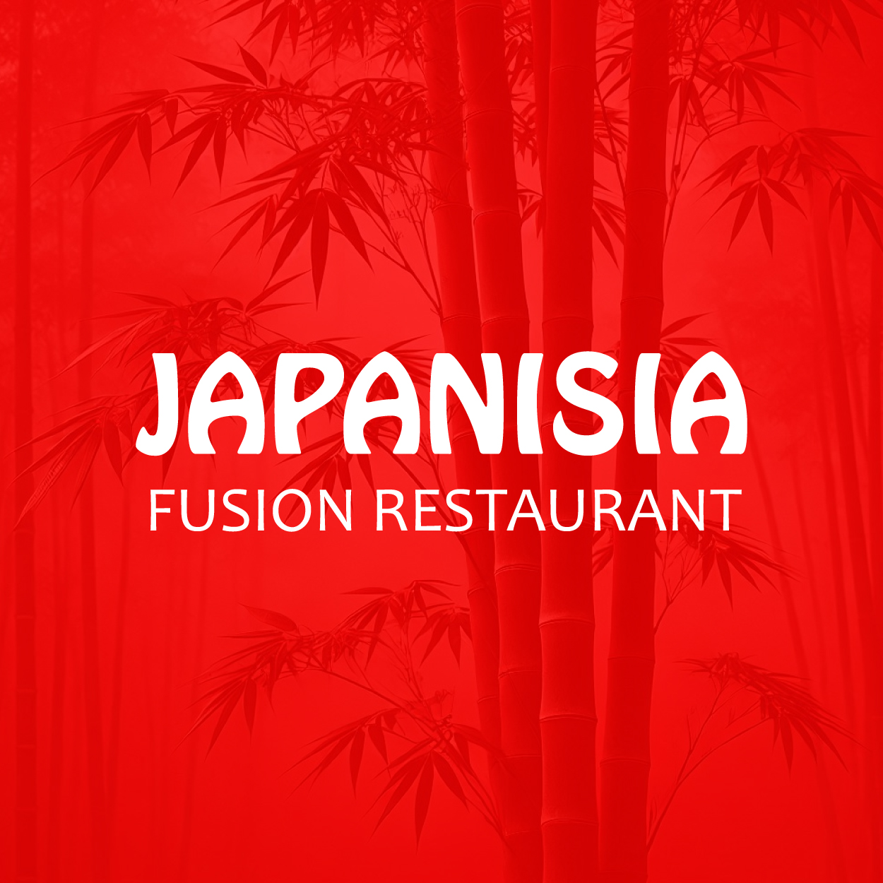
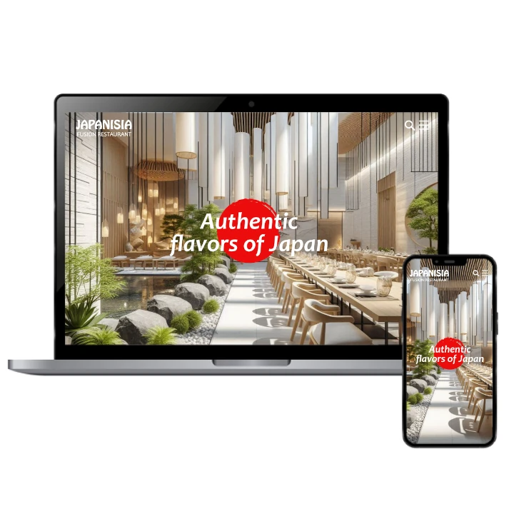
Our creative team designed this Asian restaurant logo with a deep appreciation for Japanese culture and a desire to create something fresh. Inspired by modern exoticism, we wanted the logo to feel both authentic and innovative. The use of red highlights creativity, passion, and energy, setting the tone for an exciting dining experience. The brand name and design align perfectly to reflect this bold vision.

يمكننا تصميم هذا
من أجلك.
chat_bubble
تواصل معنا!
بالتفاصيل
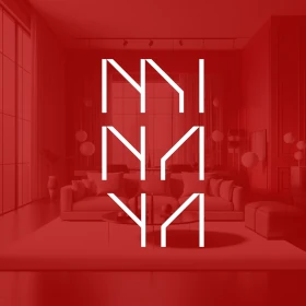
An Asian Restaurant Logo that Merges Tradition with Modern Flair
الفكرة التصميمية
The idea behind the Asian restaurant logo was to balance tradition with contemporary design. Our goal was to create a logo that reflects the essence of Japanese culture while embracing modern exoticness. The design needed to feel timeless yet fresh, showcasing both authenticity and innovation, which is exactly what the Asian restaurant logo design captures.
We drew inspiration from elements of Japanese art, architecture, and minimalism to create something that connects with the roots of the culture while presenting it in a modern, appealing way. This fusion of old and new speaks to the evolving tastes of the restaurant's clientele, offering a sense of familiarity with a contemporary twist. At our rebranding company, we ensured the final design embraced both tradition and modernity in perfect harmony.
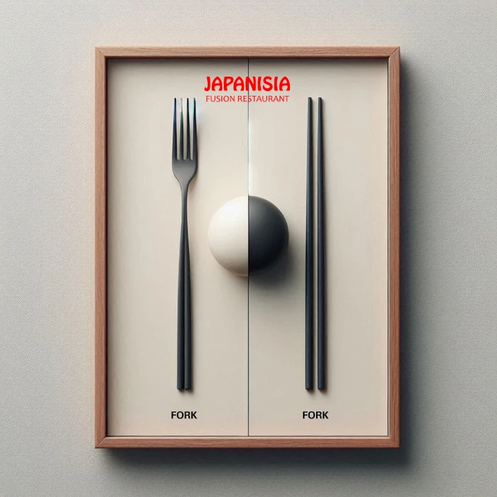
Exotic and Modern: A New Look
الأسلوب الفني
We wanted the restaurant's logo to stand out, so we chose an exotic and contemporary style that speaks to both the sophistication and excitement of the brand. The design blends sleek lines with unique flourishes to give it a bold yet approachable feel. It's not just a logo; it's an invitation to experience something fresh and exciting.
The modern aesthetic makes it versatile and memorable across different mediums, from menus to signage to social media. By combining elements of exoticism with clean, contemporary design, the logo reflects the unique fusion of flavors and experiences that the restaurant offers, ensuring it resonates with customers and feels both relevant and captivating.
Red: A Color of Energy and Passion
الألوان المختارة
Red was the perfect choice for this logo because it symbolizes energy, passion, and excitement, all of which we wanted the brand to convey. In the context of Japanese culture, red also represents good fortune and joy, making it not only visually striking but culturally significant. It creates a sense of urgency and desire, perfect for a restaurant that invites customers to indulge in something extraordinary.
The red hue also brings a sense of warmth and vibrancy, which enhances the overall dining experience. It communicates the energy of the restaurant, which prides itself on offering bold and flavorful dishes. This color is both eye-catching and meaningful, reinforcing the creativity and liveliness of the restaurant brand.
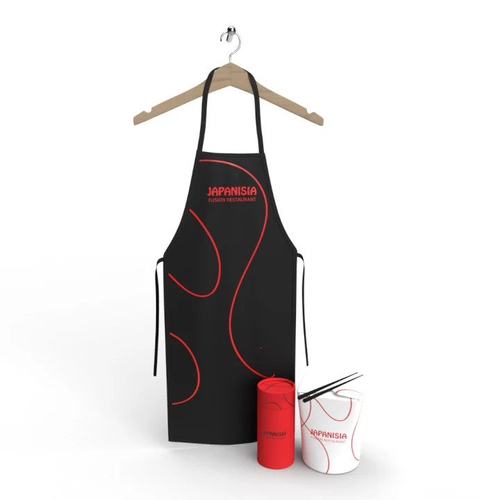
Full Branding Success and Audience Impact
التنفيذ البصري
The project was a major success, thanks to the complete branding package we delivered, which included not only the Asian restaurant logo design but also as a top company naming agency we carefully selected a creative name targeted to its audience. The combination of the logo and name has had a strong impact on customer perception, positioning the restaurant as a modern, high-energy dining spot that celebrates both culture and creativity.
Since launching, the logo and full brand identity have helped attract a steady stream of customers. The unique logo, paired with a memorable name, has enhanced the restaurant's reputation and appeal, fostering brand loyalty and ensuring it stands out in a competitive market. The overall branding strategy has been key to the restaurant's growth and customer retention.