تصميم شعار شاي بالحليب
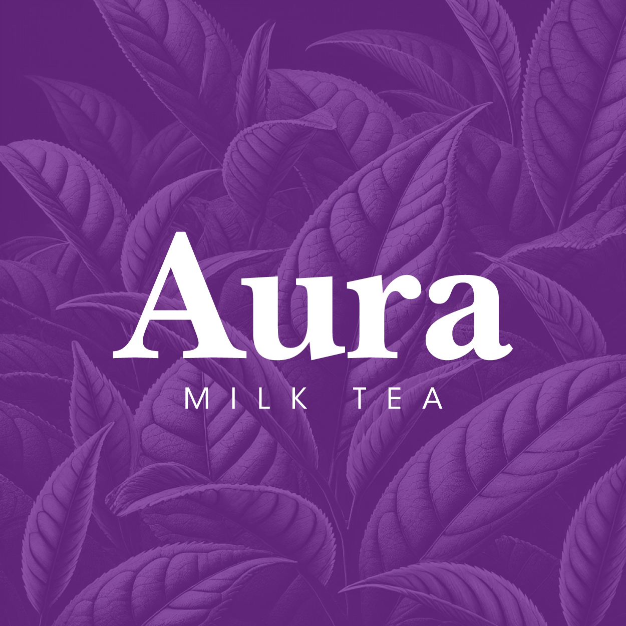
In designing this milk tea logo, we wanted to evoke a sense of peace and relaxation. The rebecca purple color was chosen for its soothing qualities, and the overall design emphasizes smoothness and harmony. This logo speaks to customers who seek tranquility and a calming escape through a perfect cup of milk tea. Our goal was to create an identity that exudes serenity, quality, and refreshment.

يمكننا تصميم هذا
من أجلك.
chat_bubble
تواصل معنا!
بالتفاصيل
A Symbol of Calm and Harmony
الفكرة التصميمية
The concept behind the milk tea logo was to create an identity that embodies relaxation. We wanted every design element to remind customers of a smooth, comforting experience, from the color palette to the clean lines. The rebecca purple color brings a sense of tranquility, ensuring the logo aligns with the peaceful, refreshing qualities of milk tea.
By infusing elements of relaxation into the logo, we crafted an inviting design that connects with the essence of milk tea. Our company naming agency, we also came out with a name inspired in the calming and soothing experience of the drink. Our aim was to provide a visual representation of the calming and soothing experience that the drink offers. The logo reflects a tranquil moment, allowing customers to experience the harmony of flavors in every sip.
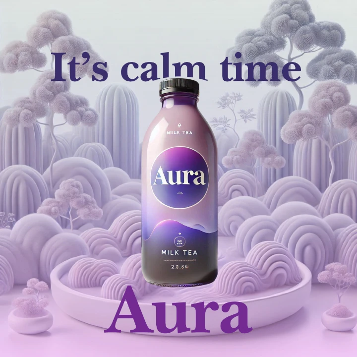
Sublime Elegance in Design
الأسلوب الفني
This logo exudes a sense of refinement, using flowing, harmonious lines to create a sense of calm. We wanted the design to convey not just a product but a lifestyle—a moment of relaxation and enjoyment. The simplicity of the lines enhances the feeling of ease, allowing the logo to feel both modern and timeless.
The style of the logo is understated yet sublime, capturing the gentle balance of smoothness and elegance. The clean, flowing design creates an effortless sense of sophistication, inviting customers to relax and indulge. The minimalistic approach ensures that the logo remains elegant, with a soothing, pleasant quality that matches the experience of sipping milk tea.
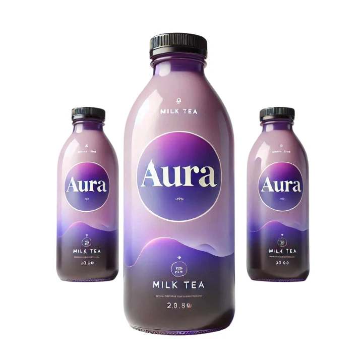
Rebecca Purple: A Relaxing Hue
الألوان المختارة
Rebecca purple was carefully selected to reflect the calming nature of milk tea. Its soft, soothing tones invoke feelings of peace and relaxation, making it the ideal choice for a brand that aims to provide comfort. This color is associated with serenity and balance, reinforcing the idea that milk tea is an escape from the daily grind.
The use of rebecca purple in the logo design establishes an immediate connection with relaxation. This color complements the smoothness of milk tea, enhancing the logo’s ability to evoke tranquility. It’s a perfect visual representation of the calm, relaxing environment the brand aims to create for its customers. The purple hue adds depth while remaining serene and approachable.
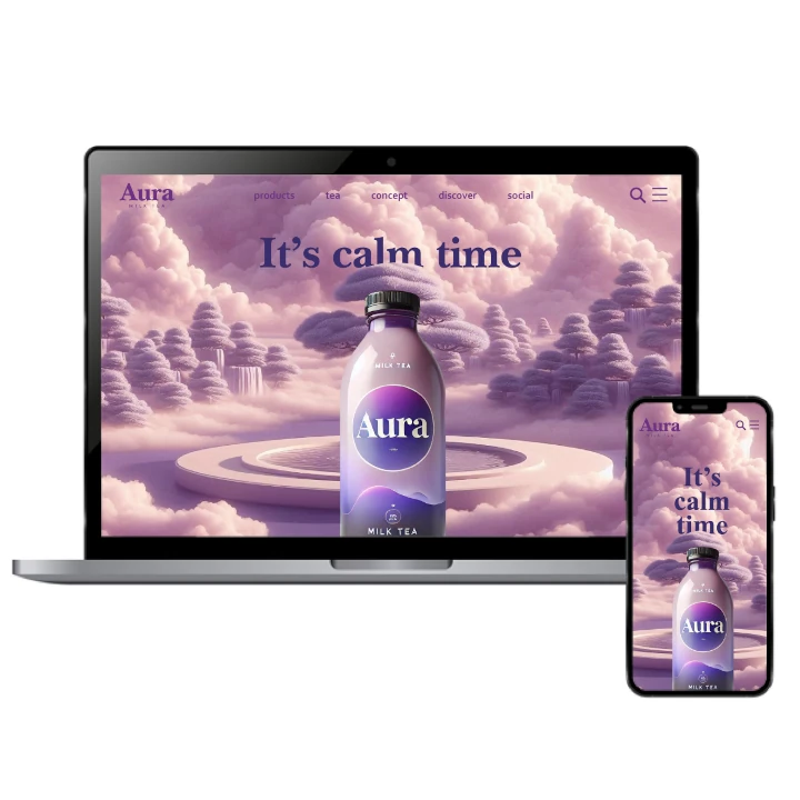
A Harmonious Visual Identity
التنفيذ البصري
The success of this logo lies in its ability to convey relaxation and smoothness with elegance. The clean, harmonious lines paired with rebecca purple create a feeling of warmth and serenity. The brand has successfully established a connection with its audience, offering a visually appealing experience that aligns perfectly with the relaxing, indulgent nature of milk tea.
This logo not only elevates the milk tea brand but also sets the tone for the brand’s identity. The simplistic yet powerful design conveys the brand's mission to provide a soothing, peaceful experience. By combining color psychology with a harmonious design, this logo has contributed to building customer loyalty and establishing the brand as a go-to destination for relaxation and indulgence.