الهوية البصرية لـ تنس
This tennis business utilizes corporate design to create an atmosphere of precision and elegance. The gold yellow color symbolizes achievement and excellence, while the overall design emphasizes grace and competitiveness. From logo design to marketing materials, the brand creates a cohesive and refined identity that appeals to athletes and fans alike. With every interaction, the design reflects the high standards and elite nature of the tennis world.

يمكننا تصميم هذا
من أجلك.
chat_bubble
تواصل معنا!
بالتفاصيل
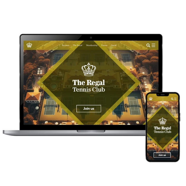
Corporate Design for Tennis Business
الفكرة التصميمية
The corporate design for this tennis business blends grace with a competitive edge. Gold yellow highlights the brand’s commitment to precision, reflecting the elegance and skill required in the sport. The visual identity is shaped to attract both players and fans, offering a sophisticated yet competitive feel. Every design touchpoint reinforces the brand’s high standards, ensuring that it stands out as an authoritative and stylish presence in the tennis world.
For this tennis business, the corporate design focuses on both elegance and competitiveness. Gold yellow is used to evoke a sense of achievement, with sleek and refined visuals reflecting the sport's precision. From promotional materials to digital presence, the design captures the brand’s essence of grace under pressure, creating an experience that is both captivating and aspirational. The design emphasizes the elite nature of the tennis world, offering a professional, polished image.
Graceful & Competitive Design Style
الأسلوب الفني
The design style for this tennis business is a perfect fusion of grace and competitive spirit. Gold yellow provides an elegant focal point, while sleek, minimalist lines create a clean and professional appearance. The brand identity emphasizes the precision and agility that tennis requires, with a style that feels both exclusive and inviting. Every design element speaks to the sport’s elite nature while maintaining accessibility for fans and players alike.
In crafting the style for this tennis business, the focus is on balance—grace combined with competitiveness. Gold yellow accents add sophistication, while clean lines and simple forms ensure the brand feels modern and approachable. The style captures the sport’s essence, emphasizing the quick thinking and agility required on the court, while providing a refined visual appeal. It speaks to both the rigor of competition and the beauty of the sport.
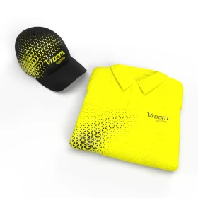
Elegant Gold Yellow with Precise Neutrals
الألوان المختارة
The color scheme for this tennis business centers around gold yellow, symbolizing achievement and excellence. Neutral tones are used to balance the vibrancy of the yellow, ensuring the design remains sophisticated and professional. The color combination reflects the brand’s commitment to precision, with the gold highlighting the brand’s elite nature. This visual identity invites clients and athletes into a space where performance meets elegance in a refined, competitive environment.
Gold yellow is the signature color for this tennis business, paired with precise neutral tones to create a sophisticated and balanced atmosphere. The yellow signifies prestige and competitive drive, while the neutral colors ensure the design remains grounded and approachable. This harmonious blend emphasizes the brand’s focus on precision, creating a dynamic yet refined identity that appeals to both tennis professionals and fans who appreciate elegance and excellence.
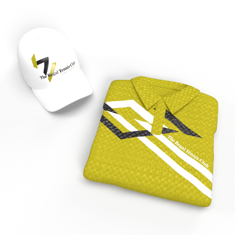
Visual Identity: Precision with Elegance
التنفيذ البصري
The visual identity of this tennis business features crisp lines and striking gold-yellow accents, symbolizing precision and sophistication. The design maintains a minimalist yet compelling appearance, capturing the sport’s blend of agility and elegance. As we refined the brand’s visual language, working with our international luxury branding agency helped the brand strike the right balance between competitive energy and timeless style. The use of gold-yellow reinforces the brand’s focus on achievement and the pursuit of excellence, making the identity both motivating and aspirational.
Minimalist artwork defines this tennis business’s visual identity. Gold yellow accents capture the essence of achievement, while clean, sharp lines communicate precision and agility. The artwork embodies both the grace and competitiveness that tennis requires, creating a refined and aspirational visual experience. Each element reinforces the sport’s elegant precision, ensuring the brand stands out as a symbol of excellence and competition in the tennis world.