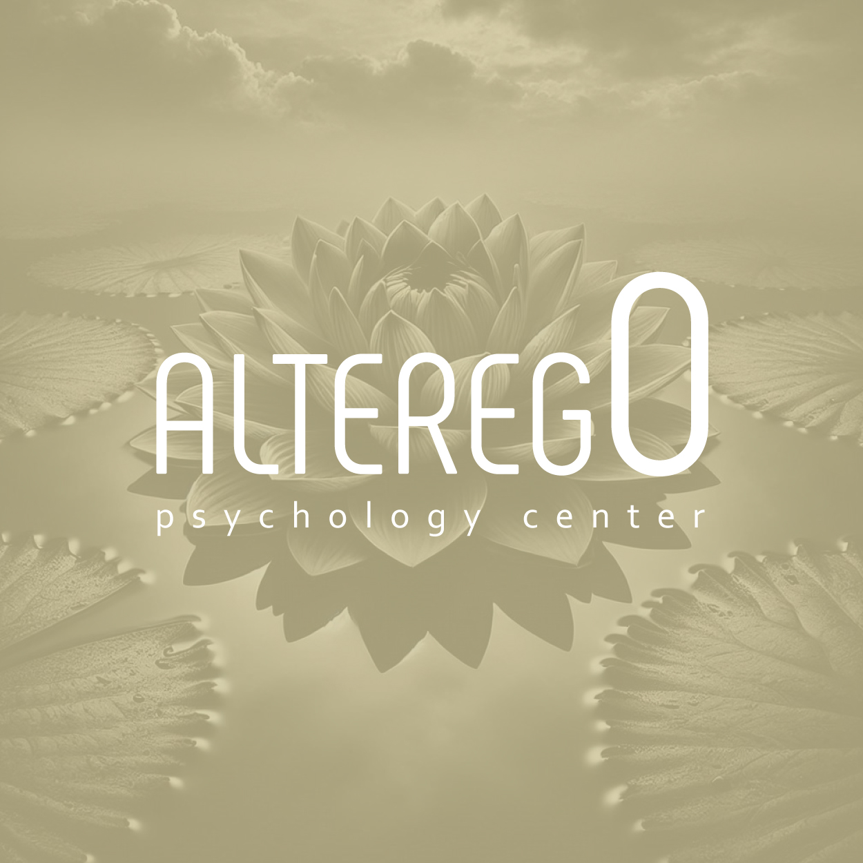
تصميم شعار علم النفس
In designing this psychology logo, we focused on personifying the spirit of serenity and mental balance. The visual elements reflect the brand's dedication to understanding and healing, offering a calming presence. The logo embodies the core values of the practice: psychological well-being, emotional balance, and a serene approach to mental health, establishing an emotional connection with clients seeking clarity and peace of mind.

يمكننا تصميم هذا
من أجلك.
chat_bubble
تواصل معنا!
بالتفاصيل
A Visual Metaphor of Inner Harmony
الفكرة التصميمية
The core concept behind this psychology logo design revolves around creating a sense of inner peace and balance. We wanted the design to reflect a therapeutic atmosphere, where the mental and emotional aspects are considered equally important. The logo combines elements that symbolize harmony, inviting those seeking clarity and mental wellness to feel reassured by the calm visual language.
The design concept emphasizes simplicity and tranquility. Every curve and line was chosen with the intention of communicating comfort and ease, echoing the therapeutic process that brings harmony to the mind. The logo speaks to the emotional experience of seeking psychological support and understanding, making it approachable while retaining a sense of professionalism and trustworthiness.
Conceptual Design that Inspires Calm
الأسلوب الفني
The style of this psychology logo is conceptual, with each element chosen to inspire a feeling of serenity and calm. The design is minimalistic yet powerful, representing mental clarity and a sense of emotional grounding. By using conceptual shapes, we created a design that conveys an emotionally resonant message while maintaining an inspiring and comforting presence.
The style balances modern aesthetics with emotional sensitivity, ensuring that the logo feels accessible to individuals seeking psychological support. By focusing on subtle, soothing elements, the logo reflects the delicate balance between the mind’s complexity and the serenity that therapy provides, while visually inviting those in need of mental well-being support.
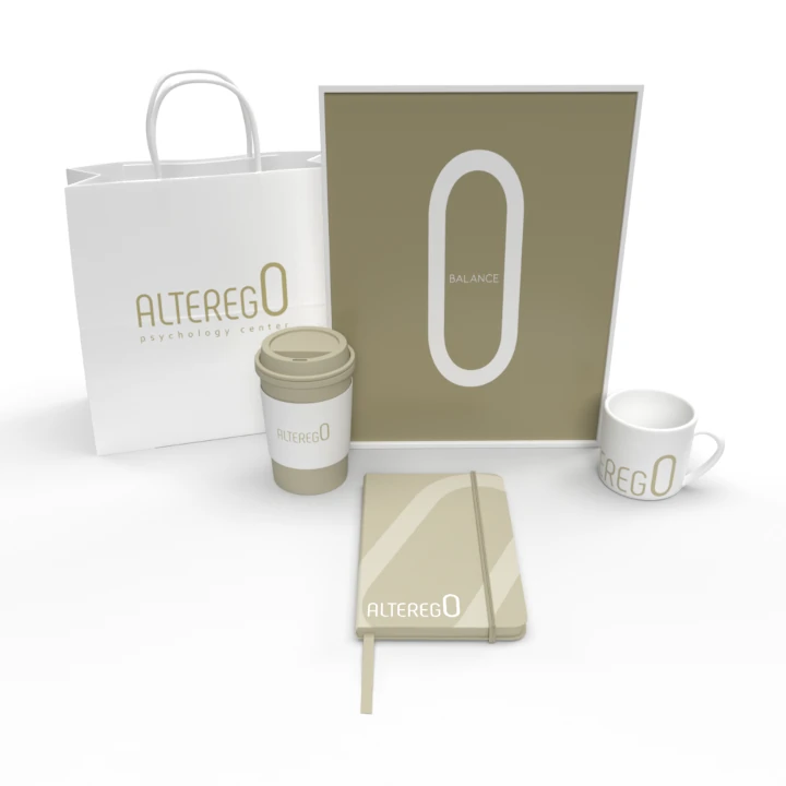
Dark Vanilla: The Essence of Calm and Harmony
الألوان المختارة
We selected dark vanilla as the primary color for its association with calmness and warmth. This color exudes a sense of serenity, providing a grounding effect that is essential in psychological support services. It offers a comforting, soft tone that complements the logo’s overall emphasis on balance and mental wellness.
The dark vanilla shade creates an atmosphere of relaxation and security, inviting clients to feel at ease and understood. The subtle warmth of the color enhances the logo’s message of mental clarity and peacefulness, providing a visual representation of the peaceful journey towards healing and self-awareness.
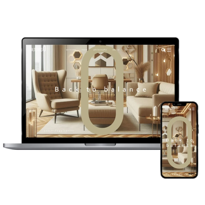
A Logo That Represents the Healing Journey
التنفيذ البصري
This psychology logo design successfully reflects the healing journey that the brand offers to its clients. As a renowed company naming agency, we also created a name that encapsulates the brand’s mission of providing support and emotional healing. Its success lies in its ability to visually communicate the core values of serenity, mental well-being, and emotional balance. The logo acts as a reminder of the peaceful journey toward mental clarity, providing a sense of hope and trust to those seeking help.
The project’s impact is evident in the way the logo resonates with the target audience, creating an emotional connection with those in need of psychological services. By embodying the values of harmony and serenity, the logo establishes a brand identity that is both compassionate and professional, positioning the brand as a trusted ally in the mental health field.