تصميم التغليف لـ مكملات غذائية
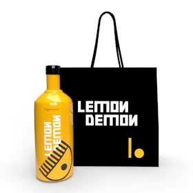
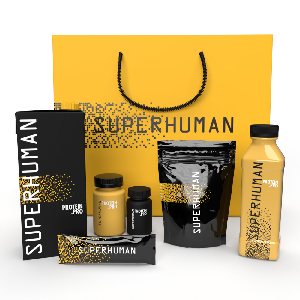
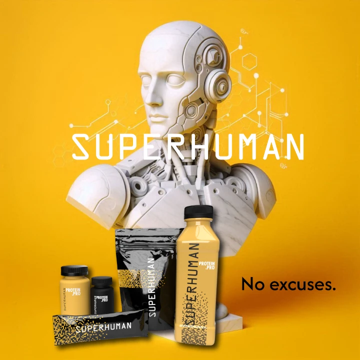
Our food supplement packaging design is crafted to reflect the brand's commitment to health and vitality. The sunflower yellow color symbolizes energy and well-being, while the pure and essential style keeps the focus on the product’s natural benefits. We wanted the packaging to feel refreshing, reinforcing the message that these supplements are all about enhancing health and vitality in a simple, straightforward way.


يمكننا تصميم هذا
من أجلك.
chat_bubble
تواصل معنا!
بالتفاصيل
Food Supplement Packaging: Vitality in Simplicity
الفكرة التصميمية
The concept behind our food supplement packaging design is rooted in health, vitality, and simplicity. We chose sunflower yellow as the main color to symbolize energy, warmth, and well-being. This vibrant, yet calming hue reflects the brand's dedication to promoting healthy living. The clean design ensures that customers are drawn to the purity of the product, highlighting its essential role in their wellness journey and reinforcing the idea of natural, uncomplicated health benefits.
Our goal was to communicate vitality in a straightforward, effective way. The packaging emphasizes the product’s purity and health benefits while staying minimalistic. Sunflower yellow not only evokes a sense of freshness but also energizes the customer, encouraging them to take the first step towards improved well-being. Every detail in the design—color, typography, and layout—was created to feel refreshing and connected to the natural, wholesome essence of the supplement.
A Pure, Essential Approach to Health
الأسلوب الفني
The style of the food supplement packaging is designed to communicate purity and essential health benefits. Our packaging design agency kept the design minimalistic and focused, ensuring that the product’s key message—health and vitality—takes center stage. By utilizing clean lines and simple graphics, we’ve created a style that reflects the brand's dedication to providing high-quality, natural products that are straightforward, effective, and impactful for those looking to enhance their well-being.
We wanted the packaging to feel pure, natural, and accessible. The minimalist style mirrors the simplicity and purity of the supplements themselves. Every detail, from the choice of font to the layout, communicates that the product inside is made with only what is necessary for health and vitality. This approach reinforces the idea that health is about simplicity, focusing on the essentials for a better, more energetic life.
Sunflower Yellow: Energy and Vitality
الألوان المختارة
Sunflower yellow was chosen as the primary color to evoke energy, warmth, and vitality. This bright, vibrant color is often associated with sunshine and positivity, making it the perfect choice for health-focused products. It represents the energy and well-being that customers can expect to gain from using the supplements. The color radiates a sense of optimism and vitality, encouraging customers to take action and invest in their health.
Sunflower yellow is a color that immediately brings to mind freshness, vitality, and well-being. It not only makes the packaging stand out but also symbolizes the life-enhancing qualities of the product. The color creates a sense of optimism and energy, drawing customers in and reminding them that by choosing this supplement, they are embracing a healthier, more vibrant lifestyle. It’s the perfect visual cue for a product focused on vitality and wellness.
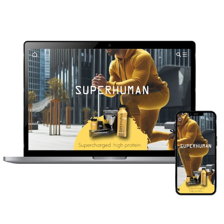
Packaging That Inspires Wellness & Vitality
التنفيذ البصري
The success of the food supplement packaging lies in its ability to inspire customers to take charge of their health. The sunflower yellow color conveys energy, while the pure, essential design reassures customers that the product is focused on quality and effectiveness. The packaging’s clean and minimal design captures the essence of the supplement, allowing it to shine through as a symbol of health and vitality, ready to support the customer’s wellness journey.
The packaging’s artwork effectively communicates the brand’s commitment to health and vitality. The sunflower yellow color serves as a visual cue for energy and positivity, while the simple design ensures that the focus remains on the product’s purity and effectiveness. Each detail of the artwork encourages customers to believe in the supplement’s ability to support their health and well-being, making them excited to incorporate it into their daily routine.