تصميم موقع إلكتروني لـ شركة تنظيف
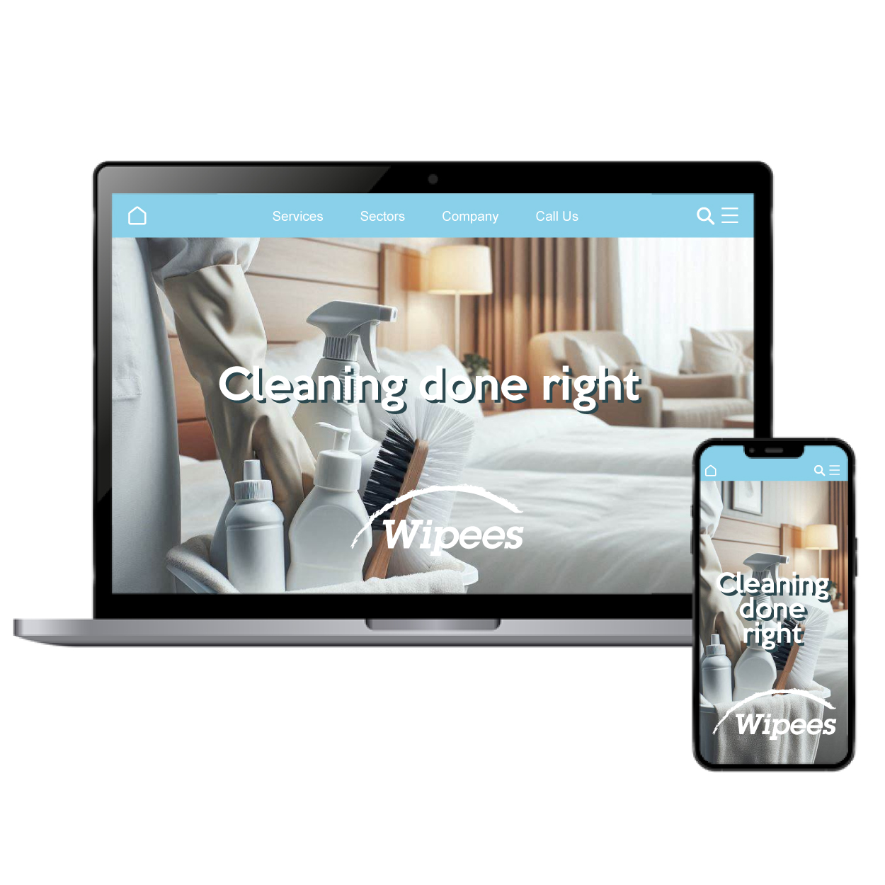
The website design was crafted to convey reliability and cleanliness, ensuring that customers feel confident about the company’s fast and efficient services. The light blue color promotes trust and calmness while highlighting professionalism. By focusing on clean lines and intuitive navigation, the design enables users to quickly learn about services, book appointments, and reach out for inquiries, all within a seamless digital experience.

يمكننا تصميم هذا
من أجلك.
chat_bubble
تواصل معنا!
بالتفاصيل
A Clear Message of Reliability and Cleanliness
الفكرة التصميمية
For this cleaning company website, we focused on creating a clear message of trust, cleanliness, and efficiency. The design highlights these values through a combination of light blue tones, modern typography, and straightforward navigation. We wanted the design to immediately give users a sense of security, knowing they can rely on the company for professional, timely service that meets their needs.
The website layout is clean, simple, and functional, offering users an easy path to discover services and book appointments. Key information is presented in an organized, no-nonsense way. We kept the design intuitive, with minimal distractions to ensure that users can navigate through service offerings and booking pages with ease, making the experience as efficient as the company itself.
A Professional, Fast, and Functional Design
الأسلوب الفني
The design style for this cleaning company website balances professionalism with efficiency. As an experienced top digital marketing agency, we knew that clean lines, plenty of white space, and strategic color placement would ensure users have a pleasant browsing experience. We used modern, easy-to-read fonts and a minimalist aesthetic to make sure information is quickly accessible, reflecting the speed and reliability the company offers in its services.
We created a modern, professional style with a focus on efficiency. The light blue color palette reinforces the clean, fresh feeling associated with the brand while keeping the look sleek and functional. This style not only appeals to users who need a quick and reliable service, but it also helps convey the company's commitment to professionalism and excellence in every job they undertake.
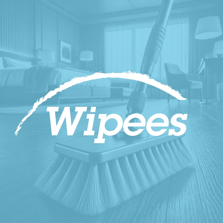
Light Blue: A Symbol of Trust and Cleanliness
الألوان المختارة
Light blue was chosen as the primary color to convey feelings of cleanliness, calmness, and reliability. It's a color associated with freshness and trust—key traits for a cleaning company. The soft, serene tones invite users to feel assured in their choice of service. It also communicates that the company prioritizes high-quality, efficient work without any hidden complexities.
The light blue color creates a welcoming atmosphere, inviting users to trust the company with their cleaning needs. It’s bright enough to stand out but not overpowering, striking the perfect balance between professionalism and approachability. This thoughtful choice of color emphasizes the clean, efficient, and reliable service that the brand offers to its customers.
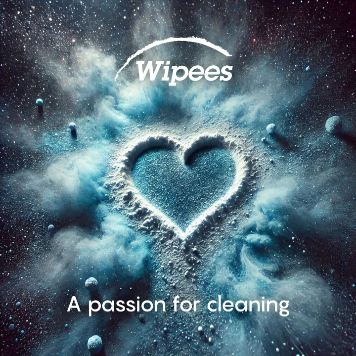
Designing for Trust and Clean Efficiency
التنفيذ البصري
The artwork in the design helps reinforce the themes of cleanliness and professionalism. From icons to product images, each visual element was selected to highlight the cleaning services offered, creating a cohesive, polished look. Simple, straightforward images and graphics support the idea that this company is focused on quick, efficient service while delivering on quality.
We integrated visuals that speak to the brand’s reliability and fast service, ensuring customers get a clear idea of the company’s capabilities. The clean, uncluttered artwork allows users to focus on essential details like service offerings and booking options. It’s a design that ensures users feel confident in making a quick decision to contact or schedule a cleaning, reflecting the company’s efficiency.