الهوية البصرية لـ شركة تنظيف
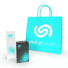
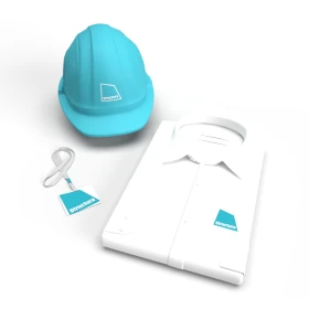
Our cleaning company corporate design focuses on the principles of precision and freshness. The clean and professional light blue color symbolizes clarity and trust, while the thorough and meticulous style captures the essence of the company's service. Every branded material, from uniforms to business cards, reflects the professionalism and attention to detail that clients expect from a leading cleaning company.


يمكننا تصميم هذا
من أجلك.
chat_bubble
تواصل معنا!
بالتفاصيل
Building a Precise and Trustworthy Brand
الفكرة التصميمية
For our cleaning company corporate design, we emphasized the values of precision and freshness. Light blue was selected as the main color because it communicates clarity and reliability, both essential qualities for a cleaning service. The design’s style reflects the thoroughness and professionalism of the company’s work, ensuring every touchpoint communicates trustworthiness and high standards. This consistent approach builds a brand image that resonates with customers seeking a dependable and efficient service.
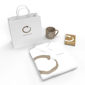
The concept of the design is rooted in the idea of fresh, meticulous service delivered with precision. Light blue evokes trust and cleanliness, while the professional, thorough style mirrors the company's commitment to delivering high-quality cleaning services. Due to our role as a rebranding company, we crafted this corporate design as part of a full rebranding initiative, aligning the company’s visual identity with its evolved values. From marketing materials to uniforms, the design elements speak to the company’s attention to detail and the care taken in every cleaning job, ensuring clients feel confident in the services offered and the expertise behind them.
A Professional, Clean and Thorough Design Approach
الأسلوب الفني
The style of this branding project is clean and professional, mirroring the service itself. Straightforward and precise typography complements the fresh light blue color, creating a design that is both easy to understand and visually appealing. The design embodies the thoroughness and attention to detail that are the hallmarks of the cleaning service. This refined, minimal approach allows clients to quickly associate the brand with high standards and an unwavering commitment to quality work.
We focused on a style that conveys professionalism, clarity, and thoroughness. Clean lines and modern typography allow the design to feel fresh while maintaining a sense of stability and trust. The light blue color complements the design by evoking cleanliness and efficiency, making it clear that the company is dependable and precise. Every element was chosen to reflect the care and quality that the cleaning service offers, ensuring a consistent and recognizable brand image.
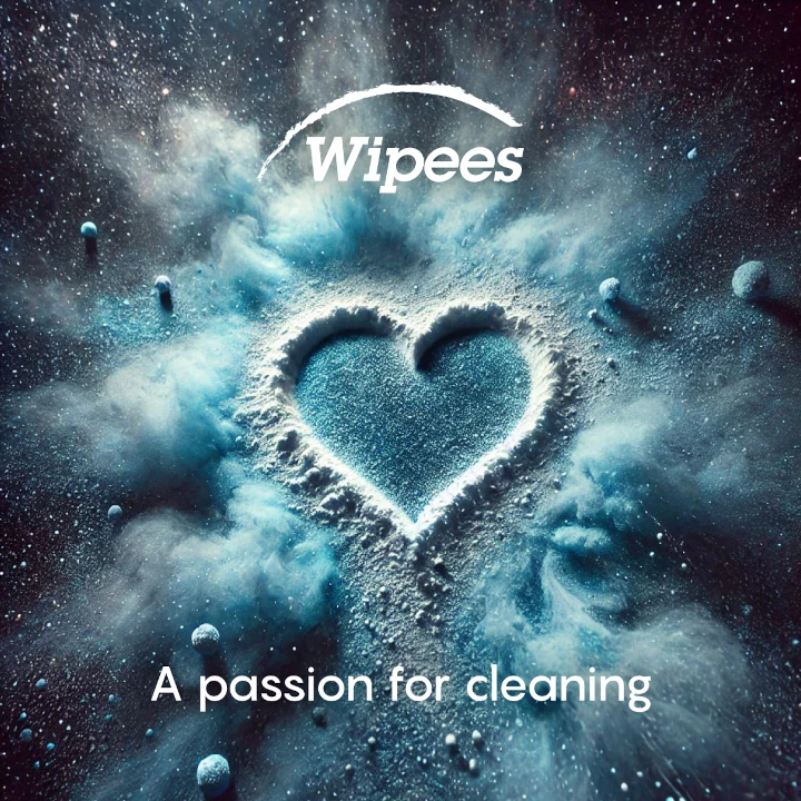
Light Blue: Freshness and Trust in Every Detail
الألوان المختارة
Light blue was chosen for its association with cleanliness, freshness, and trust. The color creates a calming effect while reinforcing the company’s precision and professional service. Light blue is universally recognized as a color that denotes clarity and reliability, key qualities for a cleaning company. The use of this color scheme ensures that the design communicates a fresh, trustworthy image, making clients feel confident in the company's ability to deliver exceptional service.
The use of light blue in the brand identity design symbolizes freshness, cleanliness, and reliability. This calming color reinforces the message of trust and quality service. It connects with clients on an emotional level, making them feel assured that the cleaning company will provide efficient and precise results. The light blue color also represents clarity and simplicity, aligning with the company's goal to deliver clean, thorough, and dependable service across all touchpoints.
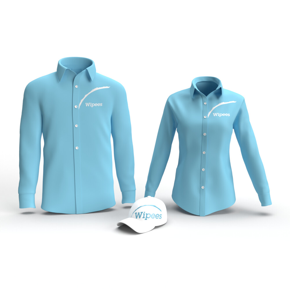
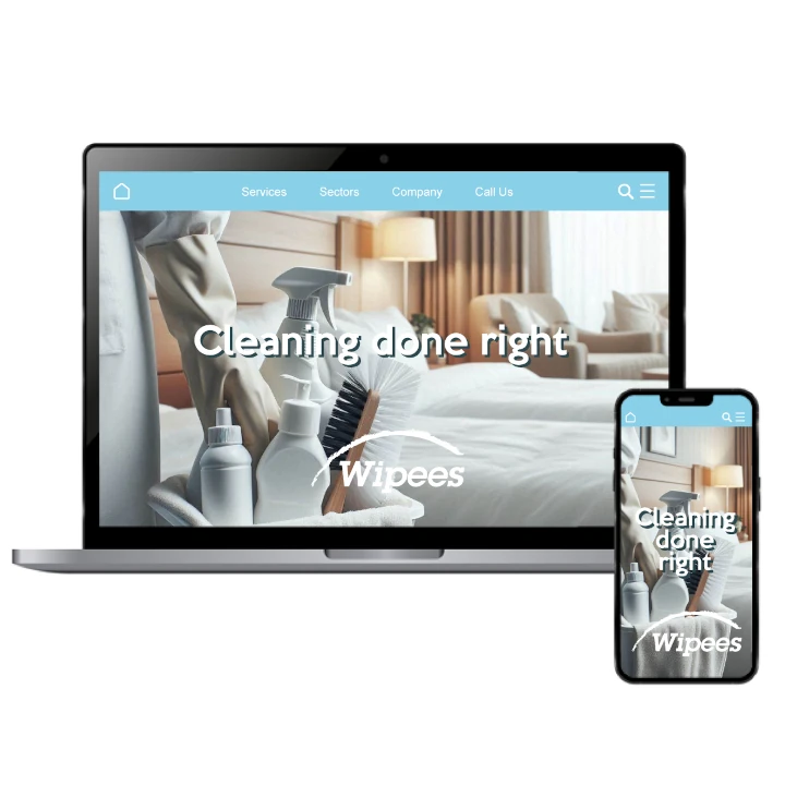
An Immaculate Brand Experience with Every Interaction
التنفيذ البصري
This branding ensures a seamless brand experience, highlighting professionalism and precision. Every element, from business cards to digital presence, reflects the company’s fresh and trustworthy image. The consistent use of light blue reinforces the clean and dependable nature of the service, while the meticulous design approach demonstrates the company's commitment to excellence. Each branded touchpoint contributes to an overall impression of high-quality, professional service that clients can rely on.
Our design provides a cohesive brand experience that reflects the company’s dedication to precision, cleanliness, and trust. Every branded material, from digital platforms to uniforms, reinforces the brand’s professionalism and fresh approach. The careful use of light blue ensures that the company’s image is clear and memorable, while the thorough style conveys an unwavering commitment to quality. This holistic approach delivers a positive brand experience that resonates with clients at every touchpoint.