تصميم شعار شركة تنظيف
We designed this cleaning company logo to embody speed, efficiency, and trustworthiness. The sleek design and light blue tones convey a sense of cleanliness and professionalism. By combining these visual elements with a strong, memorable brand name, we've established a logo that speaks to clients looking for reliable, effective cleaning services and reinforces the brand's commitment to delivering top-notch solutions.

يمكننا تصميم هذا
من أجلك.
chat_bubble
تواصل معنا!
بالتفاصيل
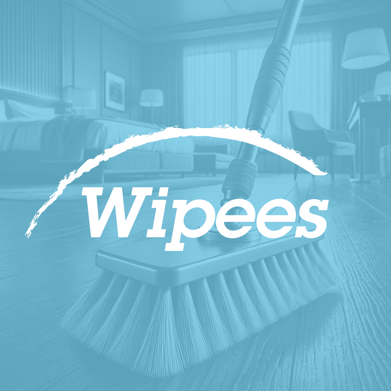
A Cleaning Company Logo Built On Efficiency And Momentum
الفكرة التصميمية
Creating a cleaning company logo that communicates speed and effectiveness was a key challenge. We aimed for a design that quickly conveys trust, dependability, and action, aligning perfectly with the brand's goals of delivering fast yet impeccable cleaning results for homes and businesses alike.
We focused on dynamic shapes that evoke movement and immediacy. Clients looking for a service that delivers quick turnarounds need an identity that exudes energy while maintaining a professional tone. The resulting logo balances vibrancy and simplicity, making it adaptable for both uniforms and digital branding platforms. Our global knowledge and vision helped craft a logo that perfectly embodies the energy and efficiency the brand represents.
Bold And Dependable Visual Language
الأسلوب الفني
The visual structure was designed to convey both strength and harmony, ensuring this cleaning company logo stands out at first glance. Sharp, defined shapes are carefully balanced with intentional spacing to maintain clarity and visual interest, reinforcing the company's image as dependable and forward-thinking.
Our goal was to create a logo that delivers more than just aesthetic appeal — it had to carry meaning. The structured forms symbolize stability and self-assurance, helping the brand appear grounded yet welcoming. This timeless design adapts seamlessly across various communication platforms, maintaining relevance and recognition over time.
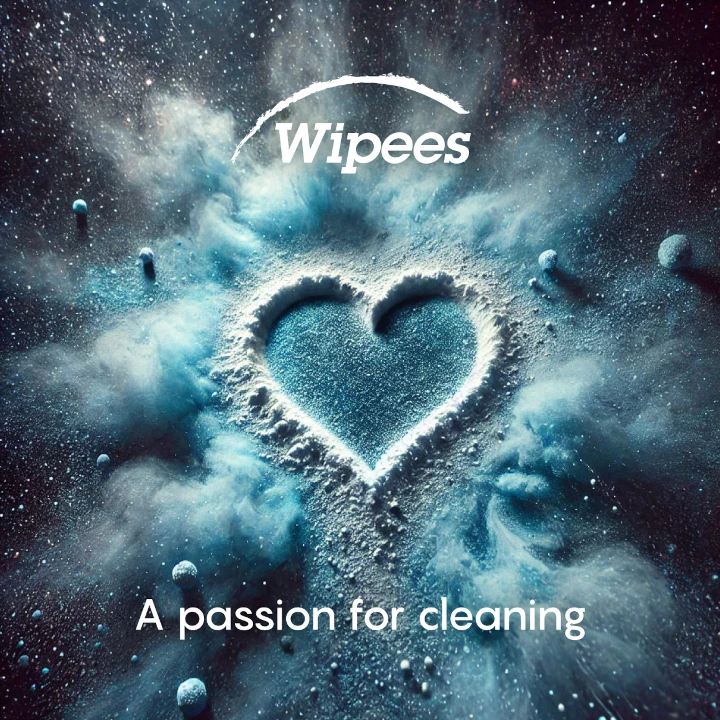
Freshness And Tranquility In Light Blue
الألوان المختارة
Light blue was chosen for its strong association with cleanliness, freshness, and tranquility. The creative team from our brand consulting agency made this intentional choice because it delivers a calming yet energetic vibe. The color symbolizes efficiency while reinforcing trust and reliability — vital characteristics for success in the cleaning industry.
This particular hue sets this cleaning company brand apart from competitors by fostering a sense of reassurance and clarity. Its visually appealing tone conveys freshness and competence, which naturally builds trust with clients. The color serves as a constant reminder that the service prioritizes delivering impeccable, stress-free results in every aspect.
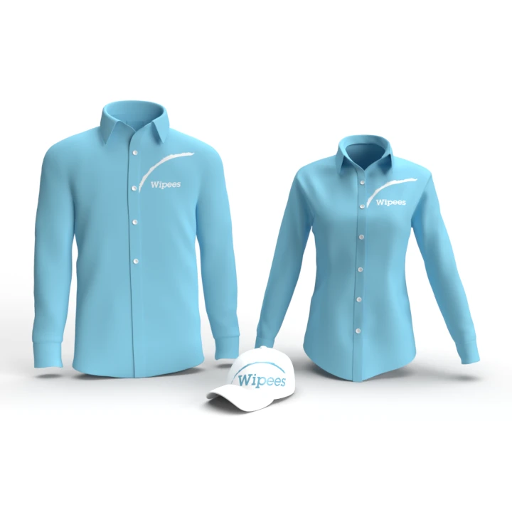
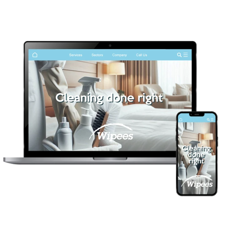
From Visual Identity To Market Growth
التنفيذ البصري
This branding project went far beyond just designing a logo; it included developing the name and establishing a cohesive visual identity system. Every element was designed to create a unified and recognizable brand experience. The result is a well-rounded and impactful brand presence that aligns perfectly with clients' expectations for high-quality services.
The outcome has been transformative. With a professional yet dynamic brand identity, the company now enjoys stronger customer recognition and has seen steady business growth. The logo has become a visual symbol that represents trust, innovation, and excellence in their field. This has reinforced the company's competitive position in the market.