الهوية البصرية لـ شركة ناشئة لتطبيق تعارف
This startup dating app embraces corporate design to emphasize connection and enjoyment. Green-yellow accents reflect energy and positivity, making every interaction feel fun and approachable. The app’s brand identity, from the logo to the interface design, is tailored to create a seamless, vibrant experience that appeals to those looking for both meaningful connections and lighthearted moments. The design fosters a relaxed, easy-going atmosphere for users to connect and enjoy their experience.

يمكننا تصميم هذا
من أجلك.
chat_bubble
تواصل معنا!
بالتفاصيل
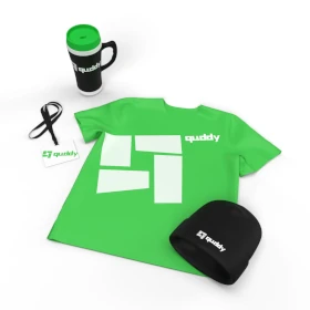
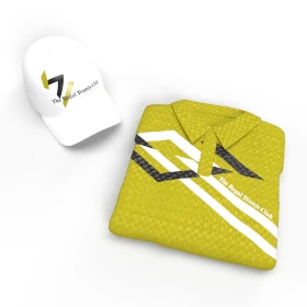
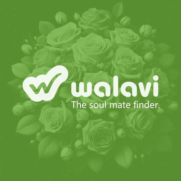
Corporate Design for Startup Dating App
الفكرة التصميمية
The corporate design for this startup dating app centers on connection and fun, with vibrant green-yellow tones that create an inviting and energetic environment. Every design element is crafted to feel modern and approachable, with the visual identity reflecting the light-hearted and social nature of dating. Whether through interactive features or engaging branding, the design enhances the user experience by fostering easy connections and an enjoyable atmosphere.
This startup dating app’s corporate design thrives on creating an approachable, vibrant brand experience. The green-yellow color palette symbolizes positivity and connection, setting the tone for a fun and easy-going platform. Every detail, from the logo to the app’s user interface, has been carefully curated to embody both vibrancy and approachability. The design ensures users feel at ease as they explore the platform, making connections and enjoying a relaxed online dating experience.
Vibrant & Approachable Style
الأسلوب الفني
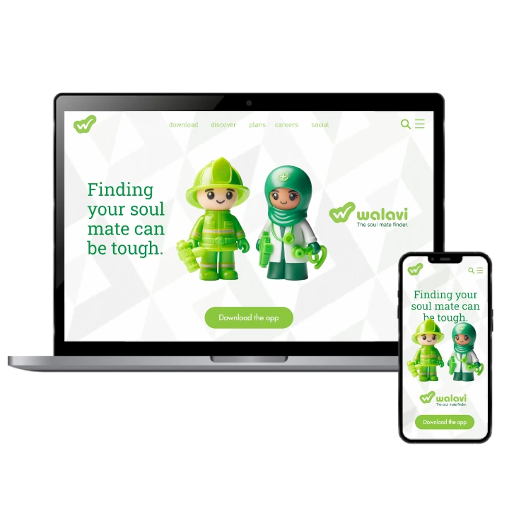
The style for this startup dating app is all about being vibrant and approachable. As an expert graphic design agency, we know that the use of green-yellow evokes a playful, energetic feel, while the simple, clean layout makes navigation easy and seamless. The design encourages interaction, with visual elements that draw attention without overwhelming the user. Each aspect of the style aims to make dating feel less intimidating, focusing instead on fun, connection, and simplicity, ensuring users feel comfortable and engaged from the first click.
This startup dating app's style is tailored to be vibrant yet approachable. The dynamic green-yellow color scheme creates an energetic atmosphere, while simple, intuitive design choices keep things user-friendly. The clean lines and modern feel encourage seamless interaction, allowing users to feel instantly at ease. The overall style focuses on fostering a positive and fun experience, making online dating feel like an enjoyable, effortless journey toward meaningful connections.
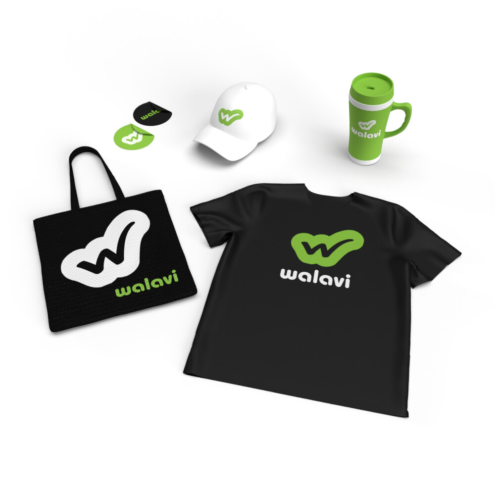
Energetic Color Palette: Green-Yellow & Playful Accents
الألوان المختارة
The color scheme for this startup dating app is based on green-yellow hues, paired with playful accents to reflect the energy and excitement of connection. Green-yellow symbolizes vitality and positivity, while the additional color accents enhance the lively, fun nature of the app. The combination helps create an environment that feels warm and welcoming, ensuring users feel encouraged to engage and connect with others in an upbeat, enjoyable way.
This startup dating app uses a green-yellow color scheme, paired with lively accent colors to convey a sense of fun and connection. The green-yellow tones evoke a feeling of freshness and optimism, while the playful accents enhance the app’s energetic and engaging nature. Together, the colors work to create a visually inviting and dynamic space where users are motivated to interact and build connections in a lighthearted environment.
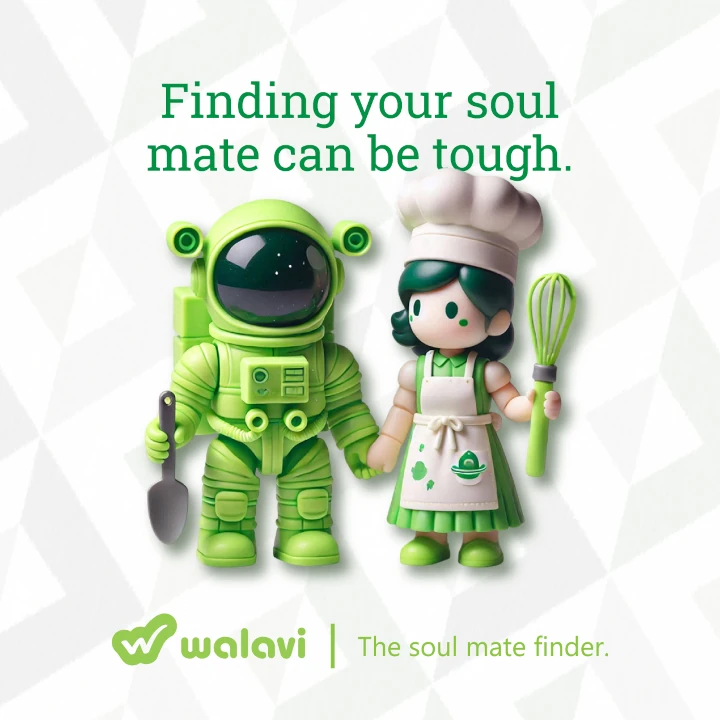
Visual Identity: Playful & Engaging Design
التنفيذ البصري
The artwork for this startup dating app reflects a playful and engaging approach, using green-yellow tones as the foundation of the visual identity. Simple, clean shapes and lively graphics give the brand a modern, youthful vibe, while maintaining a professional and approachable edge. Every design element is crafted to be visually captivating, ensuring users are drawn into the experience while feeling relaxed and confident as they connect with others.
The design for this startup dating app showcases a vibrant, energetic style, featuring green-yellow hues. Minimalistic design elements ensure a seamless, engaging user experience while maintaining a contemporary look. The playful visuals and clean graphics foster a sense of excitement, encouraging users to connect and interact in a relaxed environment. The design establishes the brand as both approachable and dynamic, providing users with a memorable and enjoyable journey on the platform.