الهوية البصرية لـ رعاية صحية
This healthcare brand’s corporate design is rooted in the values of care and healing. Aqua blue evokes a sense of calm and trust, while the responsive and progressive design style aligns with the brand’s mission to provide top-notch care. Every element, from branded materials to communication touchpoints, is crafted to reflect the brand’s commitment to responsive, empathetic, and forward-thinking healthcare services.


يمكننا تصميم هذا
من أجلك.
chat_bubble
تواصل معنا!
بالتفاصيل
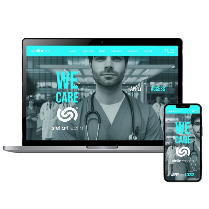
Corporate Design That Embodies Care & Trust
الفكرة التصميمية
This healthcare brand’s corporate design embodies care and healing, with aqua blue chosen as a color that symbolizes tranquility, empathy, and trust. The design elements reflect responsiveness, ensuring that each touchpoint resonates with patients and healthcare providers alike. By incorporating progressive, modern visuals, the brand communicates its commitment to providing compassionate, forward-thinking healthcare. Every element works in harmony to foster an environment of trust and well-being for those in need of medical care.
Aqua blue was carefully selected to represent both healing and peace. The color not only soothes, but also establishes a sense of trust and reliability. The corporate design integrates progressive elements to reflect the healthcare brand’s commitment to innovation and responsiveness. Whether through digital platforms or in-person interactions, the design speaks to the care and attention that patients can expect, providing a unified brand experience focused on improving health and well-being for all.
A Progressive, Healing Style for Healthcare
الأسلوب الفني
The style of this healthcare brand’s identity is rooted in the principles of care and healing, with aqua blue offering a refreshing and soothing presence. The clean and responsive design reflects the brand’s dedication to providing effective care while adapting to the needs of patients. Every visual element is carefully crafted to convey trust, empathy, and a forward-thinking approach. The style emphasizes both emotional connection and practical solutions, aligning with the healthcare mission of continuous improvement.
This brand’s style embraces a modern, progressive approach while remaining deeply empathetic to the needs of the patients. Aqua blue reinforces this calming, healing presence, while sleek lines and clear layouts convey responsiveness and innovation. The style speaks to the healthcare sector’s ever-evolving nature, ensuring that patients receive the best care possible while feeling cared for and heard. The overall design fosters trust, inviting patients to experience the future of healthcare today.
Aqua Blue: The Color of Healing & Calm
الألوان المختارة
Aqua blue plays an important part in this healthcare brand’s color scheme, symbolizing healing, trust, and compassion. This color evokes a sense of calm and serenity, which is crucial in a healthcare environment. It fosters a feeling of safety, inviting patients to engage with the brand and feel confident in the care they’ll receive. The refreshing tone of aqua blue also conveys a modern, progressive approach to healthcare, reinforcing the brand’s commitment to staying responsive and innovative.
The Aqua blue color scheme was chosen for its strong associations with care, healing, and tranquility. As a leading graphic design agency, we recognized that this color creates a peaceful atmosphere essential in a healthcare setting. It also represents progress and modernity, signaling that the healthcare brand is at the forefront of innovation. The calming nature of aqua blue encourages trust and communication, making patients feel comfortable and understood while interacting with the brand. It’s a color that aligns perfectly with the brand’s values of compassion and innovation.
Responsive & Progressive Design for Health
التنفيذ البصري
The artwork for this healthcare brand communicates healing and progress with the thoughtful use of aqua blue to evoke a sense of calm and trust. Each design element is responsive, ensuring that it adapts to the needs of the patients while still maintaining a forward-thinking approach. The visual identity highlights the brand’s mission to be a progressive leader in healthcare, offering innovative solutions that are both compassionate and effective. Every artwork piece conveys a message of care, hope, and healing.
This healthcare brand’s artwork is designed to be both calming and forward-looking, with aqua blue as the central visual element. The designs aim to promote trust, healing, and a sense of comfort for patients. Each visual component is crafted to be responsive to both the needs of the healthcare provider and the patient. By combining soothing color tones with innovative, clean visuals, the artwork reinforces the brand’s progressive approach and its dedication to providing top-quality care.