تصميم شعار مشروب طاقة
We aimed to forge an energy drink logo design that visually embodies the raw power and invigorating sensation the drink delivers. Our objective was to craft a symbol that resonates with individuals seeking a potent boost to their active lifestyles. We delved into the target audience's aspirations and the brand's fundamental values, enabling us to conceive a logo that perfectly fuses aesthetics with the promise of amplified energy. This endeavor transcended mere logo creation; it encapsulated a surge of vitality, a commitment to performance, and a pledge of unleashed potential.

يمكننا تصميم هذا
من أجلك.
chat_bubble
تواصل معنا!
بالتفاصيل
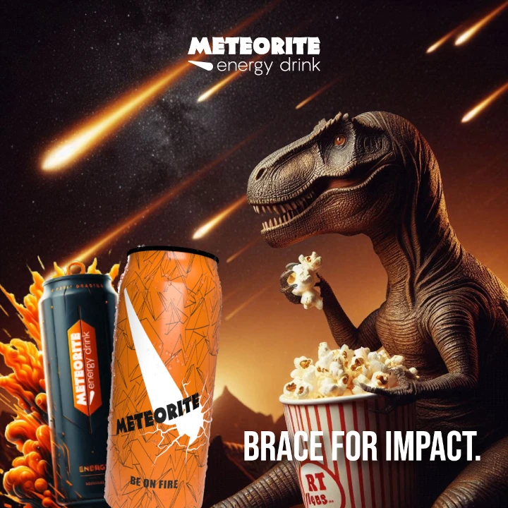
Igniting the Spark: The Logo's Foundation
الفكرة التصميمية
Crafting an energy drink logo involves more than just a visually striking graphic. For this project, our primary goal was to transmit a sense of untamed energy, something that propels individuals forward and supports a dynamic lifestyle. We investigated diverse themes linked to performance and vigor, striving to create a visual representation of the drink's energizing qualities. Our initial brainstorming sessions centered on capturing the essence of potent ingredients and the sensation of revitalized power.
The energy drink logo design needed to distinguish itself in a saturated market while also articulating the brand's dedication to peak performance. We scrutinized the target demographic and their preferences, guaranteeing the logo would connect with them on a profound level. The objective was to design a symbol that not only identified the product but also conveyed its positive impact on the consumer's active pursuits. We sought something memorable, something that would become synonymous with unleashed energy.
A Punchy and Active Expression
الأسلوب الفني
The bold and dynamic visual style we adopted was greatly influenced by the direction provided by our brand consulting agency. They played a key role in ensuring the design felt contemporary and assertive, avoiding anything too subtle or understated. Their insights allowed us to concentrate on conveying a sense of movement and dynamism, perfectly mirroring the intense energy the drink delivers. In the end, the design captures a feeling of power and activity, aligning perfectly with the brand’s core values.
The visual language was meticulously considered to ensure it would resonate with the target audience. We desired the logo to evoke feelings of drive and ambition, suggesting the drink's role in fueling a high-performance lifestyle. The aesthetic is intentionally impactful, allowing the potency of the product and its invigorating ingredients to take center stage. The punchy style communicates intensity and amplified performance.
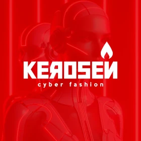
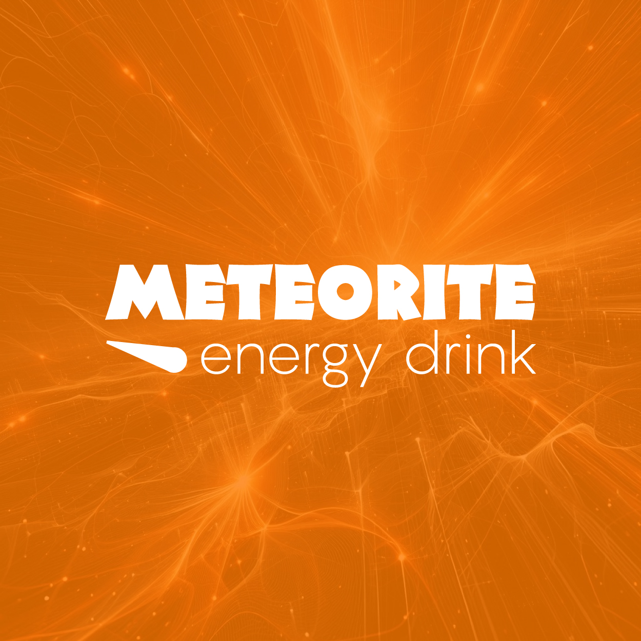
The Radiance of Tiger Orange as Identity Color
الألوان المختارة
The selection of tiger orange was deliberate and strategic. This hue evokes sensations of enthusiasm, power, and vitality. It's a color that signifies raw energy and a sense of unbridled potential, perfectly aligning with the brand's emphasis on peak performance. The vibrant orange also creates a sense of urgency and excitement, making the brand feel compelling and attention-grabbing.
We explored a range of color palettes, but tiger orange emerged as the perfect choice for this energy drink. It's a distinctive and unforgettable color that sets the brand apart from its competitors. The radiant orange also conveys a sense of confidence and boldness, elevating the brand's image and positioning it as a premium product. It's a color that resonates with individuals pursuing an active and high-octane lifestyle.
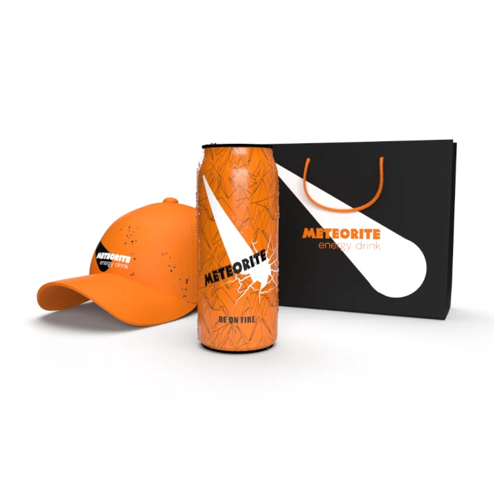
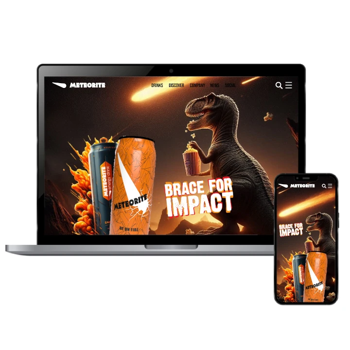
A Brand's Ascendancy: From Vision to Triumph
التنفيذ البصري
The comprehensive branding initiative, encompassing both naming and logo design, has been a resounding success. The energy drink has experienced substantial growth since its launch, garnering positive feedback from consumers and distributors alike. The brand's message of unleashed energy and peak performance has resonated strongly with the target audience, propelling sales and cultivating brand loyalty. The cohesive brand identity has been pivotal in the drink's market penetration.
The triumph of this project underscores the impact of insightful and strategic design. By meticulously considering the brand's values, target demographic, and competitive landscape, we were able to create a brand identity that truly captures the essence of the product. The energy drink logo design has not only amplified the brand's visibility but also fostered a deeper connection with consumers, contributing to the brand's overall expansion and market success. The complete branding has endowed the product with a unique identity and has been instrumental in its market ascendancy.