تصميم شعار شركة عقارات
Our logo design for this real estate company brings together the ideals of modern living and comfort, symbolizing the essence of a brand dedicated to dream homes. By focusing on clean lines and a stylized aesthetic, we aimed to create a logo that speaks to both modern sensibilities and the timeless comfort a real estate company offers. It’s designed to connect with potential homeowners, inspiring trust and reliability.

يمكننا تصميم هذا
من أجلك.
chat_bubble
تواصل معنا!
بالتفاصيل
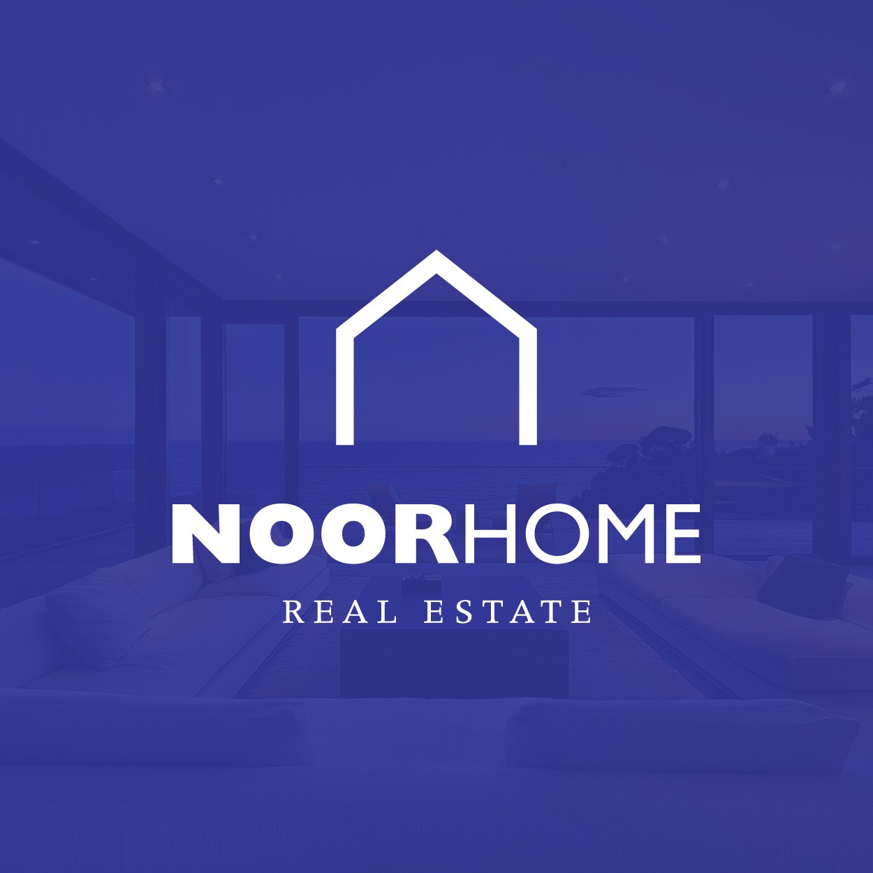
Bringing Modern Living to Life
الفكرة التصميمية
For the real estate company logo, we focused on the theme of modern living paired with comfort. The logo concept centers on the idea of combining a contemporary, urban lifestyle with the warmth and reliability people look for in a home. The design uses clean shapes and lines, creating a feeling of openness, space, and tranquility, reflecting the brand's commitment to offering both stylish and comfortable homes.
This logo is meant to reflect the company's mission: to create spaces where people can feel at home, whether they’re purchasing or renting. It serves as a beacon of modern design mixed with the familiar comfort of a cozy living space, giving a sense of security and welcoming energy. By blending these two concepts, the logo establishes an emotional connection with the target audience.
A Light and Airy Aesthetic
الأسلوب الفني
The logo was designed with a light and stylized aesthetic, making use of minimalist lines and fluid curves. The purpose was to create a look that felt both elegant and approachable. The simplicity of the logo reflects the straightforwardness and clarity of the real estate process, while also giving off a sense of calm and reassurance that potential homeowners will find a place to feel comfortable.
With its stylized design, the logo exudes a modern flair while still embracing warmth and openness. Its soft curves and balanced proportions reflect the idea of harmony, which is important when looking for a space to call home. The clean style conveys professionalism, while the overall feel remains inviting, suggesting a perfect balance between urban sophistication and homey comfort. This renovation project, handled by our rebranding company, helped redefine the brand’s image to better connect with its audience.
Blueberry: Sophistication and Comfort
الألوان المختارة
The blueberry color in the logo adds a layer of sophistication and trustworthiness. It evokes calmness and reliability while providing a refreshing touch that reflects the modern and comfortable nature of the brand. This shade of blue creates a sense of openness and tranquility, which is ideal for a company in the real estate industry, where stability and comfort are key.
Blueberry, as the primary color, helps to create an atmosphere of security and trust. It symbolizes the reliability of the real estate company while also evoking a modern and professional vibe. The color works to establish an emotional connection with clients, signaling both stability in the company’s expertise and a comfortable, inviting environment for those looking to find their ideal property.
A Perfect Symbol of Comfort and Style
التنفيذ البصري
This logo’s design successfully brings together the core values of the real estate company – modernity, comfort, and reliability. The combination of clean lines, subtle curves, and the calming blueberry color reflects the company’s mission of providing stylish and comfortable living spaces. The light, stylized nature of the design ensures that it will remain relevant and memorable for years to come.
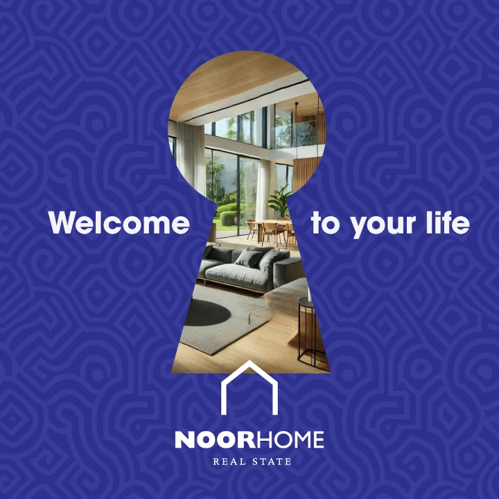
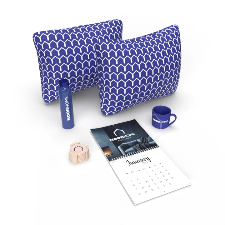
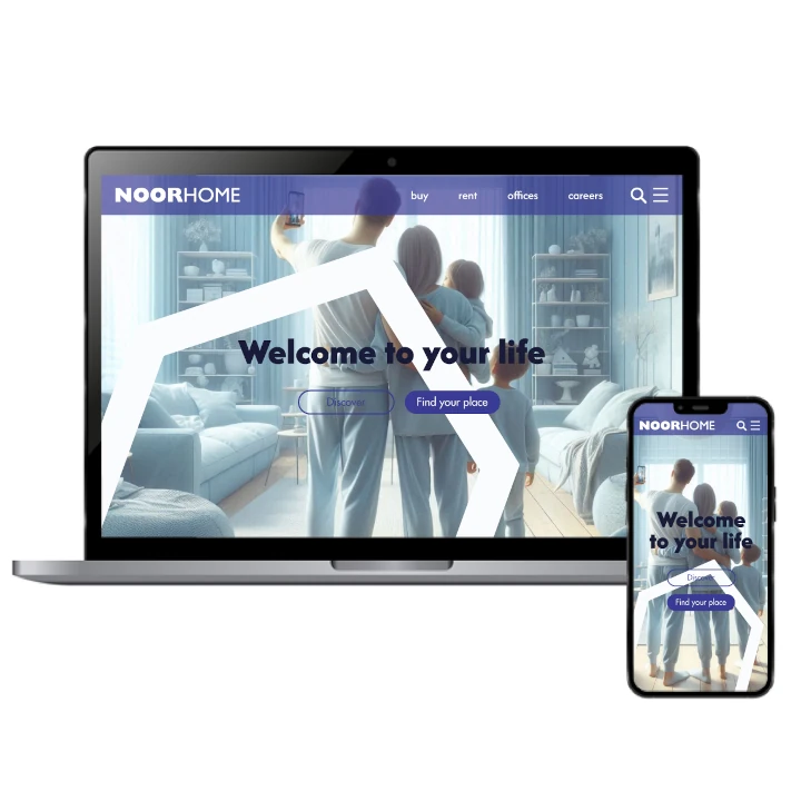
The success of this real estate logo design lies in how it encapsulates the warmth and professionalism of the brand. It’s not just a logo; it’s an invitation to imagine a new home. The project incorporated full branding, including logo and naming, to ensure the company’s identity was consistently conveyed across all touchpoints. This helped establish a strong presence, while resonating deeply with potential clients looking for a place to call home.