تصميم شعار مؤسسي
When we worked on this institutional logo design, we focused on creating a visual identity that exudes trust, respect, and harmony. The light blue color was chosen to reflect empathy and professionalism, ensuring that the logo would be approachable yet authoritative. Our goal was to design something timeless and flexible that could grow with the brand while representing the institution’s core values and mission.


يمكننا تصميم هذا
من أجلك.
chat_bubble
تواصل معنا!
بالتفاصيل
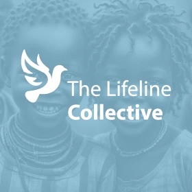
Institutional Logo Design Reflecting Core Values
الفكرة التصميمية
The foundation of this institutional logo design was built on the principles of harmony, respect, and inclusivity. Our intention was to create a visual identity that would resonate with all audiences while remaining simple and powerful. Each line and shape were designed with the purpose of creating a sense of balance, aligning with the institutional values of the brand.
In developing this design, we focused on ensuring that the logo conveys a sense of calm authority, which is crucial for institutions that are built on providing services to a diverse population. We also paid careful attention to the structure, ensuring that the design was flexible across different formats and media, making it suitable for a range of applications from print to digital.
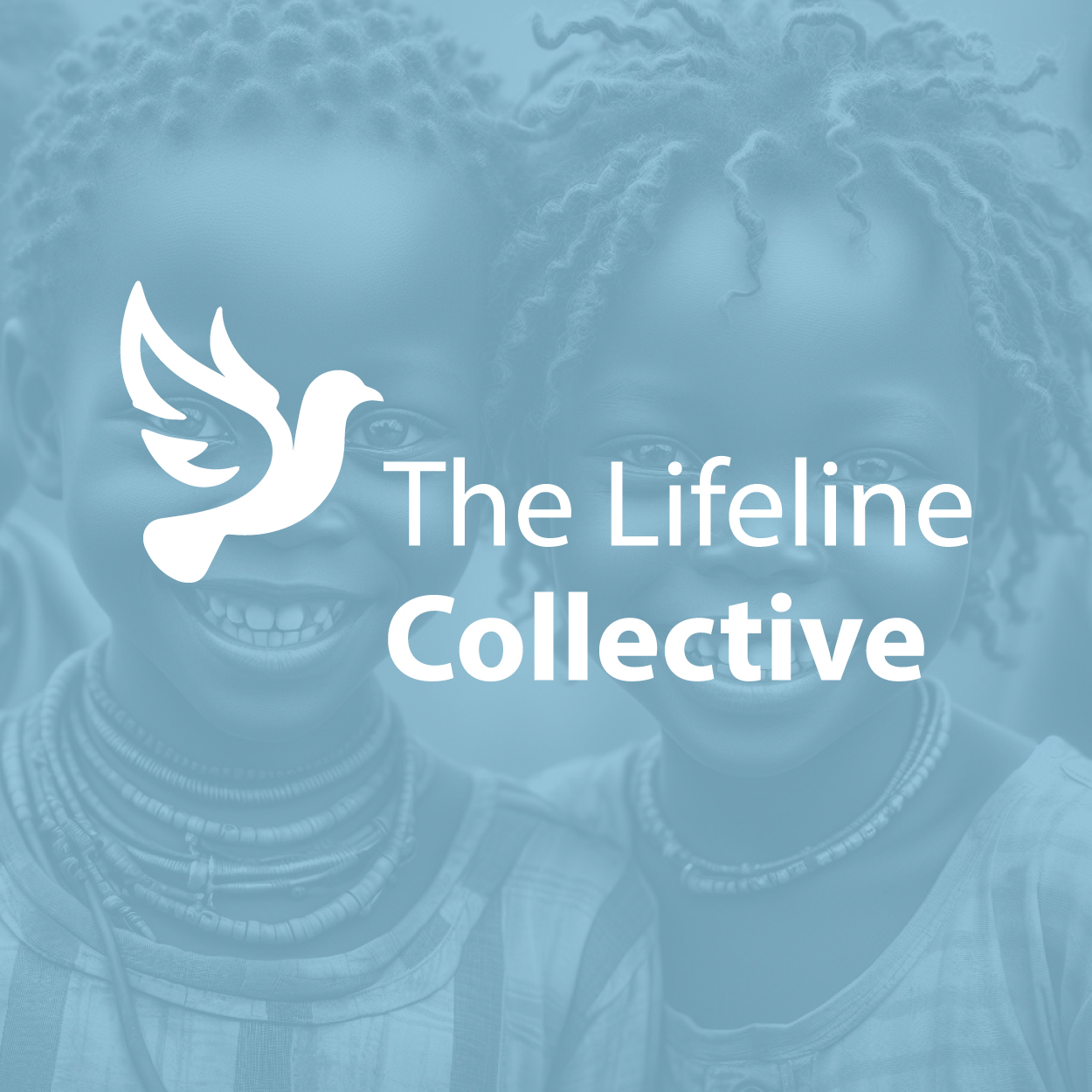
A Light and Empathetic Design Approach
الأسلوب الفني
For this institutional logo, we chose a light and airy style to reflect a sense of openness and approachability. The clean, minimal lines were crafted to give off a feeling of calm, while still projecting a sense of strength and professionalism. Our aim was to strike the perfect balance between elegance and simplicity to ensure the logo felt timeless and welcoming.
The empathetic nature of the design is felt through the soft curves and balanced proportions of the logo. We avoided harsh edges to make the design approachable and friendly, while still maintaining a sense of formality and integrity that is expected of an institutional logo. This allowed us to create a logo that could truly connect with its audience on an emotional level.
Light Blue for Calm and Professionalism
الألوان المختارة
The choice of light blue as the primary color was integral to the emotional impact of this logo. It embodies tranquility, trust, and professionalism, making it the perfect choice for an institution that seeks to build long-term relationships based on respect and reliability. Blue tones have been shown to evoke a sense of calm and clarity, which is essential for any professional setting.
The light blue color not only adds warmth and accessibility to the design but also reinforces the brand's core values of harmony and respect. The color palette is intentionally kept subtle, ensuring that the focus remains on the integrity and inclusivity of the institution, while also ensuring the logo remains adaptable to various media and environments.
Awareness Growth Through Empathy and Respect
التنفيذ البصري
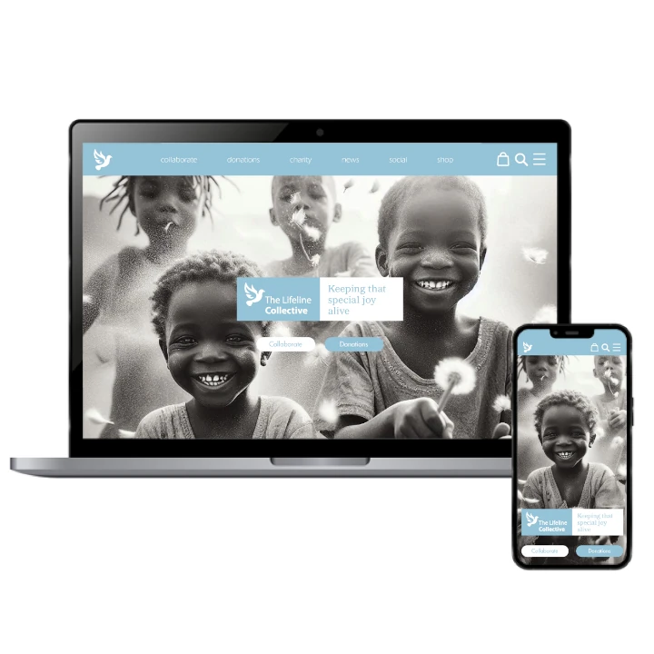
The success of this project lies in its ability to convey the values of the institution through a simple, yet meaningful design. By focusing on empathy and professionalism, we ensured that the logo would resonate with a wide audience, from clients to stakeholders. The integration of the logo into full branding materials helped amplify the brand’s presence and communicate its ethos effectively.
Since the logo's launch, the institutional brand has gained recognition for its approachable yet authoritative visual identity. This success can be attributed in part to the invaluable contributions of our brand consulting agency, whose strategic guidance shaped the logo design. The agency’s expertise played a pivotal role in enhancing the institution's reputation and enabling it to create deeper connections with its audience. By taking a holistic approach to branding—combining both the logo design and its integration into larger branding efforts—the project has supported growth and trust in the marketplace.