تصميم شعار مكملات غذائية
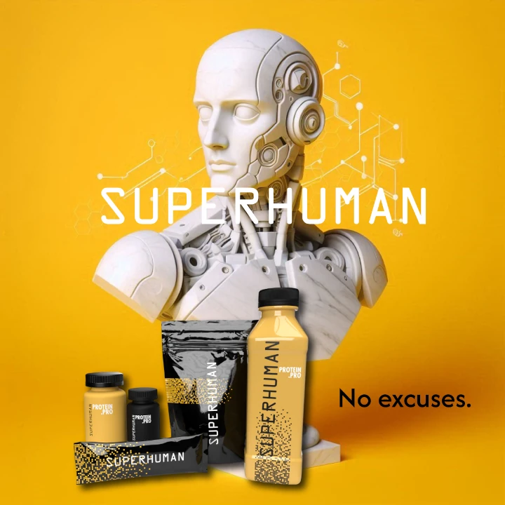
We embraced the challenge of designing this food supplement logo to represent nutrition and strength. Our goal was to create a logo that is clean and essential, inspired by the importance of health and vitality. The sunflower yellow color symbolizes energy and optimism, making the logo stand out while highlighting the brand's dedication to nourishing supplements and promoting a healthy lifestyle.

يمكننا تصميم هذا
من أجلك.
chat_bubble
تواصل معنا!
بالتفاصيل
Developing a Strong Food Supplement Logo
الفكرة التصميمية
Our primary objective in developing the food supplement logo was to reflect the essence of nutrition and strength. We wanted the food supplement logo design to convey a sense of health and vitality while maintaining a clean and essential look. The challenge was to create a logo that balances simplicity with an impactful visual message.
Inspired by the core values of nutrition, we crafted a logo that speaks to the importance of a balanced, healthy lifestyle. Each element was thoughtfully chosen to ensure the logo stands out in the market, while resonating with consumers seeking reliable and effective supplements. The final design not only aligns with our client's vision but also appeals to a health-conscious audience.
Essential and Clean Aesthetic
الأسلوب الفني
The style of this logo focused on essential and clean aesthetics. We utilized minimalist shapes and straightforward typography to create a design that is both modern and timeless. The goal was to produce a logo that feels professional and accessible, suitable for a broad audience interested in health and wellness.
By emphasizing an essential and uncluttered look, we developed a logo that is both memorable and effective. The simplicity of the design allows for instant recognition, while its clean lines and balanced elements convey a sense of purity and strength. This approach ensures the logo effectively communicates the brand's focus on quality and nutritional excellence.
The Vibrance of Sunflower Yellow
الألوان المختارة
Choosing sunflower yellow for the logo was a strategic decision to evoke feelings of energy and positivity. This vibrant color represents the food supplement brand's commitment to providing nourishing and effective products. The bright hue helps the logo stand out and create a positive association with health and vitality.
Sunflower yellow not only enhances the visual appeal of the logo but also reinforces the brand's message of optimism and strength. The color's connection to warmth and energy makes it an ideal choice for a food supplement company, creating a welcoming and uplifting impression for consumers. This energetic color choice contributes significantly to the overall impact and effectiveness of the brand's visual identity.
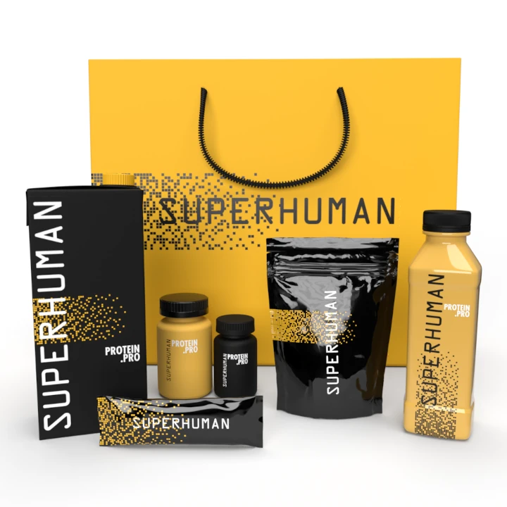
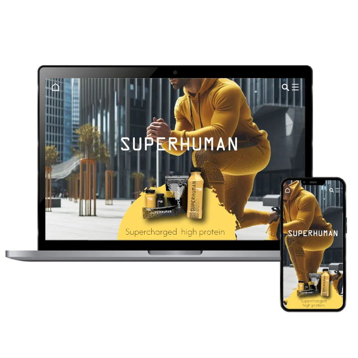
Building a Consistent Brand Ecosystem for Food Supplement
التنفيذ البصري
The success of this project extended beyond designing a logo; it involved creating a cohesive brand identity. We developed a consistent visual theme that included a compelling name and unified branding elements across various platforms. This comprehensive approach ensured the brand was easily recognizable and memorable. At our rebranding company, we meticulously handled every aspect of the brand’s transformation, ensuring a seamless integration across all touchpoints.
Our holistic branding strategy played a key role in boosting the food supplement company's market presence and growth. The clean and dynamic logo design, combined with a thoughtful naming process, helped the company build a strong connection with its target audience. This integrated approach positioned the brand as a trusted leader in the food supplement industry, fostering customer loyalty and driving brand growth.