الهوية البصرية لـ نقل شاحنات
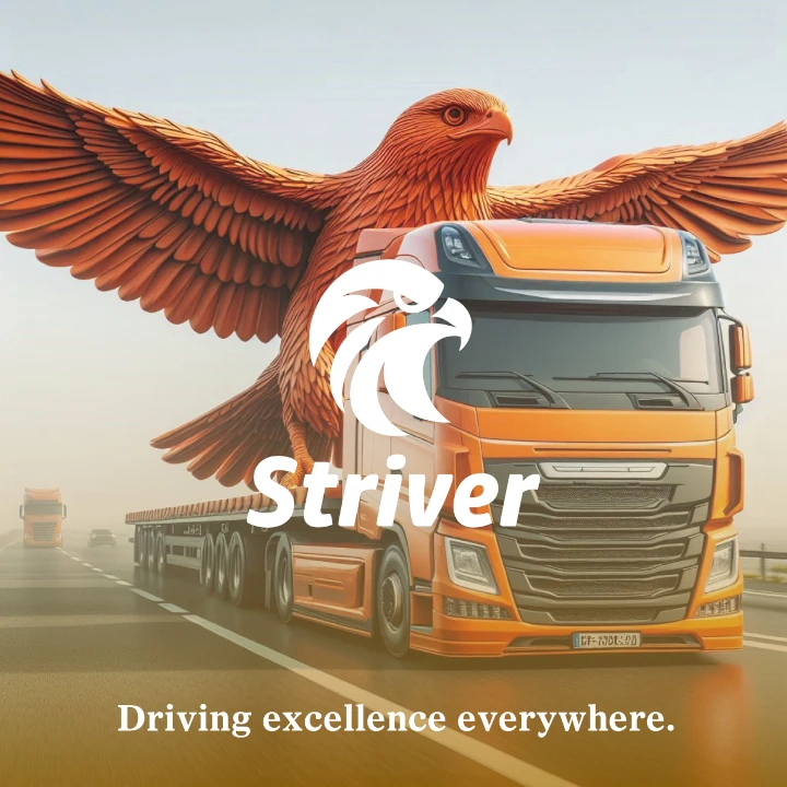
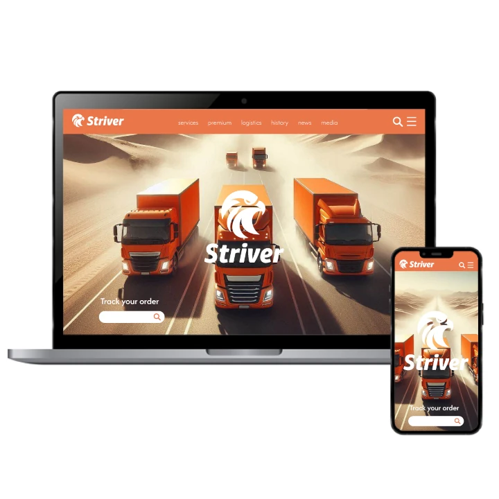
This trucking company’s corporate design channels strength and precision. Fire orange accents inject energy, while bold, rugged design elements reinforce the reliability and durability of the service. The brand’s visual identity communicates a sense of power and toughness, making sure clients feel confident that their logistics needs are handled with the utmost precision and dependability. Every touchpoint is designed for maximum impact.

يمكننا تصميم هذا
من أجلك.
chat_bubble
تواصل معنا!
بالتفاصيل
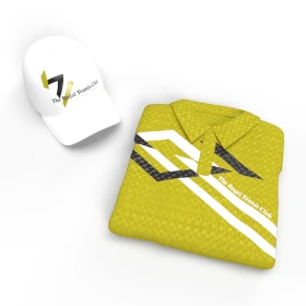
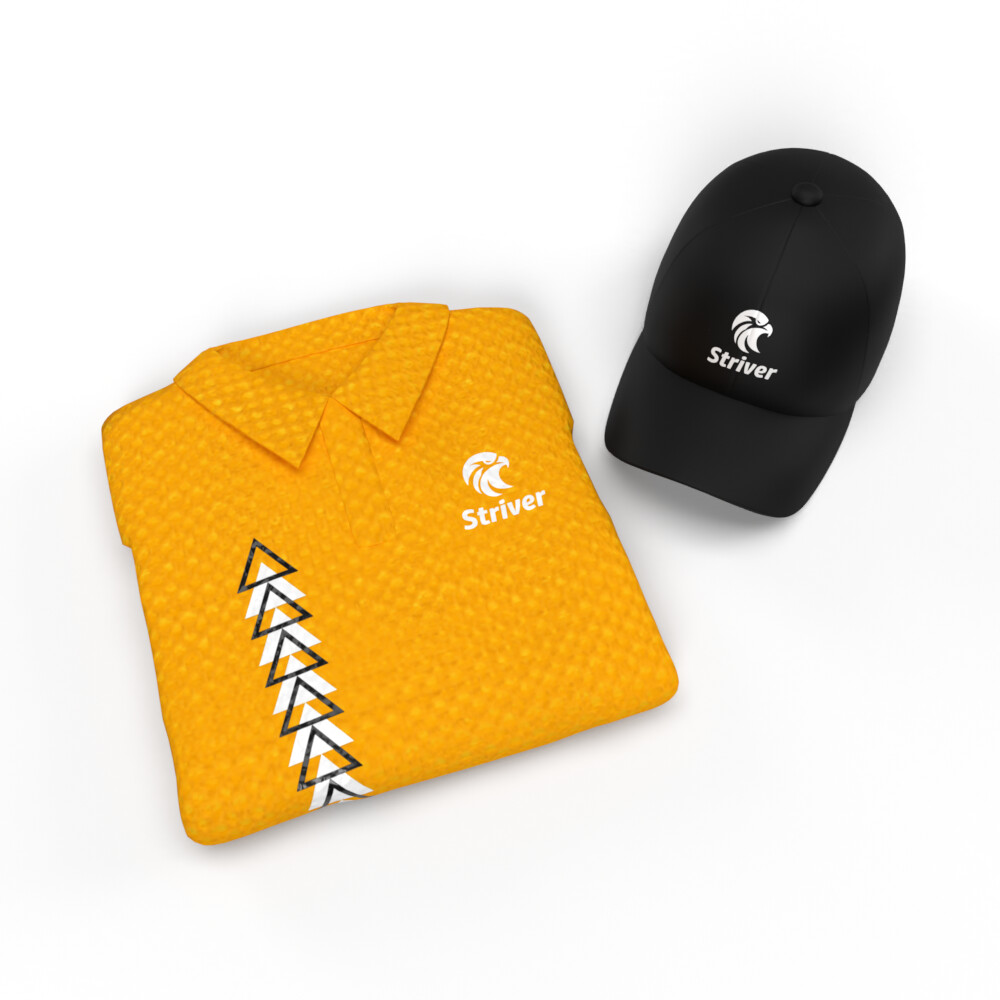
Corporate Design for Trucking Company
الفكرة التصميمية
The corporate design for this trucking company is built on a foundation of precision and power. Fire orange brings energy and urgency, while robust, straightforward design elements convey strength and durability. Every visual aspect is created to reflect the company's commitment to reliable, tough transportation services. From the logo to marketing materials, each element of the brand identity speaks to clients seeking power and dependability in their logistics partner.
This trucking company’s corporate design emphasizes precision and reliability, using fire orange as a vibrant and energetic accent. The design speaks to the rugged nature of the business, with clean, strong lines and a focus on functionality. The visual identity ensures that the brand feels powerful and professional, inspiring confidence in the company’s ability to deliver on its promise of strength and dependability, while also conveying a sense of dynamism and urgency.
Rugged & Powerful Design Aesthetic
الأسلوب الفني
The design aesthetic for this trucking company is rugged and bold. Fire orange stands out, making a strong statement, while the clean, powerful lines of the brand evoke a sense of strength and dependability. The overall style is built around clear, impactful visuals that speak to the reliability of the service. Whether online or in promotional materials, the style communicates that this company is tough, resilient, and precise—perfect for those who need a logistics partner they can trust.
The style for this trucking company incorporates bold, straightforward elements that emphasize power and durability. Fire orange adds a touch of dynamism, while the minimalist design ensures the brand exudes professionalism and strength. The result is a design that conveys both ruggedness and dependability, speaking to clients who value precision and toughness in their logistics partners. Every visual detail reinforces the company's identity as a powerful and reliable transportation service.
Bold Fire Orange & Strong Neutral Tones
الألوان المختارة
The color scheme for this trucking company is anchored by fire orange, symbolizing energy and urgency. Paired with neutral, grounded tones, it communicates the power and precision of the company’s services. The fire orange infuses the design with vibrancy, while the neutral shades balance the visuals with a sense of stability and dependability. This palette speaks to the company’s ability to deliver results in a bold, powerful manner while ensuring clients feel secure and confident in the service.
This trucking company utilizes fire orange to create a sense of excitement and strength, complemented by neutral tones that anchor the design. The bold orange captures the energy and urgency of the trucking industry, while the neutral shades provide a sense of balance and reliability. Together, these colors speak to the company’s commitment to providing powerful and dependable services while making a strong, memorable impact on clients.
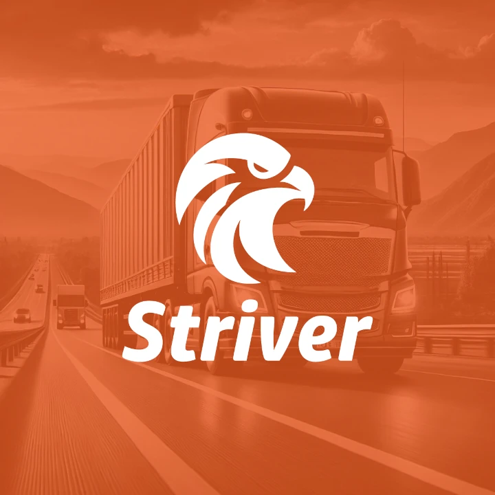
Visual Identity: Strength with Bold Precision
التنفيذ البصري
The artwork for this trucking company prominently features fire orange, symbolizing energy and strength. Bold, clean lines amplify the rugged, straightforward aesthetic, while the careful use of neutral tones brings in balance and professionalism. This powerful visual identity, developed as part of an extensive redesign, was an integral element of the full rebranding strategy by our rebranding company, which aimed to better align the company’s visual presence with its core values of precision, reliability, and power. Every design element communicates the company’s commitment to excellence and creates a lasting impression, underscoring that this is a business that exudes both toughness and trustworthiness.
This creative branding work combines fire orange with bold, simple design elements to represent strength and energy. The clean, powerful visuals communicate the company’s precision and ruggedness, while the use of neutral tones balances the design with a sense of stability. Every piece of artwork is carefully crafted to ensure the company’s identity is seen as both dynamic and reliable, reinforcing the brand’s powerful presence in the trucking industry.