الهوية البصرية لـ بيلاتس علاج طبيعي
The design for this massage business integrates soothing colors and modern aesthetics to communicate calmness and professionalism. Cobalt blue embodies tranquility, while simple, elegant elements evoke a sense of relaxation. Every branded material, from the website to promotional pieces, exudes professionalism and care. A harmonious design ensures that clients feel welcomed, relaxed, and reassured by the brand’s therapeutic atmosphere.

يمكننا تصميم هذا
من أجلك.
chat_bubble
تواصل معنا!
بالتفاصيل
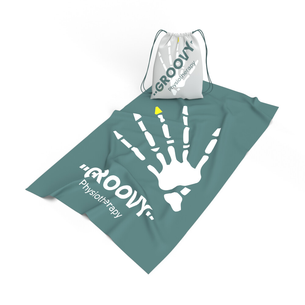
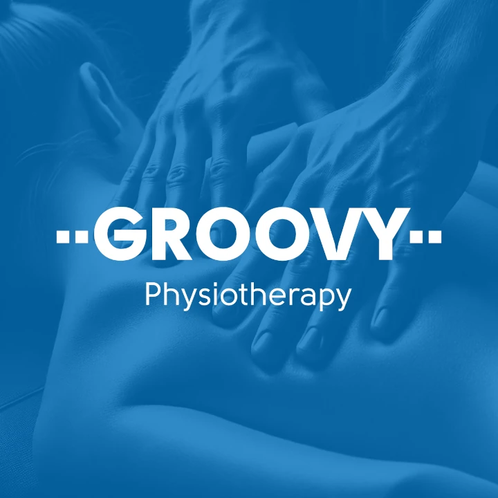
Corporate Design for Massage Business
الفكرة التصميمية
The corporate design for this massage business incorporates the calming power of cobalt blue and minimalist principles. These elements come together to craft an inviting and serene atmosphere for clients. Every design detail, from the logo to the marketing materials, is meticulously curated to support the therapeutic nature of the business and offer a consistent, professional experience. This cohesive approach speaks directly to the brand's dedication to relaxation and rejuvenation.
This corporate design strategy aims to align every interaction with the brand with the soothing, professional environment this massage company provides. By using cobalt blue and minimalist design, the corporate identity communicates serenity and reliability. The result is a design language that resonates with clients and reinforces the brand’s commitment to creating an atmosphere of peace and healing.
Elegant & Serene Style Approach
الأسلوب الفني
The visual style of this business focuses on tranquility and professionalism. Clean, flowing lines combine with a restrained color palette to create an environment of relaxation. Cobalt blue and soft neutrals are utilized to emphasize calmness and trustworthiness. This approach ensures that the brand materials feel welcoming and peaceful, providing a consistent and enjoyable experience across all customer touchpoints.
A sophisticated, minimalist style underpins the brand's visual identity. Cobalt blue paired with soft neutral tones creates a calming and inviting environment. The style reflects a commitment to excellence while ensuring clients experience a sense of calm and professionalism. Every visual detail, from typography to layout, is intentionally crafted to support the therapeutic nature of the business.
Tranquil Color Palette: Cobalt Blue & Neutrals
الألوان المختارة
The color palette prioritizes cobalt blue, symbolizing calm and trust, paired with subtle neutral tones for a serene atmosphere. This combination offers a clean, polished look while maintaining warmth and accessibility. The soothing blues create an immediate sense of relaxation, and the neutral accents support a sense of professionalism and comfort. The cohesive palette ensures the brand remains memorable and peaceful across all interactions.
Cobalt blue, representing serenity, is the central color in the palette, complemented by neutral shades that reinforce professionalism. This soothing combination helps convey a sense of calmness and healing. It ensures that all branding materials, from signage to digital platforms, communicate the tranquil and inviting environment that defines this massage business, providing a consistent experience for every client.
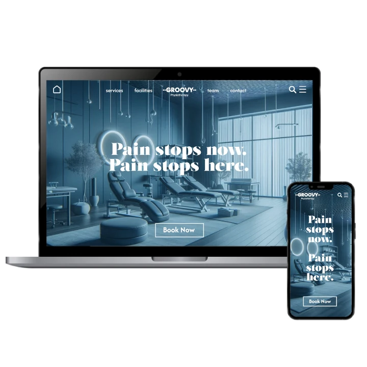
Visual Identity: Clean & Soothing Imagery
التنفيذ البصري
The artwork for this massage business focuses on simplicity and elegance. Soft, organic shapes and calming blues are used to evoke a sense of peace. These visuals create a relaxing experience for clients, whether on the website, business cards, or promotional materials. The design emphasizes clarity and sophistication, aligning perfectly with the business's therapeutic values and professional image.
Visual elements such as clean lines, smooth curves, and cobalt blue accents are incorporated into the artwork, reinforcing the therapeutic and tranquil atmosphere of the brand. At our brand design company, we developed this minimalistic approach to let the message stand out without distraction, creating a cohesive, relaxing experience for clients. These visual elements are seamlessly applied across all marketing platforms, ensuring the brand’s identity remains strong and consistent.