تصميم شعار حكومي
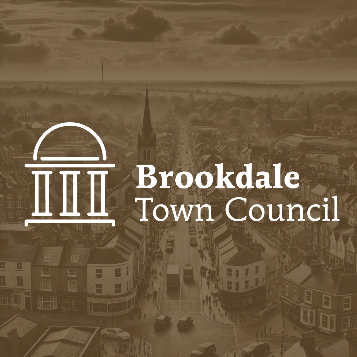
A government logo design must be a synonym of reliability, strength, and a clear sense of progress. Our approach was to create a design that communicates stability while remaining forward-thinking. Inspired by the essence of governance, the logo strikes a balance between tradition and modernity. Wood brown color as every element of the design ensures the brand is both authoritative and approachable, creating a visual foundation that instills confidence in the institution it represents.


يمكننا تصميم هذا
من أجلك.
chat_bubble
تواصل معنا!
بالتفاصيل
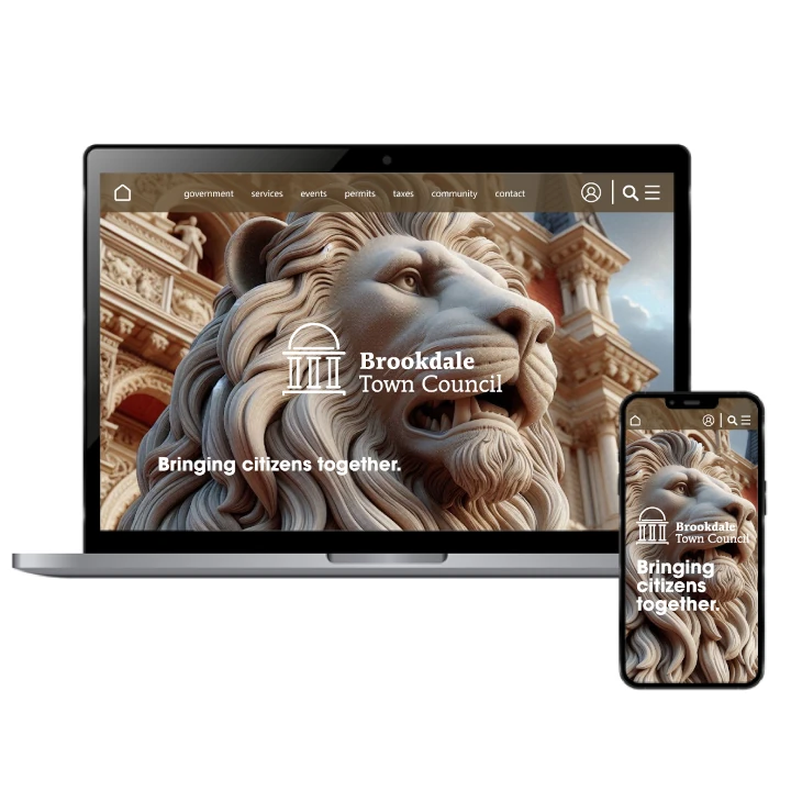
Government Logo Reflecting Stability And Progress
الفكرة التصميمية
This government logo design was developed to represent the principles of governance—accountability, reliability, and structured leadership. Every detail was crafted to ensure a look that is both authoritative and welcoming. The design speaks to institutions and the people they serve, emphasizing clarity and trust.
Creating a symbol for government requires a deep understanding of tradition and progress. We focused on a structured layout that conveys organization and reliability while incorporating elements that suggest movement toward the future. The result is a logo that serves as a visual foundation for leadership and growth.
A Design Rooted In Strength And Order
الأسلوب الفني
The style of this logo needed to reflect both resilience and adaptability. By using well-defined shapes and a structured layout, we created a design that feels solid yet modern. The careful selection of typography reinforces the sense of official authority while remaining approachable.
Government branding must maintain a professional yet welcoming appearance. We opted for clean, bold lines and a timeless design that ensures longevity. This approach ensures that the logo remains effective across official documents, digital platforms, and signage, reinforcing its credibility and clarity.
Wood Brown Representing Strength And Dependability
الألوان المختارة
Color plays a significant role in how a government entity is perceived. Wood brown was selected to symbolize resilience, responsibility, and trustworthiness. Its earthy tone reinforces a connection to stability, much like the foundations of a strong institution. Thanks to our expertise as a rebranding company, the project was able to evolve with a visual identity that speaks to the strength and reliability of the institution.
Beyond its practical associations, wood brown conveys a sense of warmth and grounded leadership. It is a color that instills confidence and reassurance, ensuring that the logo remains impactful across various mediums. This choice enhances the logo’s ability to communicate authority and reliability.
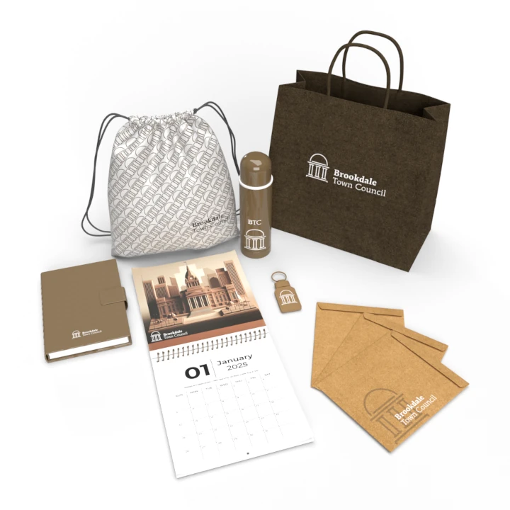
A Recognizable Identity For Public Trust
التنفيذ البصري
This project was not just about designing a logo—it was about establishing an identity that resonates with the public. The final design seamlessly integrates into government materials, from official documents to digital platforms, reinforcing its presence and reliability.
By combining strategic design choices with a strong visual foundation, this logo effectively represents governance at its best. It supports a clear, trustworthy image, helping to build recognition and credibility within the community. The result is a lasting, impactful symbol of leadership.