تصميم شعار سبا ورفاهية
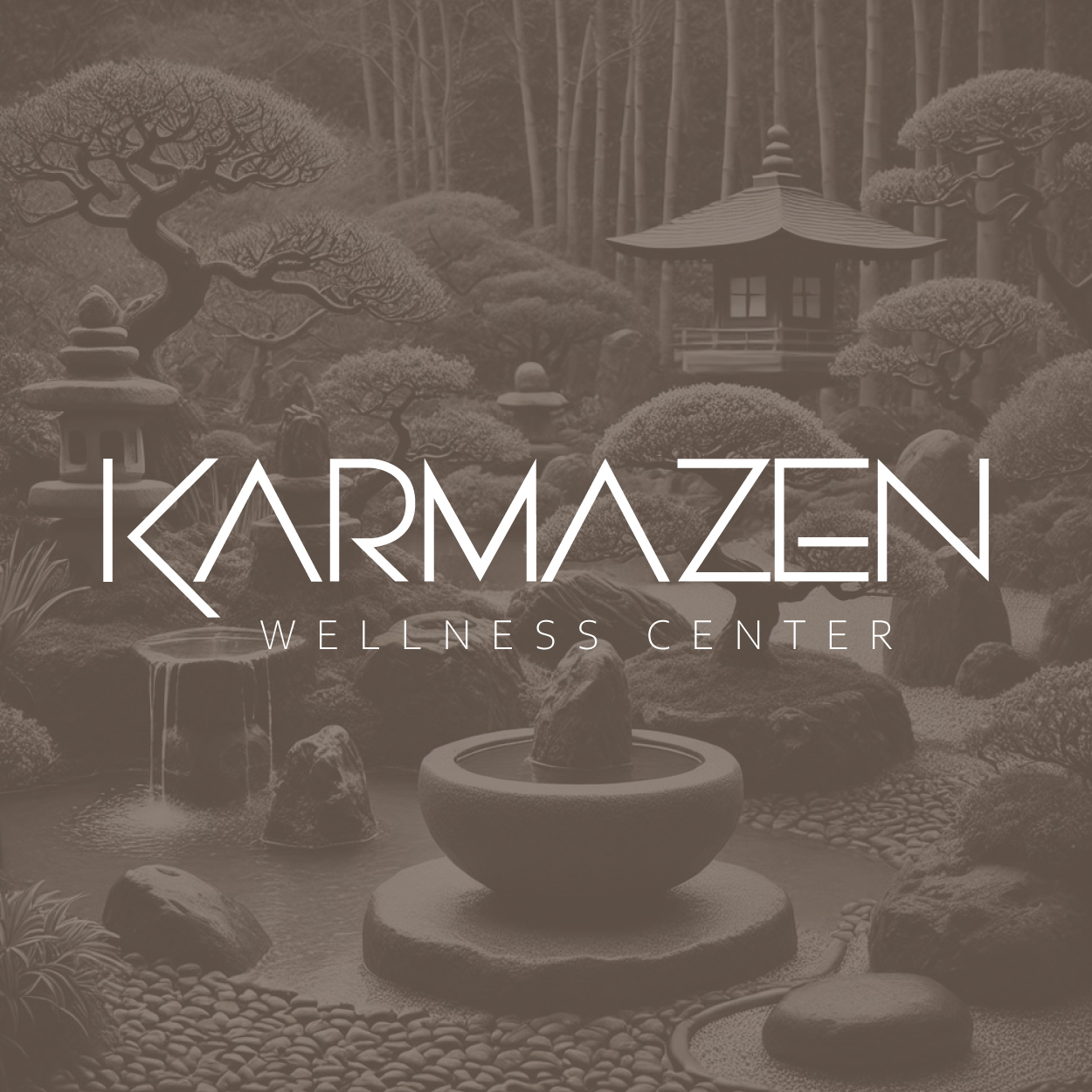
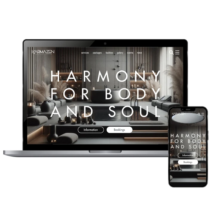
Our spa wellness logo design reflects tranquility and balance. The soothing taupe brown color evokes a sense of calm, while the delicate, ethereal style speaks to the holistic approach the spa offers. The logo is designed to resonate with clients seeking a serene experience, emphasizing the peaceful and restorative nature of the wellness services provided, making it a perfect symbol for this holistic brand.

يمكننا تصميم هذا
من أجلك.
chat_bubble
تواصل معنا!
بالتفاصيل
Embodying Tranquility and Wellness
الفكرة التصميمية
The concept for this spa wellness logo revolves around harmony and holistic healing. We wanted to create a design that reflects both peace and balance, which are essential to the wellness experience. The logo’s shape subtly represents holistic elements, while the use of taupe brown brings a grounding, calming effect to the design.
By using delicate lines and organic shapes, the logo communicates the spa’s focus on mind, body, and spirit. The soft, neutral tones reinforce the idea of an inviting space where clients can relax, rejuvenate, and find their inner peace. It’s a simple yet powerful visual of harmony in motion.
Delicate, Ethereal, and Inviting
الأسلوب الفني
The ethereal style of the logo conveys the spa's atmosphere of serenity and grace. The delicate lines and soft forms symbolize relaxation and well-being, while maintaining an aura of sophistication. The design ensures the logo feels light, inviting, and aligned with the holistic and calming environment the spa offers.
With a style that balances elegance with simplicity, the logo speaks to clients who seek not just physical relaxation, but also mental peace and spiritual renewal. The style's quiet beauty reflects the calming, restorative experience the spa promises to its visitors, creating an instant connection with the target audience.
Taupe Brown: Grounding & Soothing
الألوان المختارة
Taupe brown was chosen for its ability to evoke calmness and grounding energy. This color provides a natural, earthy tone that connects with the holistic and peaceful principles of the wellness spa. It invites clients to relax and trust that they are in a space where they can heal and rejuvenate.
The taupe brown color brings a sense of stability and comfort, while its subtlety doesn’t overwhelm the senses. It’s a perfect balance between luxury and simplicity, making the logo feel both approachable and refined. The color also aligns with the spa’s dedication to creating a balanced, harmonious experience for every client.
A Logo that Reflects Calm & Holistic Values
التنفيذ البصري
This logo truly captures the spa's essence of harmony and wellness. Its delicate, ethereal design aligns with the spa's holistic approach, while the taupe brown color symbolizes peace and grounding. The logo represents the tranquility clients seek in a space dedicated to relaxation and mental clarity.
The logo masterfully conveys the calming environment and restorative services offered by the spa. Created by us, a leading brand design company, it has fostered an emotional connection with clients, aligning perfectly with the spa’s mission of well-being. This thoughtful design has significantly enhanced the brand's reputation within the wellness industry.