تصميم شعار بيلاتس علاج طبيعي
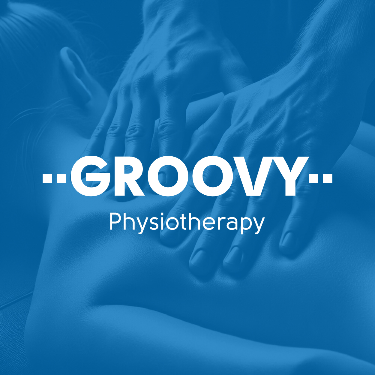
For this massage logo design, we focused on capturing the core values of healing and invigoration. The cobalt blue color symbolizes tranquility and rejuvenation, while the clean and contemporary design conveys a sense of calm and relaxation. This logo speaks directly to individuals seeking wellness and revitalization, offering them a visual representation of the restorative experience they can expect.

يمكننا تصميم هذا
من أجلك.
chat_bubble
تواصل معنا!
بالتفاصيل
Symbolizing Wellness and Renewal
الفكرة التصميمية
In designing this massage logo, our primary goal was to evoke feelings of healing and invigoration. Cobalt blue was chosen to represent both serenity and the restorative powers of massage therapy. The clean, contemporary design aligns with the modern wellness approach of the brand, while simultaneously emphasizing the soothing experience the brand promises. We wanted the logo to immediately communicate that the services offered promote both physical and mental rejuvenation.
This logo is more than just a visual mark; it is a representation of the rejuvenating experience clients will encounter. By using cobalt blue and minimalistic design, we created a logo that feels both modern and therapeutic. The elements come together to convey the promise of an environment where clients can heal, relax, and feel invigoration from the moment they enter.
Clean Design for a Calm Experience
الأسلوب الفني
The clean and contemporary style of this massage logo reflects the brand's commitment to offering a peaceful and modern environment for relaxation and rejuvenation. The simplicity of the design serves to evoke feelings of calmness, which is essential in any wellness experience. The streamlined elements speak to the brand’s focus on providing effective and restorative treatments in an inviting and professional atmosphere.
We carefully crafted the logo's clean lines to represent the simplicity and efficiency of massage therapy. The contemporary aesthetic ensures the logo appeals to a modern audience while still remaining timeless. It’s a balance of soothing simplicity and the modern appeal that reflects the brand’s commitment to delivering an exceptional, tranquil experience for every client.
Cobalt Blue: A Color of Calm and Invigoration
الألوان المختارة
Cobalt blue was chosen for its connection to both serenity and invigoration, two key qualities that massage therapy brings. This color is often associated with healing, relaxation, and tranquility, which perfectly aligns with the atmosphere the brand creates. The calming effect of cobalt blue enhances the brand’s message of restorative care and wellness.
The color cobalt blue creates an instant sense of calm and trust, making it the ideal choice for a massage therapy brand. This vibrant yet soothing tone reinforces the feelings of invigoration and mental clarity that clients experience after a rejuvenating session. It’s a powerful color that ties directly to the brand’s mission of promoting physical and emotional healing.
Creating a Strong Identity for Wellness
التنفيذ البصري
This massage logo design has proven to be an effective tool in creating a recognizable and inviting brand identity. The combination of cobalt blue and the minimalist design reflects the brand's focus on modern wellness and its ability to provide healing through massage therapy. The logo continues to resonate with clients who are looking for a serene and revitalizing experience. By working closely with the client and understanding their needs, we were able to define a design that captures the essence of the brand and builds lasting connections with its audience.
The success of the logo can be attributed to its simplicity and the message it conveys. It has played an integral role in enhancing the brand's reputation, establishing it as a trusted destination for relaxation and invigoration. The clean design and vibrant cobalt blue color have contributed to increased visibility and client engagement, solidifying the brand’s position in the wellness industry.