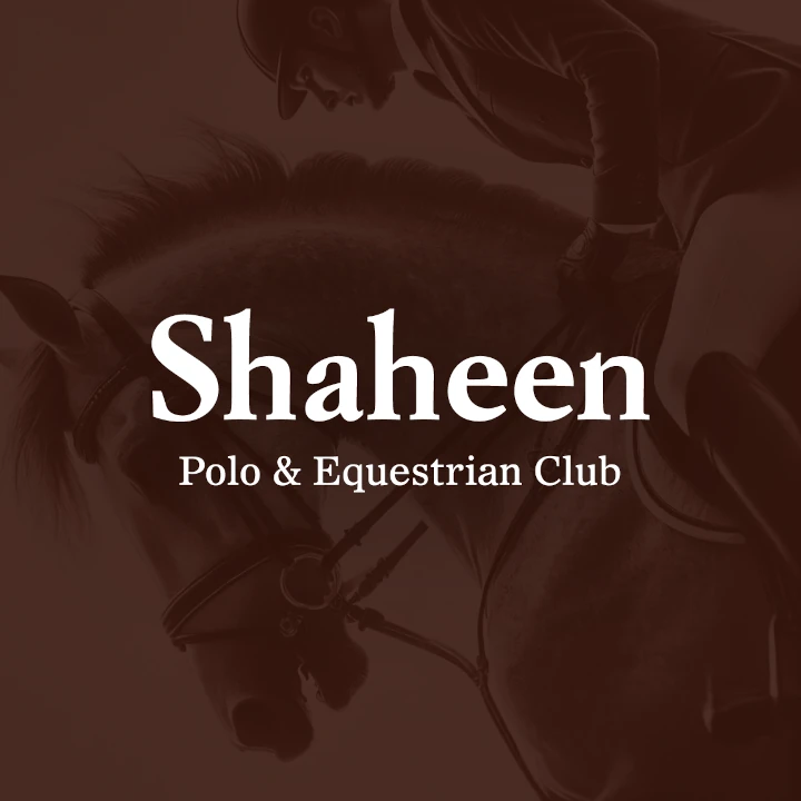
الهوية البصرية لـ فروسية
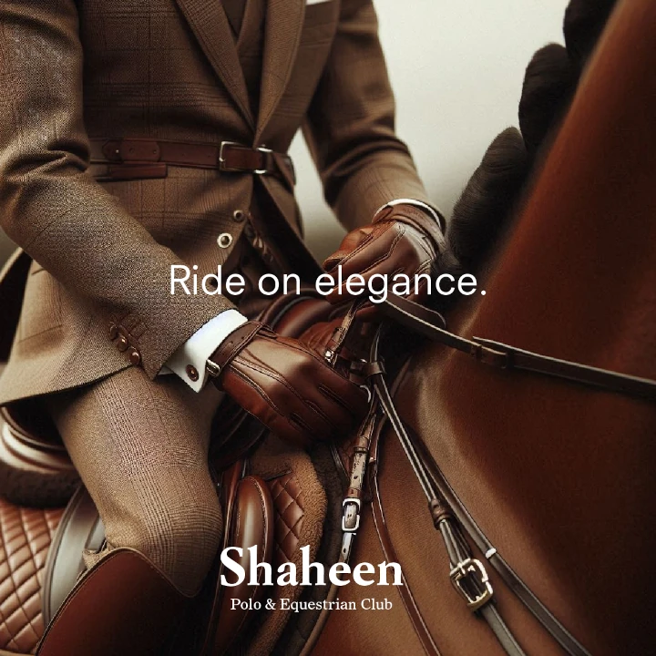
This equestrian brand’s corporate design embodies grace and agility, with hickory brown as the central color, symbolizing strength and tradition. The design combines refined aesthetics with powerful elements to capture the essence of equestrian sports. Every detail, from branded materials to user experience, is thoughtfully crafted to communicate the brand's commitment to excellence, sophistication, and the elegance of the equestrian world.

يمكننا تصميم هذا
من أجلك.
chat_bubble
تواصل معنا!
بالتفاصيل
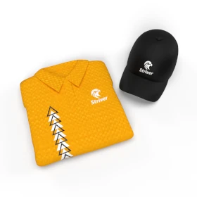
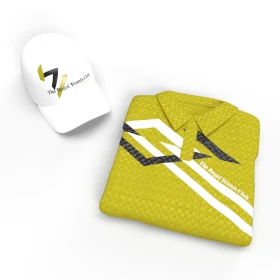
Corporate Design That Embodies Grace & Strength
الفكرة التصميمية
The corporate design of this equestrian brand emphasizes grace and agility, with hickory brown chosen for its association with strength, tradition, and refinement. The design elements reflect the power and elegance of horse riding, incorporating refined aesthetics that convey both sophistication and athleticism. Every element of the brand’s visual identity, from its logo to branded materials, speaks to the beauty and strength found within equestrian sport, while evoking a sense of timeless tradition and modern excellence.
Hickory brown was carefully selected for its earthy tone, symbolizing power, resilience, and the connection between nature and the equestrian world. The corporate design blends classical elegance with modern refinement, ensuring that the brand feels both timeless and cutting-edge. Each visual element communicates a commitment to high-performance, sophisticated style, and the unique qualities of equestrian sports that demand grace, power, and agility from both rider and horse.
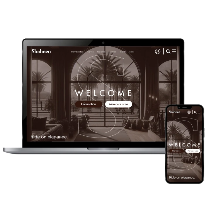
A Powerful, Refined Style for Equestrian Excellence
الأسلوب الفني
The visual identity of this equestrian brand balances strength with sophistication, using hickory brown as a central element to evoke resilience, elegance, and grace. The design seamlessly blends modern aesthetics with the timeless spirit of the equestrian world. Midway through the creative process, the insights of a skilled international luxury branding agency helped shape a distinctive look. From typography to layout, every detail conveys a sense of excellence, athleticism, and enduring prestige, positioning the brand as a standout in its industry.
With hickory brown at its core, this equestrian brand’s style embodies power and elegance, with a design language that speaks to both athleticism and grace. The use of sharp, clean lines and refined fonts ensures that the visual identity remains both sophisticated and approachable, appealing to those who appreciate the timeless beauty of horse riding. The overall style is a seamless blend of tradition and modernity, offering a refined yet dynamic visual experience for its audience.
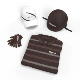
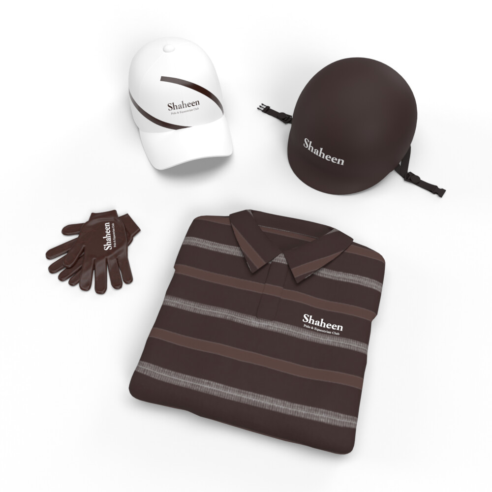
Hickory Brown: The Color of Strength & Tradition
الألوان المختارة
Hickory brown is a central component of this equestrian brand’s color scheme, symbolizing strength, tradition, and the deep connection to nature. This color evokes a sense of durability, grounding the brand in the heritage of equestrian sports while remaining modern and relevant. It represents the powerful bond between rider and horse, as well as the discipline and grace required in the sport. Hickory brown’s warm tones also evoke a sense of sophistication and elegance, ensuring the brand feels both powerful and refined.
Chosen for its connection to the earth and its association with both strength and tradition, hickory brown is the perfect representation of this equestrian brand’s values. It conveys the stability and reliability that are essential in the world of equestrian sports, while also adding an element of grace and refinement. The color works harmoniously with the brand’s style, reinforcing its commitment to excellence, sophistication, and the timeless nature of equestrian competition.
Refined & Powerful Artwork for Equestrian Excellence
التنفيذ البصري
The artwork for this equestrian brand is designed to reflect the power, agility, and grace inherent in the sport. Using hickory brown as the primary color, the visuals evoke strength, tradition, and elegance. Each design element is meticulously crafted to enhance the brand’s identity, reinforcing its commitment to both athletic excellence and refined taste. The artwork is a true reflection of the equestrian lifestyle, combining power with grace in every detail.
Hickory brown is woven throughout the artwork, enhancing the sense of strength and tradition that defines the equestrian brand. The visuals combine sleek, powerful lines with elegant, sophisticated touches, ensuring the brand stands out as a leader in its field. The artwork communicates the brand’s core values of agility, grace, and power, resonating with an audience that appreciates the timeless elegance of equestrian sports and the dedication it takes to excel within them.