تصميم شعار رعاية صحية
Creating a healthcare logo means more than just aesthetics—it’s about representing innovation and care in a meaningful way. We designed this identity with a futuristic outlook, ensuring it conveys reliability and progress. Aqua blue was chosen for its calming yet professional qualities, reinforcing the trust patients and professionals seek in the medical field. With a balanced style, the design seamlessly adapts to digital and physical applications, strengthening the brand’s credibility.


يمكننا تصميم هذا
من أجلك.
chat_bubble
تواصل معنا!
بالتفاصيل
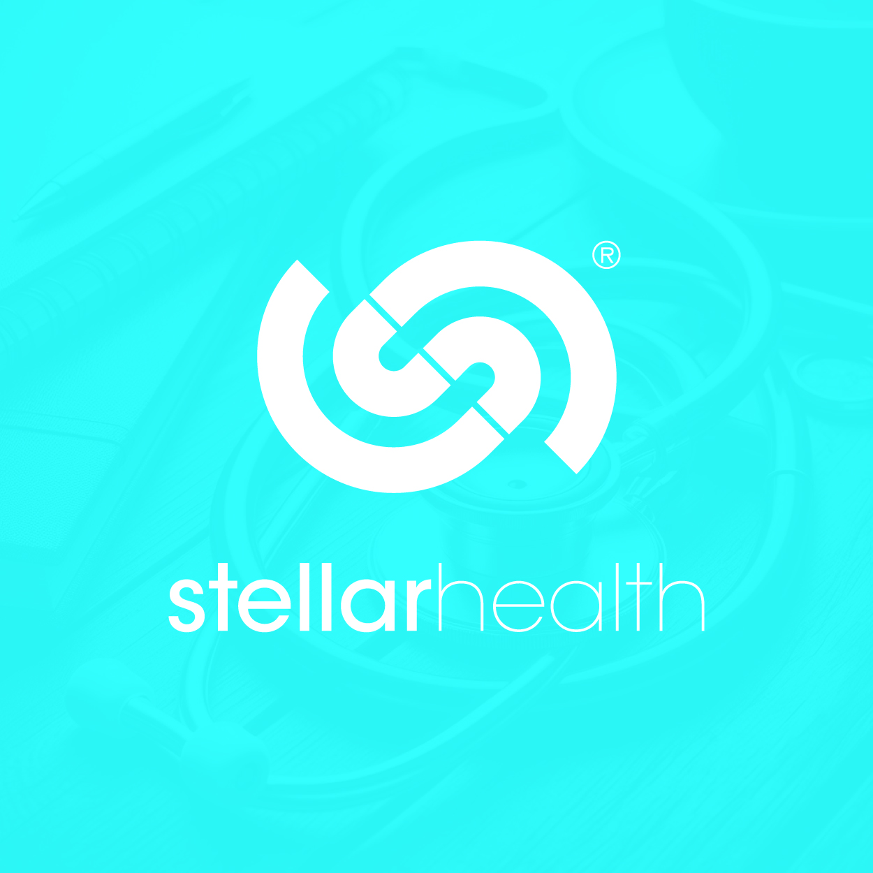
Healthcare Logo That Reflects Trust & Progress
الفكرة التصميمية
In healthcare branding, a logo must do more than just look good—it has to communicate security, innovation, and care. For this project, we focused on a visual identity that embodies protection and medical advancement. By blending futuristic elements with a welcoming touch, we ensured that the logo resonates with both professionals and patients alike.
Our healthcare logo design aimed to represent the evolving nature of medicine while maintaining a sense of familiarity and reliability. A balance between structured shapes and fluid lines creates an image that reflects both technological progress and compassionate care, ensuring a strong connection with its audience.
A Balanced Fusion of Technology & Humanity
الأسلوب الفني
Striking the right balance between futuristic innovation and human warmth was key in shaping this design. The structured elements bring a sense of technological progress, while smooth curves and approachable typography add a softer, more welcoming feel. This thoughtful combination makes the logo effective in both clinical and corporate settings.
A forward-looking brand requires a visual identity that evolves with the industry. The futuristic yet holistic style we implemented ensures the logo remains timeless and adaptable. By avoiding excessive complexity, we created a refined look that reflects confidence and clarity, reinforcing the medical field’s commitment to excellence. Being a global brand design company, we helped shape this identity to meet the ever-changing demands of the industry.
Aqua Blue Enhancing Trust & Clarity
الألوان المختارة
The choice of aqua blue was intentional—it embodies both trust and innovation. This shade bridges the gap between scientific precision and patient-centered care, making it a perfect fit for a healthcare brand. It offers a refreshing yet authoritative presence, reinforcing the brand’s credibility.
In healthcare branding, colors carry significant weight. Aqua blue conveys reliability, cleanliness, and progress, all of which are essential in the medical industry. It helps create a reassuring atmosphere while ensuring the brand stands out in a competitive landscape. This choice of color supports the brand’s commitment to excellence and innovation, fostering trust and confidence among patients and professionals.
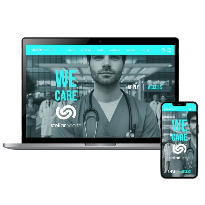
Establishing A Strong & Recognizable Identity
التنفيذ البصري
A well-designed healthcare logo is more than just a visual mark—it’s a tool that strengthens brand recognition. This project involved a complete branding approach, ensuring a cohesive and professional image across all mediums, from websites to clinical signage. The comprehensive strategy aimed at creating a unified and memorable identity that resonates with patients and professionals alike.
This branding project went beyond just a logo—it helped establish a long-term presence in the industry. The thoughtful combination of style, color, and structure resulted in a design that enhances credibility and supports the brand’s continued growth. This holistic approach ensured the brand’s message was clear and consistent, fostering trust and loyalty among its audience.