تصميم شعار مركز لياقة بدنية
When designing a fitness center logo, it’s important to balance energy, determination, and harmony. We approached this project by focusing on visual elements that would motivate fitness enthusiasts while embodying the brand's core mission. By blending sleek design with thoughtful symbolism, we crafted a logo that speaks to endurance, balance, and motivation. The result is a distinctive visual identity that stands out in the competitive fitness industry.

يمكننا تصميم هذا
من أجلك.
chat_bubble
تواصل معنا!
بالتفاصيل
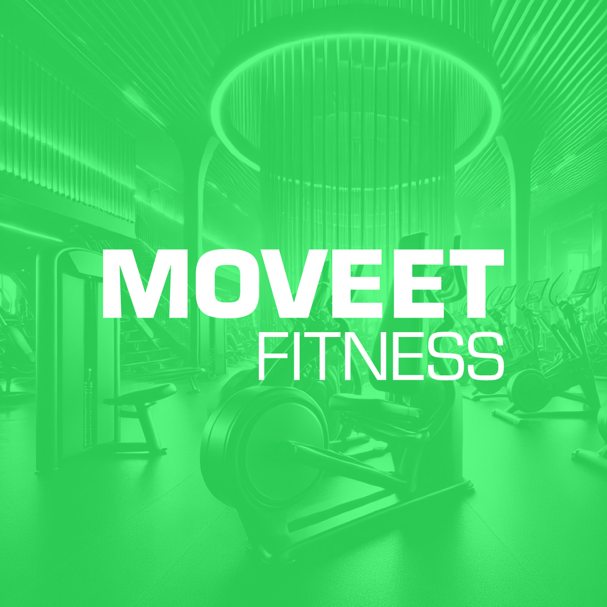
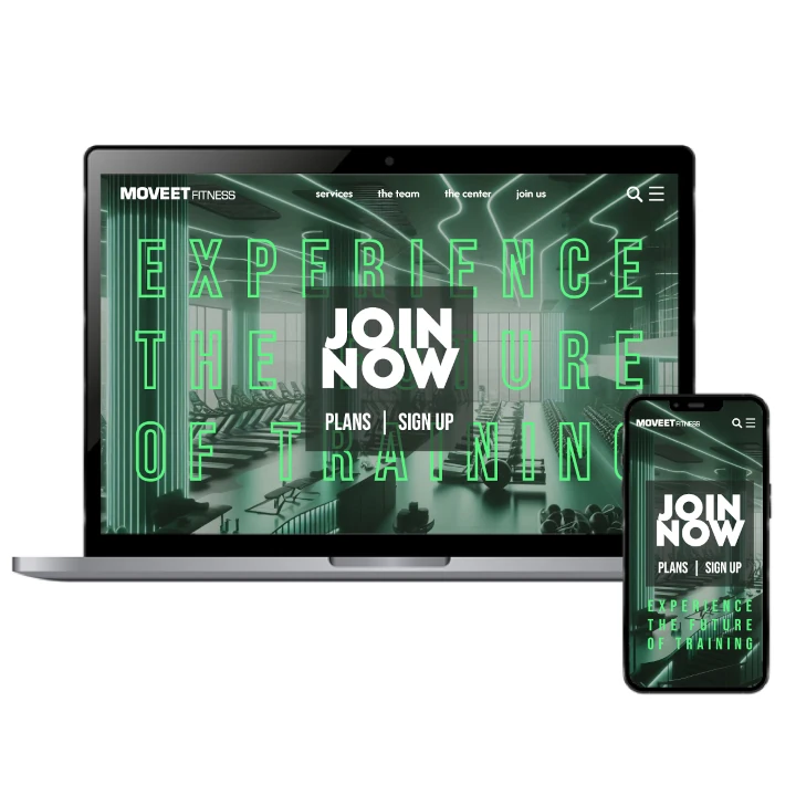
Fitness Center Logo Reflecting Endurance And Strength
الفكرة التصميمية
Creating a compelling fitness center logo design meant tapping into the core values of motivation and endurance. The fitness world thrives on dedication, and we wanted the logo to be a symbol of that energy. By focusing on clean, modern shapes and dynamic elements, we created a visual identity that encourages action and confidence. The design communicates balance, reflecting both strength and calm.
Our creative direction for the logo emphasized simplicity and clarity, ensuring it resonates with a broad audience. Every design choice was deliberate, from the curvature to the alignment of visual elements, all symbolizing motion and discipline. The result is a fitness center logo design that captures the brand’s mission to inspire people in their fitness journeys and foster a positive, motivated community.
A Sleek And Balanced Design Approach
الأسلوب الفني
The visual style of the logo had to be functional yet inspiring. We focused on a sleek, minimalist approach to convey a sense of modernity and strength. The clean and balanced lines of the design ensure versatility across various branding applications. This style reinforces the fitness center's commitment to creating an environment that promotes balance, energy, and focus.
Every detail was thoughtfully crafted to ensure the logo embodies both sophistication and motivation. The minimalist design does not sacrifice energy—it speaks through clarity and thoughtful geometry. This approach allows the fitness center to project a strong yet welcoming image, appealing to individuals who value focus, endurance, and progress.
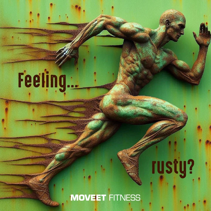
Pale Green Symbolizing Growth And Vitality
الألوان المختارة
Pale green played a significant role in shaping the visual identity. This color was chosen for its association with growth, renewal, and vitality—key concepts for a fitness brand. It stands out for its ability to communicate positivity and progress, creating a vibrant yet harmonious aesthetic that captures attention.
Beyond aesthetics, the color adds depth and emotional resonance to the brand identity. Pale green offers a fresh and inviting tone, perfectly aligning with the brand's mission of fostering growth and wellness. The subtle vibrancy evokes a sense of health and progress, encouraging users to stay motivated on their fitness journey.
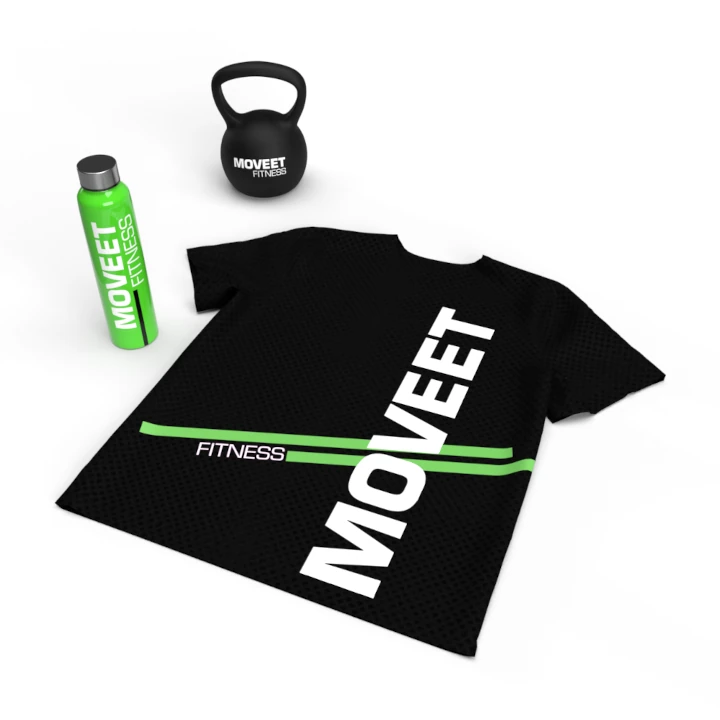
Creating A Powerful Fitness Center Visual Experience
التنفيذ البصري
This project wasn’t just about designing a logo; it was about creating a complete branding experience. Our company naming agency played a key role in developing a name that embodies the fitness center’s mission, alongside crafting the final logo design. We handled everything, ensuring a cohesive identity that aligns with the center's goals. The design is not just visually appealing but functionally effective, allowing for broad application across branding platforms.
The final result successfully communicates the fitness center’s core values of motivation and endurance. The sleek yet vibrant logo design, paired with thoughtful branding elements, has created a recognizable identity in the fitness market. The project’s success has strengthened the brand’s connection with its audience, fostering engagement and growth in the competitive wellness industry.