تصميم شعار شركة تكنولوجيا معلومات
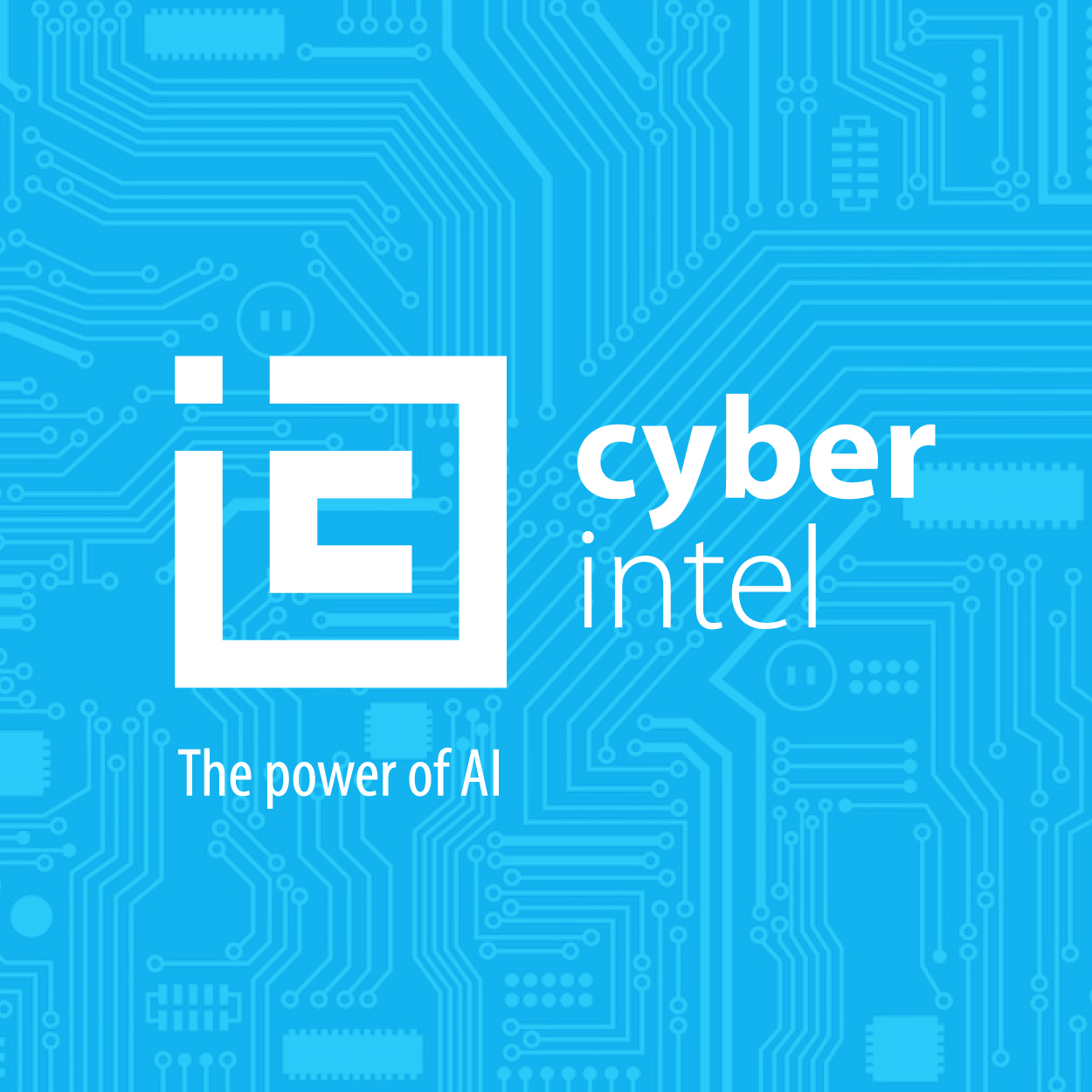
Our design for this IT company logo was inspired by the principles of innovation and computation. The goal was to create a logo that reflects technological sophistication while staying true to the streamlined, geometric style. We selected Arctic Blue to communicate modernity and clarity, ensuring that the brand feels as forward-thinking and precise as the solutions it provides. The design is both functional and memorable, capturing the essence of the IT industry.

يمكننا تصميم هذا
من أجلك.
chat_bubble
تواصل معنا!
بالتفاصيل
A Symbol of Technological Precision
الفكرة التصميمية
The design of this IT company logo revolves around the themes of innovation and computation. We wanted to craft a visual identity that spoke to the cutting-edge nature of technology while remaining clean and professional. Through sharp lines and geometric shapes, we achieved a representation of precision and efficiency—essential qualities for a forward-thinking IT company.
This logo design embodies the essence of the company’s work in the IT sector. With its clean lines and thoughtful use of space, the design communicates the brand’s dedication to offering innovative, computational solutions. It speaks directly to the company’s desire to be at the forefront of technological advancement, and its ability to deliver clear, reliable solutions to complex problems.
Streamlined Geometry for a Modern Brand
الأسلوب الفني
For this project, we adopted a streamlined, geometric style to evoke simplicity and order. The clean lines and minimalist approach provide the perfect balance for an IT company that values efficiency and clarity. Every element of the logo was meticulously considered to convey innovation, while the sharp, angular shapes suggest a forward-thinking, problem-solving mindset.
The geometric style contributes to the logo’s timeless, modern appeal. Being a prominent brand design company, we crafted its simplicity to ensure it stands out and remains versatile across various media. This approach has provided the brand with a clean, professional identity, signaling to clients that the company is efficient, modern, and capable of providing highly specialized technology solutions.
Arctic Blue for Clarity & Innovation
الألوان المختارة
Arctic Blue was chosen for its association with both clarity and innovation. It’s a color that evokes trust and professionalism, ideal for a technology brand that provides complex solutions. The cool tones of blue give the logo a calm, precise feel, reinforcing the brand’s commitment to delivering intelligent and well-designed computational solutions.
The Arctic Blue creates a sense of calm and order, which is essential in the world of IT. It’s also a color that symbolizes innovation and clarity, helping the brand to convey a sense of sophistication while maintaining a professional and approachable appearance. The color scheme enhances the logo’s ability to communicate its message, making it stand out in a highly competitive industry.
Visual Identity that Reflects Technological Mastery
التنفيذ البصري
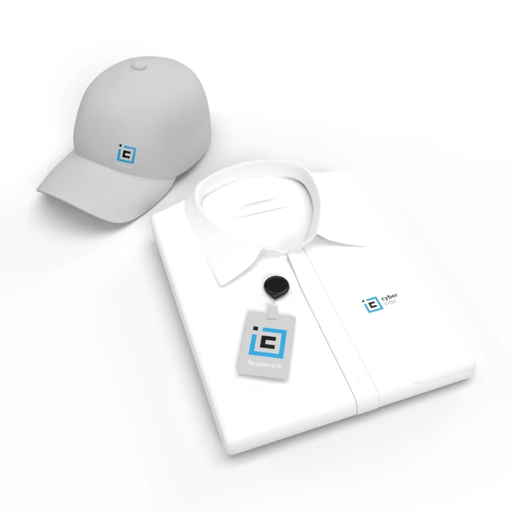
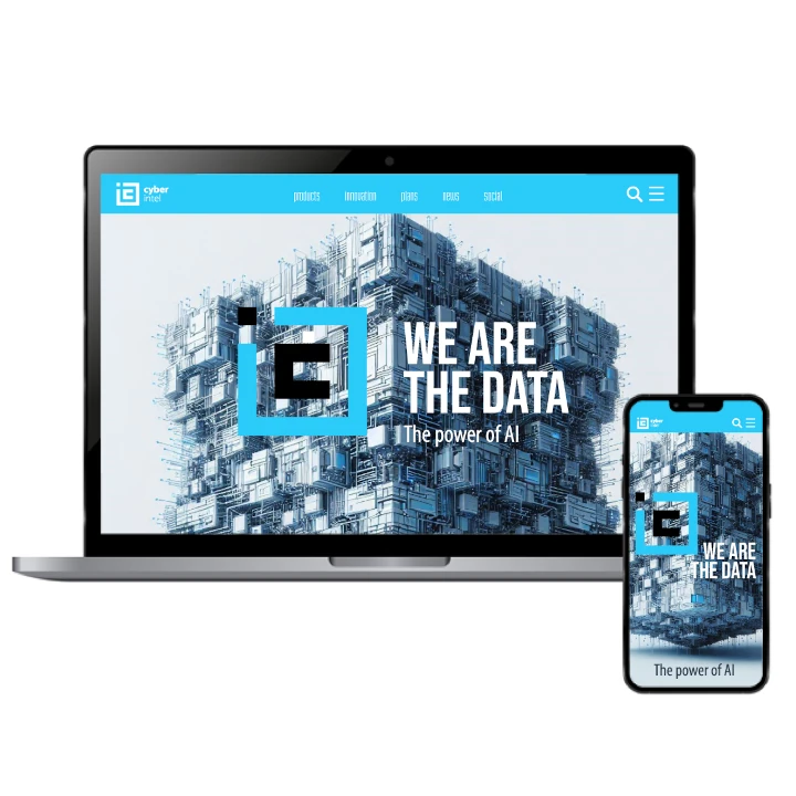
This IT company logo, with its sleek, geometric design and innovative style, was a key part of the company’s larger branding strategy. The clean, modern aesthetic helps communicate the company’s mission to deliver precise, high-tech solutions. By incorporating the logo into a full range of brand materials, the company successfully established a cohesive identity that reinforces its reputation for expertise and technological advancement.
The logo has had a powerful impact on both the company’s internal culture and its outward-facing branding. It has helped position the company as a leading innovator in the IT space, fostering trust and credibility with clients. By combining modern design elements with the company’s core values, the logo has been instrumental in driving both brand recognition and growth in the technology sector.