تصميم شعار شركة سفر
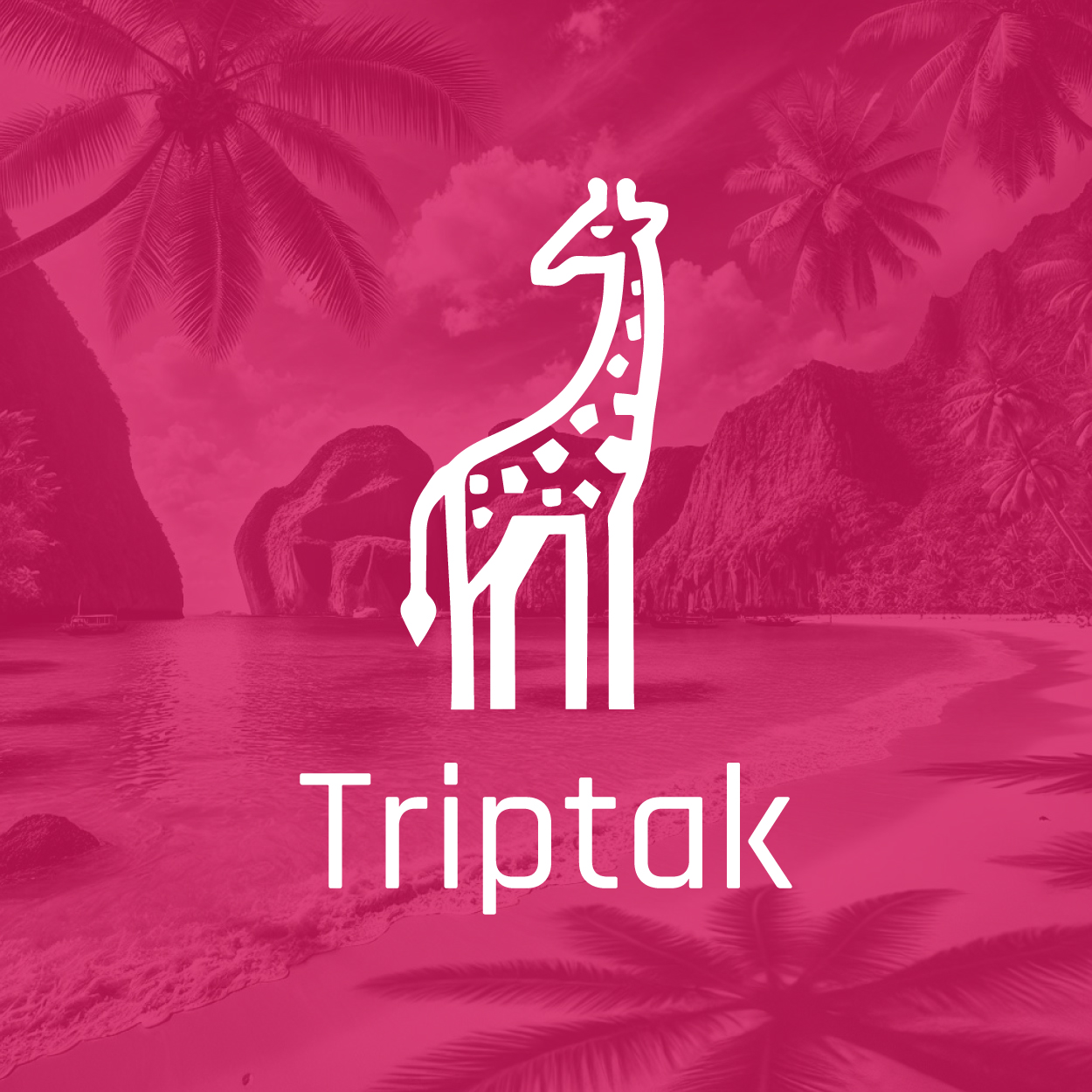
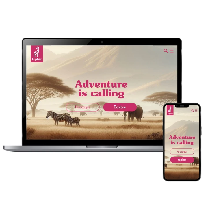
The design concept for this travel company logo incarnates the spirit of adventure, exploration, and boundless opportunities. We selected rubine red to convey energy, excitement, and the thrill of new experiences, while the light and friendly style creates a sense of approachability. This logo’s purpose is to invite customers to explore the world with confidence, offering an open invitation to adventure and discovery. It aligns with the adventurous spirit of travel.

يمكننا تصميم هذا
من أجلك.
chat_bubble
تواصل معنا!
بالتفاصيل
Embarking on the Journey
الفكرة التصميمية
The concept behind this travel company logo centers on the idea of adventure and discovery. We sought to create a design that would resonate with people eager to explore new destinations. Rubine red was chosen for its vibrant and energetic qualities, evoking a sense of excitement and enthusiasm. The clean, light style is inviting and approachable, perfectly capturing the spirit of traveling to new, exciting places with confidence and curiosity.
This travel logo design is all about sparking curiosity and a sense of wonder. The logo’s dynamic and energetic design reflects the spirit of exploration, offering an invitation to wander and discover. Rubine red, with its lively and passionate hue, represents the drive to explore new horizons, while the friendly design approach ensures that the brand feels approachable and welcoming for customers embarking on their next adventure.
Light, Inviting, and Approachable
الأسلوب الفني
The style of the logo was carefully crafted to be light, approachable, and welcoming. We wanted to create a design that felt friendly and open, allowing customers to easily connect with the brand. The simplicity of the design makes it versatile across multiple platforms, from websites to travel brochures. It reflects the easygoing and approachable nature of travel, while also capturing the essence of fun and excitement that travel brings.
The friendly and light style was chosen to make the travel company logo approachable and inviting. We wanted to create a brand that felt comforting and easy for customers to trust, offering a safe space for their travel aspirations. This style blends simplicity and modernity, ensuring that the logo would appeal to a wide audience, while staying true to the sense of adventure and excitement that comes with exploring new destinations.
Rubine Red: Passion and Excitement
الألوان المختارة
Rubine red was chosen for its vibrant and energetic qualities, making the logo feel alive and full of energy. It reflects the thrill and passion of travel, capturing the excitement of setting off on new adventures. The color was carefully selected to evoke the emotions of curiosity, passion, and excitement, all of which are integral to the concept of exploring new places. Rubine red instantly grabs attention and makes the logo stand out from the crowd.
This bold color was selected to create an immediate connection to the excitement of traveling. Rubine red communicates a sense of passion and vitality, making the logo memorable and impactful. It aligns with the core values of adventure and discovery, embodying the thrill of experiencing new cultures, landscapes, and adventures. This striking color choice ensures that the travel company stands out as a dynamic, energetic brand ready to lead its clients on their next journey.
An Inviting Design for the Adventurous Spirit
التنفيذ البصري
The artwork of this logo blends simplicity with a sense of energy, an idea brought to life with the vision of our brand consulting agency, perfectly reflecting the brand’s focus on adventure and exploration. The use of rubine red gives it a bold and confident presence, while the light and friendly design ensures it remains approachable. This logo serves as a visual representation of the travel company’s dedication to inspiring wanderlust and helping customers create unforgettable memories during their travels.
The logo’s artwork effectively communicates the spirit of adventure, inviting travelers to experience new and exciting destinations. Its clean lines and dynamic red color capture the feeling of excitement and enthusiasm that comes with exploring the world. The design successfully blends a sense of modernity with approachability, ensuring the logo resonates with customers eager to explore new places and embark on unforgettable journeys, with a trusted brand guiding them along the way.