تصميم شعار مستحضرات العناية بالبشرة
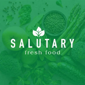
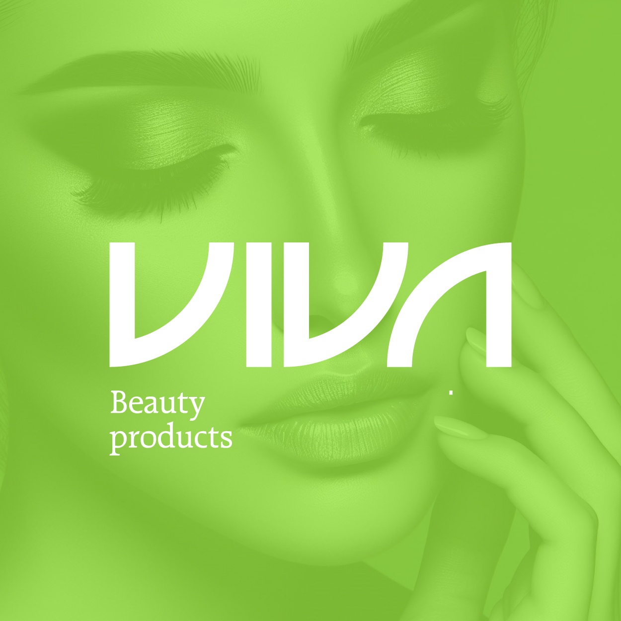
Our skincare cosmetics logo was designed with a focus on purity, youth, and minimalism. Lime green was chosen for its fresh, rejuvenating quality, symbolizing both vitality and natural beauty. The minimalist design enhances the brand’s core values of elegance, effectiveness, and simplicity, making it a perfect representation of skincare that brings out the youthfulness and vitality in everyone. It’s a timeless, clean logo that speaks to modern beauty.

يمكننا تصميم هذا
من أجلك.
chat_bubble
تواصل معنا!
بالتفاصيل
A Fresh Take on Beauty
الفكرة التصميمية
For the skincare cosmetics logo, we wanted to encapsulate the essence of beauty and youth through simplicity. Lime green, a fresh, vibrant color, perfectly complements the minimalist design, reflecting the natural purity of skincare. The clean lines and balanced form evoke feelings of rejuvenation and vitality, making the logo synonymous with a skincare line that restores and maintains youthful skin.
The concept behind this design emphasizes purity, which is central to both skincare and beauty. By focusing on minimalism, we’ve created a logo that embodies the simplicity and efficacy of skincare products that aim to rejuvenate and maintain youth. The design is not only modern but timeless, reinforcing the brand’s commitment to offering beauty products that are both effective and elegant.
Minimalism Meets Beauty
الأسلوب الفني
The minimalist style of the logo complements the skincare cosmetics brand's message of purity and natural beauty. With clean, straightforward lines and subtle proportions, the logo gives off an air of sophistication and elegance. This style appeals to customers who appreciate simplicity in design and prefer products that focus on quality and results over excess.
By stripping away the unnecessary, the logo creates a calming, serene presence. It’s a reflection of skincare itself: effective, unpretentious, and rooted in the values of simplicity and natural beauty. The minimalist design style is timeless, allowing the logo to resonate with customers seeking products that enhance their beauty with purity and confidence.
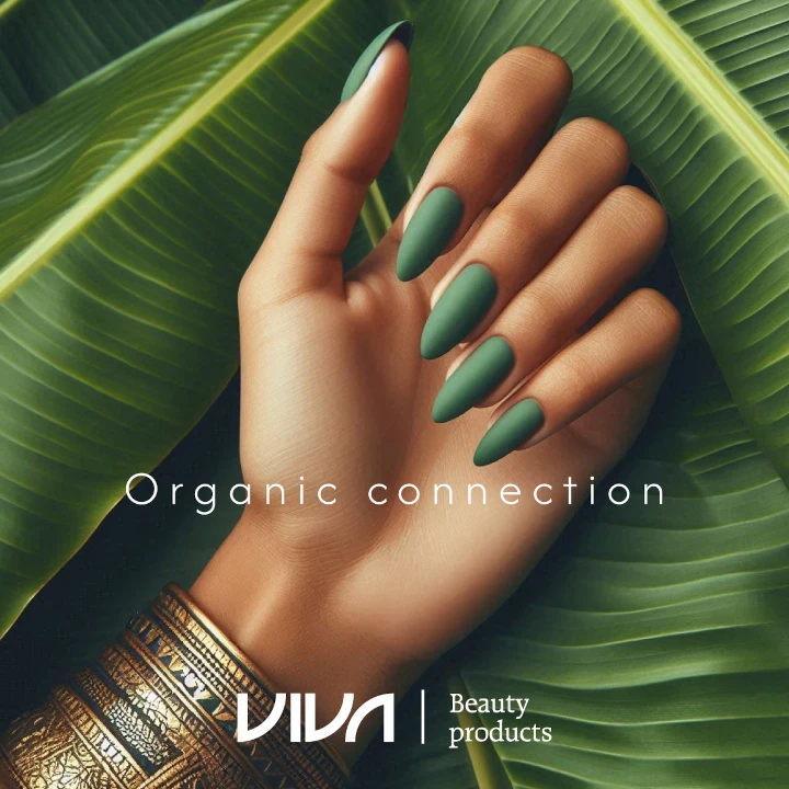
Lime Green: Freshness & Vitality
الألوان المختارة
Lime green is the perfect color to communicate freshness, vitality, and youth. It’s bright, invigorating, and has a natural association with freshness. The color embodies the rejuvenating qualities of the skincare line, suggesting that the products not only nurture but revitalize, helping consumers feel youthful and vibrant.
Lime green also symbolizes growth and renewal, tying back to the brand’s mission to rejuvenate skin and restore beauty. It’s a color that stands out in the world of skincare while staying grounded in nature’s freshness. By using lime green, the logo draws a clear connection between youthful vitality and the natural, purifying properties of the brand.
A Symbol of Natural Elegance
التنفيذ البصري
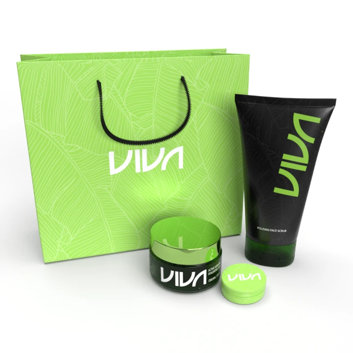
This logo beautifully reflects the core values of the skincare cosmetics brand. The minimalist design and refreshing lime green color work in harmony to communicate the purity and effectiveness of the skincare products. The logo creates an identity that feels both approachable and luxurious, connecting with consumers who seek beauty products that are natural yet sophisticated.
Through this design, we’ve achieved the perfect balance between elegance and simplicity, with key input from our brand consulting agency. Their expertise guided us in pairing a minimalist style with the vibrant lime green, giving the logo an air of purity and sophistication. The overall result is a brand identity that speaks to customers looking for skincare that enhances beauty while staying grounded in natural, rejuvenating elements.