تصميم شعار شركة لوجستية
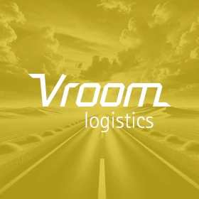
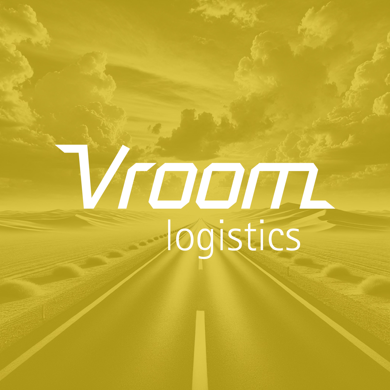
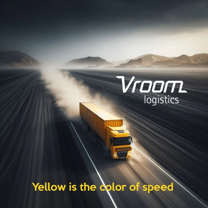
The concept behind this logo is to showcase the transportation and logistics sector’s commitment to speed, precision, and efficiency. Royal yellow symbolizes optimism, clarity, and urgency, while the active, streamlined style conveys a sense of motion and immediacy. This logo is designed to stand out in an industry that values quick decision-making and effective solutions, ensuring the brand feels dynamic and always ready to respond to the needs of its clients.

يمكننا تصميم هذا
من أجلك.
chat_bubble
تواصل معنا!
بالتفاصيل
Capturing Speed and Precision
الفكرة التصميمية
The concept behind this transportation logistics logo revolves around communicating the fast-paced nature of the industry. We wanted the design to reflect efficiency, highlighting the importance of both speed and reliability. The choice of royal yellow represents optimism, urgency, and clear communication, while the sleek lines of the logo illustrate streamlined processes. Every element was designed to reinforce the values of promptness, efficiency, and innovation within the logistics sector.
By focusing on speed and precision, this logo clearly represents the vital traits of a transportation logistics company. The active shapes and royal yellow color visually convey a sense of urgency and reliability. It’s a logo that speaks to the fast-moving world of logistics and transportation while emphasizing the business's ability to adapt and deliver solutions efficiently. Every detail was chosen to align with the swift, effective movement that the industry demands.
Active, Streamlined, and Ready
الأسلوب الفني
The style of the logo is intentionally dynamic and streamlined, reflecting the fast-moving nature of the transportation logistics industry. It focuses on being clear and direct, with elements that suggest movement and immediacy. The design’s simplicity ensures it’s easy to recognize, with an emphasis on clean lines that convey efficiency. We aimed to create a logo that feels both modern and efficient, making it perfect for the needs of the industry. Being an experienced brand consulting agency, we tailored this design to meet the unique demands of the sector.
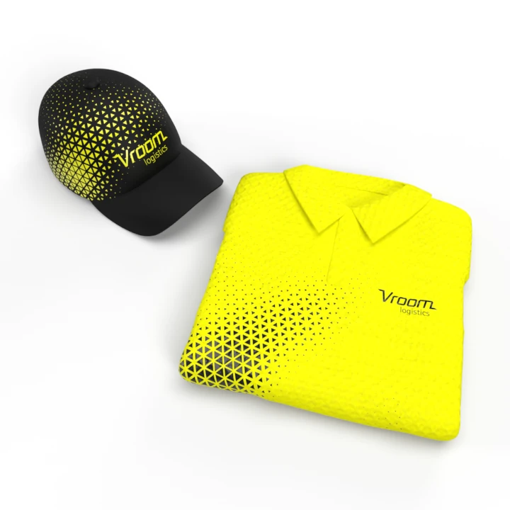
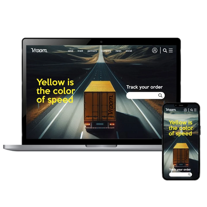
The active, streamlined design is all about speed and functionality. We wanted the logo to immediately communicate the business's role in getting things done with precision and speed. The simplicity of the style ensures it’s adaptable to a variety of mediums, making it versatile for use on trucks, websites, uniforms, and promotional materials. It’s a logo that stays current and ready for the fast-moving logistics world, symbolizing the constant motion and progress the industry demands.
Royal Yellow: Optimism & Urgency
الألوان المختارة
The color royal yellow was carefully selected for its strong connection to optimism, urgency, and energy. It’s a color that instantly draws attention and conveys a sense of importance. In the context of transportation and logistics, yellow signifies quick action, bright solutions, and a focus on rapid response. This color instantly connects with customers who are looking for fast, reliable service, making the logo memorable and impactful.
Royal yellow also has a strong association with clarity and visibility. In the fast-paced world of transportation and logistics, it’s important for a brand to stand out and be easily recognized. Yellow enhances the logo’s ability to grab attention quickly, symbolizing not just speed but also a sense of clarity in communication. The color reinforces the notion that the brand can be trusted to act quickly and efficiently.
A Logo Reflecting Active Solutions
التنفيذ البصري
The artwork of this logo captures the essence of active solutions. It embodies the logistics industry’s core values: efficiency, speed, and precision. The design is clean and modern, offering a sleek representation of the brand’s ability to act swiftly and deliver results. By combining royal yellow with dynamic lines, we created a logo that speaks to the agility and reliability of the company, ensuring that it stands out in a competitive field.
This logo’s artwork was designed to perfectly represent the fast-moving and adaptable nature of the transportation logistics industry. The use of royal yellow and streamlined shapes makes the logo instantly recognizable and easy to associate with fast, efficient service. It’s a visual representation of the company’s commitment to delivering high-quality results quickly. The design reflects the core values of the industry, reinforcing the idea of an ever-present, dependable solution for clients in need.