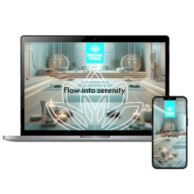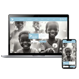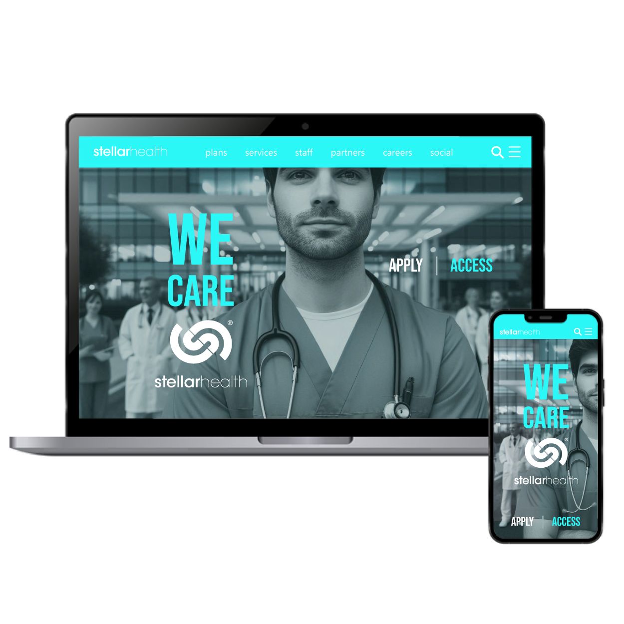
تصميم موقع إلكتروني لـ رعاية صحية
Our healthcare website design prioritizes care and healing while embracing innovation. The layout is structured for easy navigation, ensuring patients and medical professionals can access essential information effortlessly. Aqua blue reinforces a sense of calm and reliability, creating a reassuring experience. By integrating modern features and a comprehensive approach, the design enhances engagement while maintaining the trust and clarity essential in healthcare communication.


يمكننا تصميم هذا
من أجلك.
chat_bubble
تواصل معنا!
بالتفاصيل
A Digital Platform Focused on Care and Accessibility
الفكرة التصميمية
This website is designed to provide a seamless and reassuring experience for patients, healthcare providers, and medical staff. Every element is structured to support clear communication, quick access to vital resources, and an overall sense of trust. By focusing on accessibility and patient-centered design, the platform ensures that healthcare services are always within reach when they’re needed most.
The foundation of this concept is care and efficiency—two essential elements in healthcare. The layout ensures that users can navigate smoothly, whether booking appointments, accessing medical records, or reading health-related information. Every detail is intentional, allowing for a structured yet welcoming experience that reflects the industry’s dedication to healing and innovation.
An Innovative and Comprehensive User Experience
الأسلوب الفني
Healthcare requires a digital presence that is both advanced and approachable. The website’s style integrates modern design principles with a comprehensive structure, ensuring that information is presented clearly. With intuitive navigation, well-defined sections, and responsive layouts, the platform supports a stress-free experience for patients and healthcare professionals alike.
Innovation is key in both healthcare and digital experiences. By utilizing structured content, dynamic elements, and a patient-focused layout, the design balances technology with human connection. The result is a digital experience that enhances communication, improves efficiency, and fosters confidence in healthcare services, ensuring users always feel supported and informed.
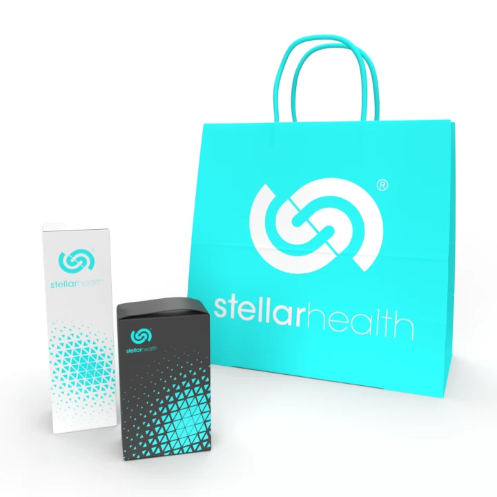
Aqua Blue: A Symbol of Calm and Trust in Healthcare
الألوان المختارة
Aqua blue was chosen for its calming and trustworthy qualities—key emotions in healthcare. This color provides a sense of stability and reassurance, making it easier for users to engage with medical resources. It also represents cleanliness and innovation, reinforcing the credibility of the healthcare industry while maintaining a welcoming and professional tone.
Beyond aesthetics, aqua blue plays a psychological role in creating a soothing environment. Whether patients are scheduling appointments or reading health advice, this color choice fosters a sense of comfort and reliability. Combined with an intuitive layout, it enhances the overall digital experience, ensuring the website feels as compassionate and trustworthy as the services it represents.
Strengthening Patient Engagement with Digital Solutions
التنفيذ البصري
A strong digital presence is essential for connecting patients with healthcare services. Being the ecommerce website designers responsible for the project, we incorporated targeted digital strategies, including SEO optimization for medical topics, patient-centered content, and user-friendly interfaces. These efforts improve accessibility, allowing users to quickly find the health information and services they need.
By integrating patient education, social engagement, and performance tracking, the website adapts to the evolving needs of the healthcare community. Digital marketing strategies are designed to inform, guide, and connect patients with trusted healthcare providers. The result is a more engaged audience and a platform that continuously supports both medical professionals and the people they serve.