تصميم شعار شركة ناشئة لتطبيق تعارف
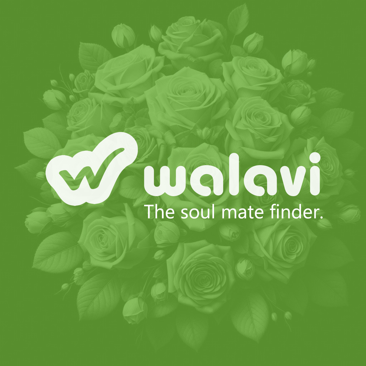
For this startup dating app logo, we combined elements of joy and connection in a modern, fluid desig. The green-yellow color scheme promotes warmth, optimism, and energy, while the sleek, contemporary style resonates with a dynamic audience. The logo is intended to evoke a sense of approachability, ensuring that users feel comfortable and excited about connecting with others. It’s not just a logo – it’s a visual invitation to make meaningful connections.

يمكننا تصميم هذا
من أجلك.
chat_bubble
تواصل معنا!
بالتفاصيل
Creating a Logo That Sparks Connection
الفكرة التصميمية
For the startup dating app, we focused on a logo that would symbolize joy, warmth, and the ease of connection. The concept revolves around creating a design that feels both welcoming and dynamic, making the user feel excited about the possibilities. The simplicity and fluidity of the design ensure that it resonates with people looking for genuine connections. This logo aims to evoke positivity and openness from the first glance.
The logo design reflects the values of the app: meeting new people, sparking joy, and creating meaningful relationships. The flowing lines and curves help reinforce the idea of ease and comfort, while also symbolizing the organic process of connecting with others. By blending these aspects, we’ve designed a logo that’s not only visually attractive but also truly speaks to the core values of the dating experience.
Trendy, Fluid, and Fun
الأسلوب الفني
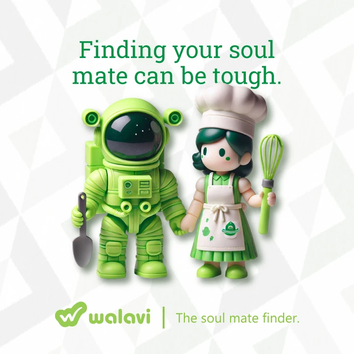
The design style of the dating app logo is fluid and trendy, capturing the essence of modern relationships. We used curving lines to convey a sense of movement and fluidity, representing how people naturally connect with each other. This style is current and on-trend, reflecting how modern dating has evolved to be more casual and accessible. It’s an invitation to be yourself and connect in a relaxed, non-pressured environment.
The logo’s fluidity evokes a sense of ease and openness, which was a key consideration from our brand consulting agency, especially for a dating platform. Their insights helped us maintain a minimalist approach, focusing attention on the connection itself while keeping the design visually interesting. The trendy style, shaped by the agency's guidance, ensures that the brand feels fresh and relevant, appealing to a broad audience. This logo is designed to be both approachable and intriguing, an ideal mix for a dating app that's all about connecting people.
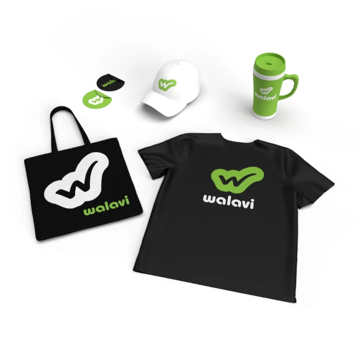
Green-Yellow: Warmth & Energy
الألوان المختارة
The color palette of green and yellow was chosen for its ability to express joy, energy, and warmth. Green signifies growth, connection, and harmony, while yellow evokes happiness and optimism. Together, they create an inviting, vibrant atmosphere. This combination is perfect for a dating app, where people come together with a sense of hope and excitement. It’s a color scheme that immediately brings a positive, energetic vibe to the brand.
The green-yellow colors also suggest a sense of freshness and openness. This combination feels youthful and lively, making it approachable and exciting for users. The color choice reinforces the idea of joy and connection, while offering an inviting first impression. It’s a natural fit for a dating app where the goal is to make users feel comfortable and inspired to meet new people and form connections.
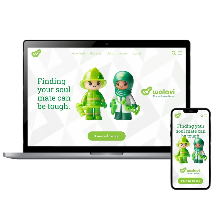
Design That Reflects the App’s Purpose
التنفيذ البصري
The logo design successfully conveys the values and spirit of the startup dating app. With its fluid shapes and vibrant color scheme, it communicates an inviting and energetic vibe, making it perfect for a modern, approachable platform. This logo represents the simplicity and ease of meeting people, while encouraging joy and positivity in the process.
By embracing trendy design and dynamic colors, the logo has already proven successful in establishing a connection with users. The clean and fluid design reflects the app’s focus on helping individuals connect in an easy, natural way, fostering a welcoming environment. This thoughtful approach to the branding has resonated well with the target audience, creating a strong sense of recognition and trust with the brand.