تصميم شعار متجر رياضي
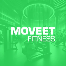
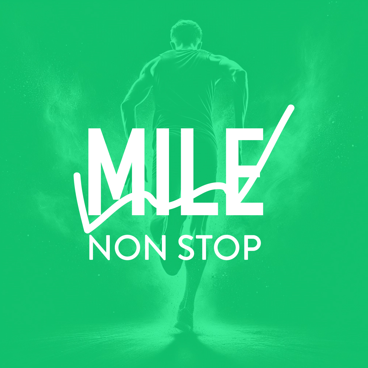
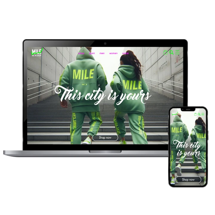
The logo design for this sport company combines bold, sharp shapes and vibrant spring green to symbolize defiance, energy, and strength. Every aspect of the logo evokes the spirit of athletes who face challenges head-on. The geometric style communicates confidence, while the color injects passion and vitality. This design was created to inspire action and motivate individuals, capturing the essence of resilience, perseverance, and ambition in the world of sports.

يمكننا تصميم هذا
من أجلك.
chat_bubble
تواصل معنا!
بالتفاصيل
A Symbol of Strength & Challenge
الفكرة التصميمية
For this sport company, we designed a logo that speaks to the core values of strength and determination. The sharp, angular lines represent power, focus, and movement, all essential for overcoming obstacles. Every element was strategically chosen to inspire athletes to push their limits and face challenges head-on. The logo represents the constant pursuit of excellence in sports and personal growth.
This design isn’t just about appearance, it’s about purpose. The bold shapes and angles are symbolic of overcoming obstacles, defying expectations, and striving for greatness. It speaks directly to the tenacity athletes need to reach their goals. The logo embodies that drive to succeed and be victorious, all while representing a brand that empowers individuals to rise above and keep pushing forward. Crafted as part of a complete overhaul, this project was expertly handled by our rebranding company, ensuring the new identity aligns with the brand’s evolved vision.
Edgy, Bold & Inspirational
الأسلوب الفني
We chose an edgy, bold style to make the logo stand out. The sharp lines and geometric shapes evoke power, speed, and energy, perfectly suited to a sports brand. The design is intended to be eye-catching, embodying the dynamic world of sports, while simultaneously conveying focus and strength. It’s a style that demands attention and leaves a lasting impression on the viewer.
This style captures the essence of an athlete’s journey—bold, driven, and relentless. The sharp lines and intense shapes reflect the challenges athletes face, while the confident design pushes them to defy the odds. This logo’s strong presence communicates power and determination, inspiring individuals to embrace their own potential and tackle obstacles with the same ferocity, both on the field and in life.
Spring Green: Energy & Vitality
الألوان المختارة
The vibrant spring green color was chosen to reflect vitality, growth, and renewal. It’s a color that inspires energy, optimism, and confidence, making it a perfect fit for a sports company. The spring green hue energizes the design, symbolizing progress and constant improvement, just as athletes evolve and push themselves to new heights. This color represents fresh starts and limitless potential.
Spring green isn’t just a color; it’s a feeling. It speaks to the heart of athletes, encouraging them to stay motivated and always strive for the next level. It adds vitality and positivity to the logo, symbolizing that with hard work and determination, anything is possible. This color not only enhances the logo’s visual appeal but also strengthens the brand’s message of progress and triumph.
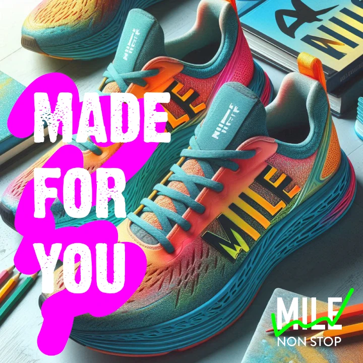
A Logo that Drives Action & Motivation
التنفيذ البصري
This logo has been successful in capturing the essence of the brand and resonating with the target audience. Its bold design and vibrant color evoke the energy and passion needed to excel. The visual strength of the logo motivates athletes to stay driven and focused, while also appealing to those who appreciate a modern, dynamic sports brand. It’s a logo that inspires action.
The logo has become a powerful tool in connecting with its audience, reinforcing the values of strength and resilience. By focusing on bold geometric elements and an energizing color, the logo successfully motivates individuals to pursue their goals. The brand has grown in recognition and relevance, inspiring athletes to push their limits while reinforcing the idea that challenges are meant to be conquered.