الهوية البصرية لـ علم النفس
This psychology practice uses corporate design to foster clarity and understanding. The dark vanilla tones create a serene, welcoming atmosphere, while simple, thoughtful designs reflect the practice's commitment to insightful, compassionate care. The visual identity communicates trust, calm, and intelligence, aligning perfectly with the goals of the practice: to offer clarity and support to those seeking guidance in their mental health journey.


يمكننا تصميم هذا
من أجلك.
chat_bubble
تواصل معنا!
بالتفاصيل
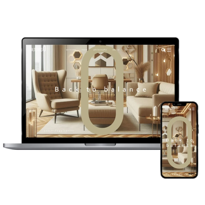
Corporate Design for Psychology Practice
الفكرة التصميمية
The corporate design for this psychology practice centers around creating a calming and trusted environment. Dark vanilla is used as a central color, evoking a sense of tranquility and clarity. Each design element, from logo to business cards, is designed to inspire trust and offer a feeling of compassion. The overall corporate identity is built to reflect the insightfulness and professionalism that the practice stands for, connecting with clients on a deeply personal level.
For this psychology practice, the corporate design blends clarity with empathy. The dark vanilla color symbolizes both mental clarity and calm reassurance, while each design element focuses on creating a serene environment. This approach speaks to the practice’s focus on insight, care, and understanding, ensuring that clients feel welcomed and supported in their journey toward mental well-being. The design fosters a sense of trust that is essential for any therapeutic relationship.
Compassionate & Insightful Style
الأسلوب الفني
This psychology practice's style is thoughtful and welcoming, with dark vanilla providing a soft, calming foundation. The clean, minimalist style ensures that the focus remains on the core message: understanding and clarity. The design uses warm, empathetic visuals to create a feeling of comfort and safety for clients. Every design element contributes to a sense of trust, professionalism, and insight, offering clients a seamless, soothing brand experience that complements the therapeutic process.
The style for this psychology practice revolves around empathy and clarity. Dark vanilla tones give the design an approachable warmth, while minimalist visuals maintain focus on the practice's purpose: to provide insightful guidance. The use of simple yet thoughtful elements encourages a feeling of security and support, ensuring that clients feel confident in the care they will receive. The design mirrors the compassionate nature of the practice, creating a space of comfort and reassurance.
Calming Color Palette: Dark Vanilla & Soft Neutrals
الألوان المختارة
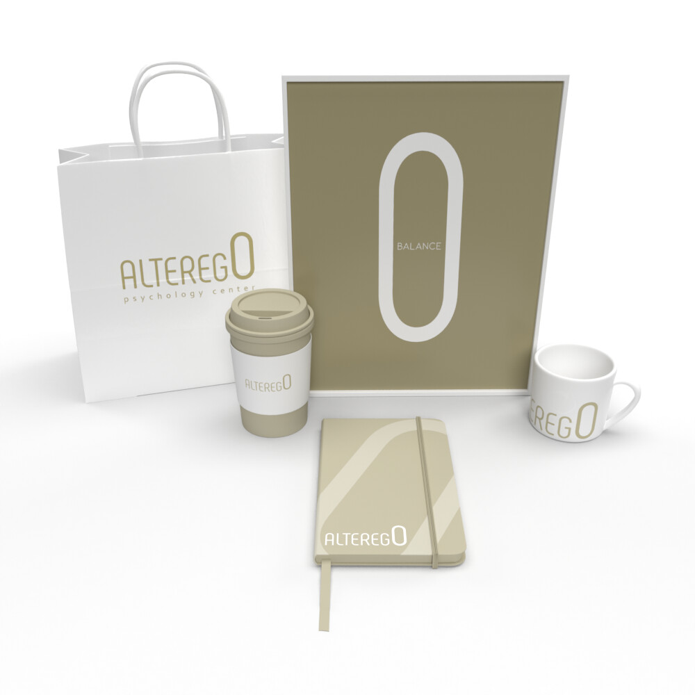
The color scheme for this psychology practice incorporates dark vanilla and soft neutrals, creating a calming and welcoming atmosphere. Dark vanilla symbolizes clarity and understanding, while the subtle neutrals add warmth and stability. Together, these colors reflect the practice’s approach to providing clear, thoughtful support while offering a serene environment for reflection and healing. This balanced palette speaks to the brand’s commitment to clarity, compassion, and professionalism in every client interaction.
Dark vanilla, paired with soft neutrals, creates a calming and inviting color scheme for this psychology practice. The richness of dark vanilla symbolizes clarity and insight, while the neutrals offer a sense of balance and warmth. This color combination fosters an environment where clients feel at ease, ready to explore their emotions and thoughts in a safe, supportive space. The palette perfectly mirrors the practice’s mission to provide understanding and compassionate care. Our brand consulting agency is proud to have been a part of this project empowering this brand to grow and develop.
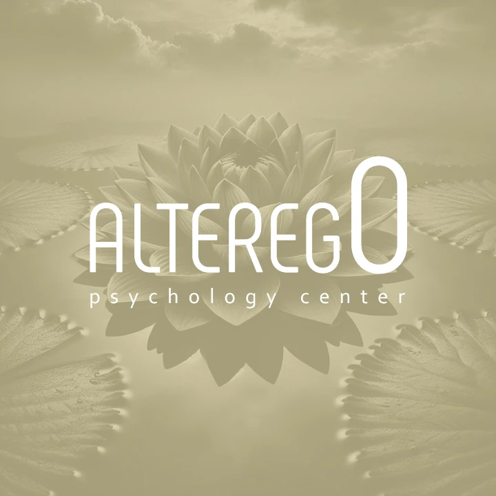
Visual Identity: Compassionate Clarity & Thoughtful Design
التنفيذ البصري
The artwork for this psychology practice blends minimalism with thoughtful design elements. Dark vanilla is used as the central color to evoke calmness and clarity, while soft, welcoming graphics reflect the practice’s compassionate approach to care. Each visual element contributes to the overall message of understanding and trust, offering clients a sense of support and professionalism. The clean lines and gentle colors ensure that the artwork aligns perfectly with the calming and insightful atmosphere of the practice.
The visual identity for this psychology practice combines clarity with warmth, using dark vanilla tones to symbolize insight and understanding. Simple, minimalist artwork allows the design to focus on emotional resonance, with subtle details that evoke a sense of comfort and empathy. The artwork reinforces the practice’s compassionate approach, ensuring that every touchpoint—whether digital or physical—creates a safe, professional space for clients to connect with the support they need.